VSI DECwindows Motif Guide to Application Programming
Preface
1. About VSI
VMS Software, Inc. (VSI) is an independent software company licensed by Hewlett Packard Enterprise to develop and support the OpenVMS operating system.
2. Intended Audience
This document is intended for programmers who need information about the DECwindows Motif Toolkit.
This document assumes that you are familiar with the overall design of the DECwindows implementation.
3. Document Structure
Chapter 1, "Introduction" describes the DECwindows Motif Toolkit. You should read this chapter to become familiar with the DECwindows Motif Toolkit implementation. The chapter is intended to complement the introductory chapters in the OSF/Motif Programmer's Guide.
Chapter 2, "DECwindows Application Interface Design" describes how to use the Toolkit to design a DECwindows application interface. The chapter includes a description of the DECburger application interface. Note that the DECburger demo application is available only on OpenVMS systems.
Chapter 3, "Helpful Hints for Creating a DECwindows Application" describes helpful programming hints on a variety of topics.
Chapter 4, "Using the Help Widget" describes how to use the help widget in an application.
Chapter 5, "Using the DECwindows Motif Help System" describes how to use the DECwindows Help System in an application.
Chapter 6, "Using the Color Mixing Widget" describes how to use the color mixing widget in an application.
Chapter 7, "Using the Print Widget" describes how to use the print widget in an application.
Chapter 8, "Using the Compound String Text Widget" describes how to use the compound string widget in an application.
Chapter 9, "Using the SVN Widget" describes how to use the structured visual navigation widget in an application.
Chapter 10, "Interoperability Coding Recommendations" describes a set of interoperability coding recommendations that you should follow if you are writing DECwindows applications for multiple hardware platforms.
Appendix A, "Using the OpenVMS DECwTermPort Routine" describes how to use the DECwTermPort routine to create a DECterm window on OpenVMS systems.
4. Associated Documents
DECwindows Extensions to Motif provides reference information on extensions to Motif.
DECwindows Motif for OpenVMS Guide to Non-C Bindings describes non-C bindings for Xlib, Intrinsics, Motif Toolkit, and extension routines.
DECwindows Companion to the OSF/Motif Style Guide covers style issues for extensions to Motif and topics not addressed in the OSF/Motif Style Guide.
VMS DECwindows Guide to Xlib Programming: MIT C Binding describes how to program with Xlib using C bindings.
VMS DECwindows Guide to Xlib (Release 4) Programming: VAX Binding describes how to program with Xlib using VAX bindings.
Porting XUI Applications to Motif describes how to port an existing XUI DECwindows application to Motif.
OSF/Motif Style Guide describes style guidelines for applications based on the Motif Toolkit.
OSF/Motif Programmer's Guide describes how to program with the Motif Window Manager, Motif Toolkit, and the Motif User Interface Language (UIL).
OSF/Motif Programmer's Reference provides reference information on the Motif Toolkit.
5. VSI Encourages Your Comments
You may send comments or suggestions regarding this manual or any VSI document by sending electronic mail to the following Internet address: <docinfo@vmssoftware.com>. Users who have VSI OpenVMS support contracts through VSI can contact <support@vmssoftware.com> for help with this product.
6. OpenVMS Documentation
The full VSI OpenVMS documentation set can be found on the VMS Software Documentation webpage at https://docs.vmssoftware.com.
7. Typographical Conventions
|
mouse |
The term mouse is used to refer to any pointing device, such as a mouse, a puck, or a stylus. |
|
MB1 (Select) MB2 (Drag) MB3 (Menu) |
MB1 indicates the left mouse button, MB2 indicates the middle mouse button, and MB3 indicates the right mouse button. The buttons can be redefined by the user. |
|
Ctrl+x |
A sequence such as Ctrl+x (or Ctrl/x) indicates that you must hold down the key labeled Ctrl while you press another key or a pointing device button. |
|
PF1 x |
A sequence such as PF1 x indicates that you must first press and release the key labeled PF1, then press and release another key or a pointing device button. |
. . . |
A vertical ellipsis indicates the omission of items from a code example or command format; the items are omitted because they are not important to the topic being discussed. |
|
boldface text |
Boldface text represents the introduction of a new term or the name of an argument, a field, a resource, or a reason. Boldface text is also used to show user input in online versions of the book. |
|
italic text |
Italic text represents information that can vary in system messages (for example, Internal error number). |
|
UPPERCASE TEXT |
Uppercase letters indicate that you must enter a command (for example, enter OPEN/READ), or they indicate the name of a routine, the name of a file, the name of a file protection code, or the abbreviation for a system privilege. |
|
- |
Hyphens in coding examples indicate that additional arguments to the request are provided on the line that follows. |
|
numbers |
Unless otherwise noted, all numbers in the text are assumed to be decimal. Nondecimal radixes—binary, octal, or hexadecimal—are explicitly indicated. |
Chapter 1. Introduction
DECwindows Motif Toolkit
Basic DECwindows Motif Toolkit programming concepts
Note
This chapter is intended to complement the introductory chapters in the OSF/Motif Programmer's Guide, which is the definitive source of programming information for the Motif Toolkit.
The DECwindows Motif Toolkit on OpenVMS systems includes an example application called DECburger. DECburger is based on the OSF/Motif Motifburger application and demonstrates the use of widgets provided by VSI. Section 1.5, ''Using the OpenVMS DECburger Demo Application'' describes how to compile, link, and run the DECburger application. Note that the DECburger application is unavailable on UNIX or Windows NT systems.
1.1. Overview of DECwindows Motif Toolkit
The DECwindows Motif Toolkit, hereinafter called the Toolkit, is a set of application development tools and run-time routines you can use to create and manage a DECwindows application user interface.
The Toolkit is based on the OSF/Motif Toolkit and the X Toolkit Intrinsics, Release 5, and includes widgets and support routines added by VSI. The widgets and support routines provided by VSI have the prefix DXm. In the case of the Structured Visual Navigation (SVN) widget, the prefix is DXmSvn.
Open a connection to a display device
Create a complete user interface for your application
Perform output operations to windows
Receive input from windows
A set of user interface objects, with run-time routines to create them
A pair of application development tools, called the User Interface Language (UIL) and the Motif Resource Manager (MRM)
A set of run-time routines to manipulate the widgets, called X Toolkit intrinsics. The intrinsics routines have the prefix Xt.
1.1.1. Toolkit Building Blocks: Widgets and Gadgets
The Toolkit provides a set of user interface objects called widgets. Widgets are the building blocks for the user interface of an application.
From a user's perspective, widgets are the interface for an application; users use menus, push buttons, scroll bars, and text widgets to make selections, view output, enter input, and so forth. Because the Toolkit implements widgets with a consistent appearance and behavior, users can move between DECwindows applications without having to learn how to use a new interface.
From a programmer's perspective, widgets are windows that are logically connected to application functions. When a user interacts with a widget (for example, by making a menu selection), information in the widget makes the application respond appropriately.
A Toolkit widget is made up of a window packaged with input and output capabilities. Some widgets display information, such as text or graphics. Others are merely containers for other widgets. Some widgets are for output only and do not react to pointer or keyboard input. Others change their display in response to input and can invoke functions that an application has attached to them.
Each widget supports a set of attributes—such as width, height, font, color, and border width—that you can use to customize the widget's appearance and function. The Toolkit assigns default values to widget attributes to create widgets that conform to the recommendations of the OSF/Motif Style Guide.
Some widgets in the Toolkit have variants, called gadgets. Gadgets have the same general appearance as their widget counterparts but have restricted capabilities. Gadgets use fewer system resources and can offer improved application performance. For example, gadgets do not have an associated window, thus eliminating the processing involved with creating a window. On the other hand, gadgets do not provide access to all the attributes supported by their widget counterparts.
To build a user interface using widgets (or gadgets), you create instances of the widgets in your application program. When you create a widget, you specify its parent/child relationship, its initial appearance, and other characteristics by assigning values to widget attributes.
The hierarchy of widgets
For example, an interface object might consist of a box (parent) with buttons (children) inside the box. Both the box and buttons are widgets; specifying the hierarchy of widgets entails establishing the relationship between the box and buttons.
The characteristics of each widget
For example, you specify the height, width, and position of a widget.
The routines your application executes when a user provides input to the interface
1.1.2. Widget Types
Input/output widgets
These widgets provide the basic input and output capabilities of a user interface, such as displaying text or graphics, allowing text editing, and enabling user input to your application. The widgets that provide these functions are the XmLabel, XmPushButton, XmToggleButton, XmScale, XmScrollBar, and XmText widgets.
Container widgets
These widgets act as containers for other widgets. You use these widgets to gather together the widgets that provide access to the functions of your application. The widgets that provide these functions include the XmBulletinBoard, XmForm, and XmMainWindow widgets. The Toolkit includes container widgets that are preconfigured to perform commonly needed functions such as presenting caution messages.
Choice widgets
These widgets present choices to the user of your application. The widgets that provide these functions include the XmList widget.
1.1.3. Widgets in the OSF/Motif Toolkit
As described in Section 1.1, ''Overview of DECwindows Motif Toolkit'', the DECwindows Motif Toolkit is based on the OSF/Motif Toolkit. The OSF/Motif Toolkit widgets are described in the OSF/Motif Programmer's Guide.
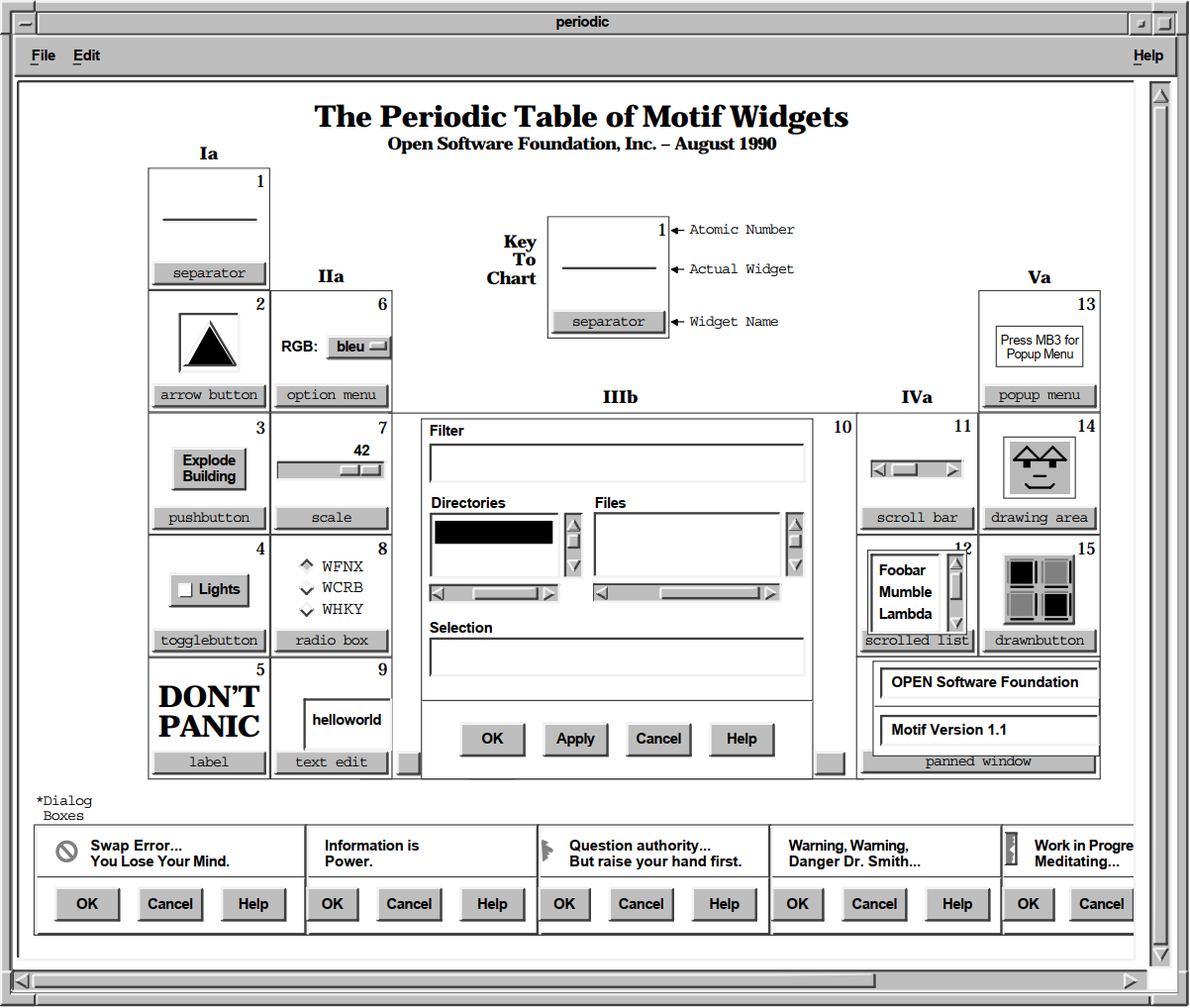
The OSF/Motif demonstration program Periodic demonstrates the use and appearance of many of the OSF/Motif widgets. The Periodic main window is shown in Figure 1.1, ''The OSF/Motif Periodic Demonstration Program''.
 |
1.1.4. Widgets Provided by VSI
Help widget
Print widget
Color mixing widget
Compound string text widget
SVN widget
Using these widgets can save you considerable programming time, while allowing your application to comply with the DECwindows Companion to the OSF/Motif Style Guide. The programming interface to these widgets, with examples, is documented in subsequent chapters.
1.1.5. Toolkit Widget and Gadget Routines
static void create_help (topic)
XmString topic;
{
unsigned int ac;
 Arg arglist[10];
XmString appname, glossarytopic, overviewtopic, libspec;
static Widget help_widget = NULL;
if (!help_widget) {
ac = 0;
appname = XmStringCreateLtoR("Toolkit Help", XmSTRING_ISO8859_1);
glossarytopic = XmStringCreateLtoR("glossary", XmSTRING_ISO8859_1);
overviewtopic = XmStringCreateLtoR("overview", XmSTRING_ISO8859_1);
libspec = XmStringCreateLtoR("decburger.hlb", XmSTRING_ISO8859_1);
Arg arglist[10];
XmString appname, glossarytopic, overviewtopic, libspec;
static Widget help_widget = NULL;
if (!help_widget) {
ac = 0;
appname = XmStringCreateLtoR("Toolkit Help", XmSTRING_ISO8859_1);
glossarytopic = XmStringCreateLtoR("glossary", XmSTRING_ISO8859_1);
overviewtopic = XmStringCreateLtoR("overview", XmSTRING_ISO8859_1);
libspec = XmStringCreateLtoR("decburger.hlb", XmSTRING_ISO8859_1);
 XtSetArg(arglist[ac], DXmNapplicationName, appname); ac++;
XtSetArg(arglist[ac], DXmNglossaryTopic, glossarytopic); ac++;
XtSetArg(arglist[ac], DXmNoverviewTopic, overviewtopic); ac++;
XtSetArg(arglist[ac], DXmNlibrarySpec, libspec); ac++;
XtSetArg(arglist[ac], DXmNfirstTopic, topic); ac++;
XtSetArg(arglist[ac], DXmNapplicationName, appname); ac++;
XtSetArg(arglist[ac], DXmNglossaryTopic, glossarytopic); ac++;
XtSetArg(arglist[ac], DXmNoverviewTopic, overviewtopic); ac++;
XtSetArg(arglist[ac], DXmNlibrarySpec, libspec); ac++;
XtSetArg(arglist[ac], DXmNfirstTopic, topic); ac++;
 help_widget = DXmCreateHelpDialog (toplevel_widget,
"Toolkit Help",
arglist, ac);
XmStringFree(appname);
XmStringFree(glossarytopic);
XmStringFree(overviewtopic);
XmStringFree(libspec);
help_widget = DXmCreateHelpDialog (toplevel_widget,
"Toolkit Help",
arglist, ac);
XmStringFree(appname);
XmStringFree(glossarytopic);
XmStringFree(overviewtopic);
XmStringFree(libspec);
| Declare an array of 10 Arg data structures. |
| Call XtSetArg to set values into the argument list. |
| Create the widget, passing in the argument list and the count of argument data structures. |
Although you can use widget manipulation routines to access the complete set of widget attributes after a widget has been created, it is more efficient to assign values to widget attributes when you create the widget.
1.1.6. Application Development Tools
The Toolkit provides routines for creating a widget hierarchy and specifying the complete set of attributes of a widget. Moreover, the Toolkit includes additional tools that simplify the process further—the User Interface Language (UIL) Compiler and the Motif Resource Manager (MRM) routines.
UIL is a user interface definition language. Using UIL, you specify the "form" of the application—that is, the user interface—in a text file called a UIL specification file and compile this specification file using the UIL compiler.
The widgets that comprise the interface
The hierarchy of widgets in the application
The characteristics of the specified widgets
The callback routines for each widget
Because you compile the specification file separately from the functional routines, you separate form and function in an application. For example, you can use UIL to create an OK XmPushButton without having to specify what happens when a user presses this button. The application's functional routines determine what happens when a user presses the OK push button.
When you define widgets in a UIL specification file, you can access the complete set of widget attributes. The UIL compiler checks that the values you assign to attributes are of the data type expected by the widget. At run time, your application retrieves the compiled interface specification, called a UID file, using MRM routines.
MRM routines enable you to open the UID specification file, retrieve the widget definitions from the file, create the widgets, and build the user interface at run time.
1.1.7. Internationalization Using UIL and MRM
Using UIL and MRM, you can change the user interface specification without making major changes to your main application program. This feature of UIL and MRM is particularly important for applications developed for international markets. For example, you can create user interfaces in several languages for a single application.
1.1.8. Toolkit Intrinsic Routines
X Toolkit routines, called intrinsics, let you manipulate widgets at run time. The X Toolkit Intrinsics is a standard routine library layered on the X Window System, Version 11, R5.
Initialize the Toolkit
Map and unmap widgets to the screen
Process input from an application end user
1.2. Toolkit Routines Contrasted with UIL
You can use either UIL or the Toolkit routines to create the initial instance of each widget for your application. You will probably find that it is much more convenient to use UIL because of the separation between form and function that UIL allows. For example, you can dramatically change the user interface for an application, recompile the UIL module into the UID file, and not make any changes to your application source code.
However, once you have created the initial user interface, you must use the Toolkit routines to make changes to widget resources in response to user actions. For example, assume that you create a Color Mixing widget through UIL. You can set the initial red, green, and blue colors for the widget through UIL. If you then need to change these colors in response to a user action, you must use the Toolkit routines.
1.3. Toolkit Routines Contrasted with Xlib Routines
As compared to using Xlib routines, the Toolkit simplifies the task of creating a user interface. For example, you can create a menu with a call to one Toolkit routine. Creating the same menu using Xlib routines requires many more calls and program lines. Using Toolkit routines also ensures that an application interface conforms to the DECwindows Companion to the OSF/Motif Style Guide.
Most drawing operations, with the exception of drawing compound strings
Getting information about the screen, such as determining the visual type (XDefaultVisualOfScreen) or the default colormap (XDefaultColormapOfScreen)
Allocating color cells from the installed colormap (XAllocColor)
Creating Xbitmaps for use as icons
1.4. Toolkit Programming Considerations
Application widget hierarchy
Form versus function
Associating functions with callbacks
Using widget attributes in applications
1.4.1. Application Widget Hierarchy
You create a user interface for your application by arranging widgets in a widget hierarchy based on parent/child relationships. Parent widgets control the behavior and appearance of their children. In turn, their children can have children. This layering of parent/child relationships creates the application widget hierarchy.
The application widget hierarchy should not be confused with the widget class hierarchy. The application widget hierarchy defines the parent/child relationship of widgets in a user interface. The widget class hierarchy defines the subclass/superclass relationship of the widgets in the Toolkit. The widget class hierarchy determines which attributes a widget inherits from its superclass and which attributes are unique to a particular widget class.
When you design your application hierarchy, it is a good idea to work down from the top of your application hierarchy so that you know in advance which child widgets a parent widget supports. Also, not every Toolkit widget can be a parent. Widgets are either composite widgets or primitive widgets. Composite widgets can be parents or children of other composite widgets; primitive widgets can be only children.
1.4.2. OpenVMS DECburger Application Hierarchy
To understand the concept of an application hierarchy in the context of an application, consider the example of the OpenVMS DECburger main window, as shown in Figure 1.2, ''The OpenVMS DECburger Widget Hierarchy''.
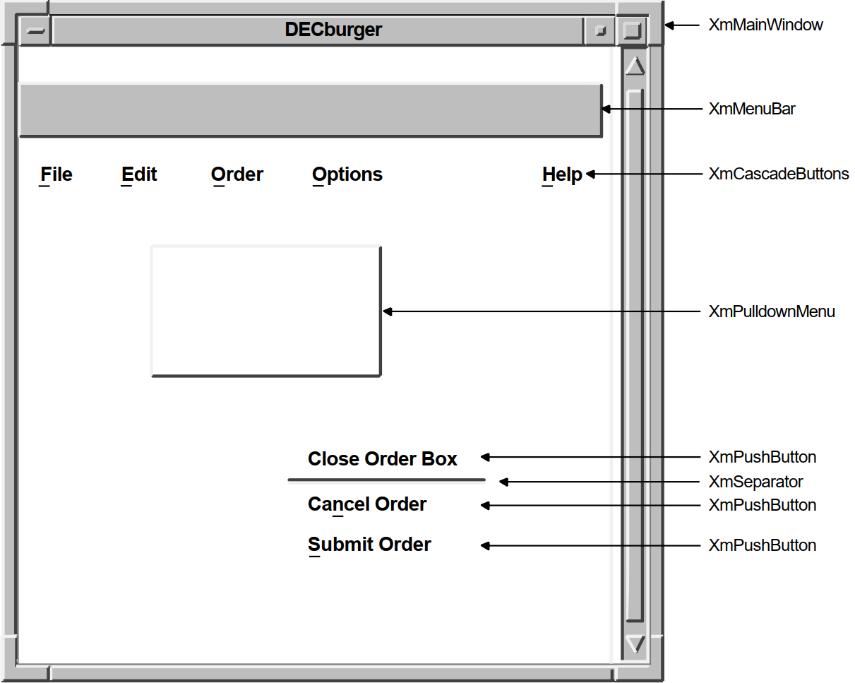 |
At the top of the application widget hierarchy of the DECburger program is the application shell widget. The application shell widget acts as the mediator between the application program and the workstation environment in which the application runs. Every application must have a shell widget at the top of its application widget hierarchy.
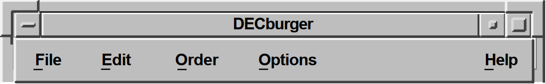
The main widget of the DECburger application is an XmMainWindow widget. This widget is the child of the application shell widget (an application shell widget can have only one child). The XmMainWindow widget has two children, an XmMenuBar and an XmScrolledList (not shown in the figure). The XmScrolledList widget creates the scroll bar.
The XmMenuBar widget creates a blank menu bar. To add menu entries to the menu bar, the XmMenuBar widget has four XmCascadeButton widget children: File, Edit, Order, and Help. In the case of a color system, DECburger has a fifth XmCascadeButton for customizing colors.
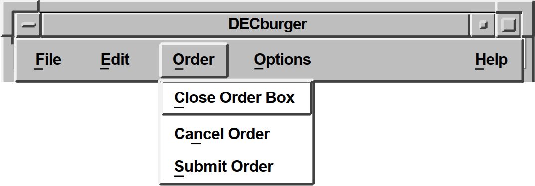
The XmCascadeButton widgets use pull-down menus to present choices to the user. Therefore, each XmCascadeButton widget controls one XmPulldownMenu widget child.
The XmPulldownMenu widgets create empty pull-down menus. To control the contents of the pull-down menus, the XmPulldownMenu widgets have XmPushButton gadget children. For example, the Order XmPulldownMenu widget controls three XmPushButton gadgets (Dismiss, Cancel, and Submit) and a separator gadget.
The XmPushButton gadgets do not support children.
1.4.3. Form Versus Function
The fundamental concept of programming with the Toolkit is the separation of form and function. Using the Toolkit, you can consider the form your application takes—its user interface—separately from the routines that implement the functions of your application.
The form of an application defines its appearance, not how it functions. You can consider the form of an application to be its facade; your application's function routines provide the support structure.
This separation lets you create applications by using widgets and groups of widgets as building blocks; once you create widgets, you group them together in different combinations to build applications. From a programming perspective, it takes less time to modify an existing widget than to create a new one.
object
do_button : XmPushButton {
arguments {
XmNlabelString = compound_string("do label");
XmNaccelerator = compound_string("do label");
XmNacceleratorText = compound_string("do text");
XmNmnemonic = keysym("D");
};
callbacks {
XmNactivateCallback = procedure do_proc();
};
};This UIL code fragment creates an XmPushButton widget but does not specify what happens when a user clicks MB1 on this button. Widgets use callback routines to specify what happens when a particular action or set of actions occurs. Callbacks are described in more detail in Section 1.4.4, ''Associating Functions with Callbacks''.
The application's activate routine (in this case, do_proc) is called when a user clicks MB1 on the push-button widget. This routine determines what action the program takes as a result of the button being pressed.
Because the push-button widget is not inherently tied to a function, you can use this code fragment wherever you need a push button and change the activate callback procedure as needed. For example, by changing the label string and activate callback associated with the push button, you could use this push button as an OK, Cancel, or Apply push button.
object
my_menu : XmPulldownMenu {
controls {
XmPushButton do_button;
XmPushButton clear_button;
XmPushButton save_button;
};
callbacks {
MrmNcreateCallback = procedure create_proc (k_my_menu);
XmNhelpCallback = procedure sens_help_proc(k_my_menu);
};
};
object
do_button : XmPushButton {
arguments {
XmNlabelString = k_do_label_text;
XmNaccelerator = k_do_accelerator;
XmNacceleratorText = k_do_accelerator_text;
XmNmnemonic = keysym("D");
};
callbacks {
XmNactivateCallback = procedure do_proc();
};
};
object
clear_button : XmPushButton {
arguments {
XmNlabelString = k_clear_label_text;
XmNaccelerator = k_clear_accelerator;
XmNacceleratorText = k_clear_accelerator_text;
XmNmnemonic = keysym("C");
};
callbacks {
XmNactivateCallback = procedure clear_proc();
};
};
object
save_button : XmPushButton {
arguments {
XmNlabelString = k_save_label_text;
XmNaccelerator = k_save_accelerator;
XmNacceleratorText = k_save_accelerator_text;
XmNmnemonic = keysym("S");
};
callbacks {
XmNactivateCallback = procedure save_proc();
};
};
.
.
.Note
The building block approach is not unique to UIL; you could also create these widgets with the Toolkit routines and use them as needed.
1.4.4. Associating Functions with Callbacks
When a user invokes a DECwindows application program, the application's initial user interface appears on the display. The application then waits in an infinite loop for the user to interact with its interface. Applications running in the DECwindows environment perform their functions only in response to user interaction with the interface.
When a user of your application uses the mouse or keyboard to perform an action, that action causes a change in the state of the widget. Each widget supports a specific set of such changes in its state that cause it to notify an application. This flow of data from the interface to the application at run time is accomplished through the callback mechanism. The callback mechanism provides a one-way path of communication from the interface to the application. This is the primary means an application has of getting input from its interface.
A widget can define one or more callbacks, depending on how many changes in its state it is willing to communicate. Each particular set of user actions that triggers a callback is called a reason. When a change of state in the widget triggers a callback, your application executes the routine you have associated with the widget. This routine is called a callback routine. In this way, you associate the routines that implement the functions of your application with the widgets that make up the user interface of your application. You can associate more than one callback routine with a single callback reason. When there is more than one callback routine, the routines are executed in the order in which you specify them.
Note that reasons are not actions in the way that "MB1" is an action.
Reasons represent a more abstract concept, such as "activate". For
example, the push-button widget defines the MB1 down/MB1 up sequence of events as
the activate callback reason.
The X Window System, on which the Toolkit is based, defines an action (such as MB1 up) that occurs in a window as an event. The server is responsible for noting when an event occurs in a window. In general, an application that uses Toolkit widgets need not be concerned with events. Toolkit widgets automatically notify applications when the event or sequence of events the widget defines as a reason occurs.
1.4.5. Using Widget Attributes in Applications
Every Toolkit widget supports a set of attributes you can use to customize aspects of its appearance and function. A subset of these widget attributes is supported by every Toolkit widget. These are called common widget attributes. In addition, most widgets support their own unique attributes. The OSF/Motif Programmer's Reference describes the complete set of attributes that each widget supports.
Size and position attributes (geometry management)
Appearance attributes
Callback attributes
The sections that follow briefly describe programming considerations for using widgets in applications. See the OSF/Motif Programmer's Guide for additional information.
1.4.5.1. Size and Position Attributes
|
Attribute |
Description |
|---|---|
|
XmNwidth |
Specifies the width of the widget. |
|
XmNheight |
Specifies the height of the widget. |
|
XmNx |
Specifies the x-coordinate of the upper left corner of the widget. |
|
XmNy |
Specifies the y-coordinate of the upper left corner of the widget. |
Note that, while you can specify the size and position of a widget using these attributes, for many widgets it is preferable to let the widget define its own size and position in the context in which it is used. The size and position of a widget is controlled by its parent. A child can request to be a certain size, but its parent makes the final decision. Parent widgets must weigh the sizing and positioning needs of their other children. In addition, parent widgets are children themselves and must negotiate their space requirements with their parent. This negotiation between parent and child for display space is called geometry management.
1.4.5.2. Appearance Attributes
All Toolkit widgets support attributes that specify aspects of their
appearance. Many of these attributes are unique to each widget. For example, the
XmPushButton widget appears on the display with a shadow to give a
three-dimensional impression. However, you can create push-buttons with a
different shadow thickness by setting the push-button widget
XmNshadowThickness resource to a value other than the
default of 2.
If you do not set an appearance resource of a widget, the Toolkit uses a default value. The default values for widget attributes create widgets that conform to the recommendations of the OSF/Motif Style Guide.
1.4.5.3. Callback Attributes
|
XmNactivateCallback |
Callback performed when a user clicks MB1 inside the push-button widget |
|
XmNarmCallback |
Callback performed when a user holds down MB1 inside the push-button widget |
|
XmNdisarmCallback |
Callback performed when a user moves the pointer cursor off the push-button widget without releasing MB1 |
|
XmNhelpCallback |
Callback performed when a user presses the Help key and clicks MB1 in the push-button widget |
|
XmNdestroyCallback |
Callback performed when a push-button widget is destroyed |
1.4.5.4. Assigning Values to Widget Attributes
The argument list supplied with the creation routine
The widget resource database
The default values contained in the widget
The Toolkit first checks the argument list for resource values. You assign values to widget attributes when you create the widget using Toolkit routines or UIL/MRM. If you have specified any resource values in an argument list, the Toolkit assigns these values to the widget when it creates it.
For any attribute to which you do not assign a value, the Toolkit retrieves a default value from a database of resource values.
If the Toolkit cannot find a value for a resource in an argument list or a resource database, the default value contained in the widget itself is used. Each widget contains a default value for every resource it supports.
1.5. Using the OpenVMS DECburger Demo Application
The OpenVMS DECburger demo application implements an order-entry system for a fictitious fast-food restaurant. In DECburger, the user interface is made up of dozens of widgets (and gadgets). To become familiar with a basic DECwindows application, run the DECburger application. Note that the DECburger application is available only on OpenVMS systems; it is not available on UNIX or Windows NT systems.
The C language and UIL source files for the DECburger sample application are included in the examples directory (DECW$EXAMPLES). The DECW$EXAMPLES:DECBURGER.COM command procedure compiles the DECburger C language program, links it with the Toolkit and Xlib shareable images, creates the help library, and runs the DECburger executable image.
$@DECW$EXAMPLES:DECBURGER.COM
1.6. Non-C Language Examples for OpenVMS
The DECwindows Motif for OpenVMS Guide to Non-C Bindings contains language binding information for Ada, FORTRAN, and Pascal. Ada and FORTRAN versions of the HelloMotif and Motifburger programs are included in DECW$EXAMPLES.
Chapter 2. DECwindows Application Interface Design
This chapter discusses the design of a DECwindows application interface. The chapter includes a description of the OpenVMS DECburger demo application interface.
2.1. Designing a DECwindows Application—Where to Begin
The first step in designing a DECwindows application interface is to become familiar with the application interface guidelines contained in the DECwindows Companion to the OSF/Motif Style Guide, the definitive reference on the look and feel of a DECwindows application. If you design your application in accordance with the guidelines of the DECwindows Companion to the OSF/Motif Style Guide, you can be certain that your application interface will be consistent with other DECwindows applications.
Once you are familiar with the application interface guidelines, you can decide the form of the application; that is, what you want your application to look like. You might want to sketch out how you want your application to look before you create it. A sketch also helps you to visualize the parent/child relationships of the widgets in your interface, as described in Section 1.4.1, ''Application Widget Hierarchy''.
2.1.1. Application Design Topics
Must all parts of the application be visible when the application is started? Or, can you present an initial environment and then wait for a user action before revealing additional components? For example, the DECwindows Clock application initially presents only a clock; a user must click MB3 to get a customize menu.
Will the application need only one main window that remains visible as long as the application is running, or will it require widgets that appear, perform a function, and then disappear?
Will the physical relationship between widgets be important? That is, will you need form widgets to maintain a physical layout in the event that the application is resized?
Will the application require the user to enter text or take some other action in response to a query? Will your application use the compound string text widget to determine character set and writing direction information?
Will the application need label widgets to provide the user with information? If so, will this text need to be translated for international use? (UIL provides capabilities for this.)
Will the application need capabilities — such as color mixing or help — implemented by the widgets provided by VSI? Using the widgets provided by VSI can save you considerable programming time while allowing your application to be in compliance with the DECwindows Companion to the OSF/Motif Style Guide.
Will the application take advantage of gadgets? Because gadgets use fewer resources than widgets, use gadgets whenever appropriate.
With the exception of the XmFileSelectionBox widget, all manager widgets accept gadgets. However, there are several resources that can be used only if the child objects are widgets:- XmNbottomShadowColor
- XmNbottomShadowPixmap
- XmNforeground
- XmNhighlightColor
- XmNhighlightPixmap
- XmNtopShadowColor
- XmNtopShadowPixmap
2.1.2. Use of Callbacks
Remember that callbacks are the connection between the application interface and your functional code. As you design your user interface, try to equate a user action with the callback to be generated; that is, if you want the user to perform an action such as cancel, a cancel push button should be available.
2.1.3. Making Assumptions About Resources
As you design your application, be careful about assumptions you make about available resources. DECwindows applications are likely to be displayed on a variety of hardware platforms and your application should provide for differing screen sizes, availability of color resources, and so forth.
Depending on your application, you might want to selectively reduce functionality if you are unable to allocate sufficient resources. This requires that you determine the minimum operating environment your application needs and reduce functionality until you reach that environment.
Font fallback
Screen independence
Color support
2.1.4. Selecting Appropriate Widgets
After you have determined what your application will look like, check the OSF/Motif Programmer's Guide for the widgets that most closely implement your planned user interface.
Container widgets
Most applications use some form of container widget, such as XmBulletinBoard or XmMainWindow, as the main widget of their application. These widgets support many types of children and give your application a flexible platform.
For example, if your application needs to include a menu bar, you might find that the XmMainWindow widget would make a suitable main window for your application because it easily supports a menu bar child. You might also find that the simple geometry management provided by XmBulletinBoard is a convenient way to make sure that child widgets do not overlap.
Input/output widgets
Input/output and choice widgets are used to present information or to query the user for input. Pick the type of widget that best fits your application. For example, if a text entry field needs to handle more than one line of text, you might want to use the XmCreateScrolledText routine to create an XmText widget that is contained within a scrolled window. Using this routine is easier than creating separate text and scroll bar widgets.
Choice widgets
These widgets allow your application to present choices to the user and obtain a response. Choice widgets can be "pick one" and "pick many."
As described in Section 1.4.3, ''Form Versus Function'', you might find that you can use part of an existing application to build a new application. That is, if you already have written an application that uses an XmMainWindow widget, consider reusing that code with different callbacks.
You should use existing Toolkit widgets whenever possible. However, if you cannot find a widget that suits your needs, you can create your own widget, as described in the X Window System Toolkit. Note that, if you create your own widgets, you become responsible for implementing the DECwindows look and feel.
2.1.5. Widgets in the OpenVMS DECburger Application
This section describes the reasons for using the various widgets in the OpenVMS DECburger demo application. Figure 2.1, ''OpenVMS DECburger User Interface'' shows the OSF/Motif widgets as used in the DECburger user interface. The widgets provided by VSI are shown in subsequent chapters.
 |
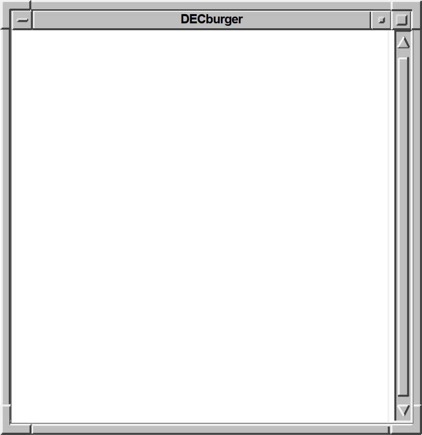
The OpenVMS DECburger demo application uses an XmMainWindow widget as the base of the application, as shown in Figure 2.2, ''OpenVMS DECburger XmMainWindow Widget''.
The main window widget presents some of the OpenVMS DECburger application's basic functions, such as placing an order, as items in a menu bar widget. The DECburger XmMenuBar widget contains the four XmCascadeButton menu entries shown in Figure 2.3, ''OpenVMS DECburger XmMenuBar Widget''. The menu bar widget also contains an Options menu entry on color systems.
 |
Each XmCascadeButton controls an XmPulldownMenu widget. When the user selects one of the entries in the menu bar widget, a pull-down menu widget appears on the screen. The pull-down menu widget disappears when the user releases MB1.
The XmPulldownMenu displayed in Figure 2.4, ''OpenVMS DECburger XmPulldownMenu Widget'' is the Order pull-down menu widget DECburger uses when the order box is already displayed. The contents of this menu vary depending on whether the order-entry box is visible.
 |
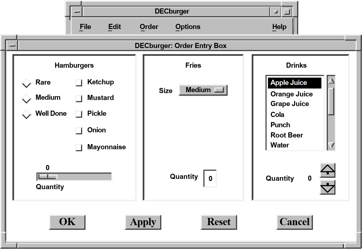
The OpenVMS DECburger Order-Entry Box shown in Figure 2.5, ''OpenVMS DECburger XmFormDialog Widget'' is an XmFormDialog widget, which is a general container widget that imposes geometry management on its children. Dialog widgets can extend beyond the boundaries of their parent widgets, and the DECburger Order-Entry Box does so.
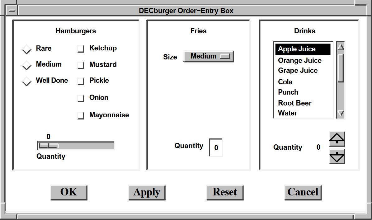 |
To distinguish each XmForm widget in the Order-Entry Box, DECburger includes a descriptive text label at the top of each section. Each of these text labels is an XmLabel gadget.
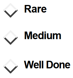
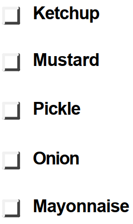
DECburger uses the XmRadioBox widget shown in Figure 2.6, ''OpenVMS DECburger XmRadioBox Widget'' to present a list of choices from which the user can choose only one item at a time. Each item in the radio box widget is implemented by an XmToggleButton gadget.
To present a list of choices from which the user can select any number of items, DECburger uses an XmRowColumn widget, as shown in Figure 2.7, ''OpenVMS DECburger XmRowColumn Widget''. Each item in the menu is an XmToggleButton gadget.
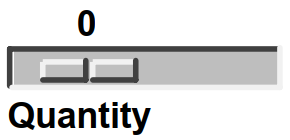
To solicit quantity information, DECburger uses an XmScale widget, as shown in Figure 2.8, ''OpenVMS DECburger XmScale Widget''. Because scale widgets graphically present a range of values, they prevent users from entering an incorrect value.
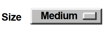
DECburger uses an XmOptionMenu widget to present a list of choices from which only one item can be selected at a time, as shown in Figure 2.9, ''OpenVMS DECburger XmOptionMenu Widget''. Each item in the option menu widget is an XmPushButton gadget. As with the pull-down menu widget, the option menu appears on the display only when the user presses MB1. In this way, the list of items does not take up any display space until it is invoked. The option menu widget always displays its current selection.
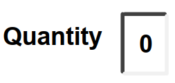
DECburger uses an XmText widget to handle another quantity choice, as shown in Figure 2.10, ''OpenVMS DECburger XmText Widget''. The text widget lets the user enter text from the keyboard.
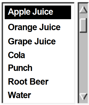
To present a long list of choices, DECburger uses the XmScrolledList widget shown in Figure 2.11, ''OpenVMS DECburger XmScrolledList Widget''. Only a portion of the entire list of items is visible in the scrolled list as it appears on the display. XmScrolledList widgets can be configured to allow users to select more than one item at a time.
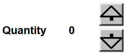
DECburger uses the XmForm widget shown in Figure 2.12, ''OpenVMS DECburger XmForm Widget'' to implement drink quantity selection. The XmForm widget includes two XmPushButton widgets with pixmap labels. The "up arrow" XmPushButton increases the drink quantity; the "down arrow" XmPushButton decreases the drink quantity. Note that XmPushButton widgets are used instead of gadgets because you cannot use pixmap labels with XmPushButton gadgets. The XmForm widget also includes two XmLabel gadgets to display descriptive text and to present the current value selected by the user.
DECburger uses an XmFormDialog widget containing four XmPushButton widgets to implement the OK, Apply, Reset, and Cancel functions, as shown in Figure 2.13, ''OpenVMS DECburger XmFormDialog Widget''. Note the use of widgets instead of gadgets to allow DECburger to specify a larger font size to emphasize these important functions. You cannot specify the font in a gadget; gadgets use the font specified in their parent. The figure does not represent the actual font used in these buttons. To see this attribute, run the DECburger application.
The XmNshowAsDefault resource identifies the OK XmPushButton as the default; the XmNdefaultButtonShadowThickness is set to one for all of the XmPushButton widgets so that they have the same size when selected.
 |
2.1.6. Toolkit Intrinsic Routines Used in OpenVMS DECburger
As described in Section 1.1.8, ''Toolkit Intrinsic Routines'', your application can use intrinsic routines to initialize the Toolkit, get information about the screen and display, map and unmap widgets to the screen, process input from an application end user, and so forth.
- XtAppInitialize—Initializes the Toolkit internals to create a default application context for use by the other convenience routines. XtAppInitialize returns the "top-level" widget for an application.
XtAppContext app_context; . . . toplevel_widget = XtAppInitialize(&app_context, "DECburger", NULL, 0, &argc, argv, &fallback, NULL, 0); - XtDisplay—Returns the display pointer for the specified widget. DECburger uses XtDisplay when querying colors associated with the default color map.
XQueryColor(the_display, XDefaultColormapOfScreen(the_screen), &newcolor); - XtScreen—Returns the screen pointer for the specified widget. DECburger uses XtScreen to determine the screen associated with the top-level widget.
the_screen = XtScreen(toplevel_widget);
- XtSetMappedWhenManaged—Maps a window if it is managed. DECburger allows a user to customize the background color only if a color workstation is being used. Specifically, DECburger uses XtSetMappedWhenManaged to map the Options menu entry.
XtSetMappedWhenManaged(widget_array[k_options_pdme], TRUE);
- XtManageChild—Adds a single child widget to the managed children of the parent widget. DECburger first calls this routine to manage the main window.
XtManageChild(main_window_widget);
- XtUnmanageChild—Removes a single child widget from the managed children of the parent widget.
XtUnmanageChild(widget_array[k_order_box]);
- XtRealizeWidget—Realizing a widget creates a window for the widget and maps the window to the display. For composite widgets (that is, widgets with children), realizing a widget also creates and maps windows for all of the managed children of the widget. Therefore, DECburger needs to realize only its top-level widget.
XtRealizeWidget(toplevel_widget);
- XtAppMainLoop—Performs a loop that waits for the user to interact with the user interface and then processes input data in the form of callbacks.
XtAppMainLoop(app_context);
- XtSetArg—Fills in the argument data structures in an argument list. XtSetArg takes the following arguments:
The address of the argument-list element
The name of the widget attribute
The value being assigned to the attribute or the address where the value will be returned by XtGetValues
In the following example, XtSetArg fills in an argument data structure with the name of a widget attribute (DXmNfirstTopic) and the value being assigned to that attribute (compound string identified by help_topic).XtSetArg (arglist[0], DXmNfirstTopic, help_topic);
XtSetValues—Modifies the current value of a resource associated with a widget instance. XtSetValues is commonly used together with XtSetArg to change the value of a resource. In the following example, XtSetArg first fills in an argument data structure with the name of a widget resource DXmNfirstTopic and the value being assigned to that attribute (compound string identified by help_topic).
XtSetValues then sets the DXmNfirstTopic attribute for this instance of the help widget.XtSetArg (arglist[0], DXmNfirstTopic, help_topic); XtSetValues (help_widget[help_num], arglist, 1);
- XtGetValues—Retrieves the current value of resource data associated with a widget instance. DECburger uses XtGetValues together with XtSetArg.
XtSetArg(arglist[0], XmNbackground, &newcolor.pixel); XtGetValues(main_window_widget, arglist, 1);
This example calls the XtSetArg and XtGetValues intrinsic routines to get the background color of the main window widget and store it in the newcolor.pixel pixel field.
- XtIsManaged – Determines if the specified widget is currently managed. Applications are obliged to create new instances of the help widget if one is already managed. DECburger uses XtIsManaged to determine if a help widget is already managed.
if (XtIsManaged(main_help_widget)) {
Chapter 3. Helpful Hints for Creating a DECwindows Application
Using the widgets supplied by VSI from UIL
Using XmForm widgets
Using default files
Using multiple displays
Creating a cursor
Using the XtAppAddInput routine
Freeing resources allocated through UIL
3.1. Using Widgets Supplied by VSI from UIL
DXmInitialize();
X Toolkit Warning: Urm__WCI_LookupClassDescriptor: Couldn't find class descriptor for class xxxxxxx - MrmNOT_FOUND
3.2. XmForm Widget Hints
The sections that follow describe additional XmForm widget programming hints. See the OSF/Motif Programmer's Reference for a complete description of the XmForm widget.
3.2.1. Creating a Form Dialog Box with Children
.
.
.
object
form_main : XmForm{
arguments
{
XmNdialogTitle = compound_string("XmForm");
XmNwidth = 400;
XmNheight = 400;
};
controls
{
XmPushButton a_button;
XmPushButton b_button;
XmPushButton c_button;
XmPushButton d_button;
XmPushButton e_button;
XmPushButton f_button;
XmPushButton g_button;
XmPushButton h_button;
XmPushButton i_button;
XmPushButton j_button;
};
};
object
a_button : XmPushButton {
arguments {
XmNlabelString = compound_string("a button");
XmNtopAttachment = XmATTACH_FORM;
XmNtopOffset = 25;
XmNleftAttachment = XmATTACH_FORM;
XmNleftOffset = 25;
XmNbottomAttachment = XmATTACH_NONE;
XmNrightAttachment = XmATTACH_NONE;
};
};
object
b_button : XmPushButton {
arguments {
XmNlabelString = compound_string("b button");
XmNtopAttachment = XmATTACH_WIDGET;
XmNtopOffset = 5;
XmNtopWidget = a_button;
XmNleftAttachment = XmATTACH_FORM;
XmNleftOffset = 25;
XmNbottomAttachment = XmATTACH_NONE;
XmNrightAttachment = XmATTACH_NONE;
};
};
object
c_button : XmPushButton {
arguments {
XmNlabelString = compound_string("c button");
XmNtopAttachment = XmATTACH_WIDGET;
XmNtopOffset = 5;
XmNtopWidget = b_button;
XmNleftAttachment = XmATTACH_FORM;
XmNleftOffset = 25;
XmNbottomAttachment = XmATTACH_NONE;
XmNrightAttachment = XmATTACH_NONE;
};
};
object
d_button : XmPushButton {
arguments {
XmNlabelString = compound_string("d button");
XmNtopAttachment = XmATTACH_WIDGET;
XmNtopOffset = 5;
XmNtopWidget = c_button;
XmNleftAttachment = XmATTACH_FORM;
XmNleftOffset = 25;
XmNbottomAttachment = XmATTACH_NONE;
XmNrightAttachment = XmATTACH_NONE;
};
};
object e_button : XmPushButton {
arguments {
XmNlabelString = compound_string("e button");
XmNtopAttachment = XmATTACH_WIDGET;
XmNtopOffset = 5;
XmNtopWidget = d_button;
XmNleftAttachment = XmATTACH_FORM;
XmNleftOffset = 25;
XmNbottomAttachment = XmATTACH_NONE;
XmNrightAttachment = XmATTACH_NONE;
};
};
object
 f_button : XmPushButton {
arguments {
XmNlabelString = compound_string("f button");
XmNtopAttachment = XmATTACH_FORM;
XmNtopOffset = 25;
XmNleftAttachment = XmATTACH_WIDGET;
XmNleftOffset = 5;
XmNleftWidget = a_button;
XmNbottomAttachment = XmATTACH_NONE;
XmNrightAttachment = XmATTACH_NONE;
};
};
object
f_button : XmPushButton {
arguments {
XmNlabelString = compound_string("f button");
XmNtopAttachment = XmATTACH_FORM;
XmNtopOffset = 25;
XmNleftAttachment = XmATTACH_WIDGET;
XmNleftOffset = 5;
XmNleftWidget = a_button;
XmNbottomAttachment = XmATTACH_NONE;
XmNrightAttachment = XmATTACH_NONE;
};
};
object
 g_button : XmPushButton {
arguments {
XmNlabelString = compound_string("g button");
XmNtopAttachment = XmATTACH_WIDGET;
XmNtopOffset = 5;
XmNtopWidget = f_button;
XmNleftAttachment = XmATTACH_WIDGET;
XmNleftOffset = 5;
XmNleftWidget = b_button;
XmNbottomAttachment = XmATTACH_NONE;
XmNrightAttachment = XmATTACH_NONE;
};
};
object
h_button : XmPushButton {
arguments {
XmNlabelString = compound_string("h button");
XmNtopAttachment = XmATTACH_WIDGET;
XmNtopOffset = 5;
XmNtopWidget = g_button;
XmNleftAttachment = XmATTACH_WIDGET;
XmNleftOffset = 5;
XmNleftWidget = c_button;
XmNbottomAttachment = XmATTACH_NONE;
XmNrightAttachment = XmATTACH_NONE;
};
};
object
i_button : XmPushButton {
arguments {
XmNlabelString = compound_string("i button");
XmNtopAttachment = XmATTACH_WIDGET;
XmNtopOffset = 5;
XmNtopWidget = h_button;
XmNleftAttachment = XmATTACH_WIDGET;
XmNleftOffset = 5;
XmNleftWidget = d_button;
XmNbottomAttachment = XmATTACH_NONE;
XmNrightAttachment = XmATTACH_NONE;
};
};
object
j_button : XmPushButton {
arguments {
XmNlabelString = compound_string("j button");
XmNtopAttachment = XmATTACH_WIDGET;
XmNtopOffset = 5;
XmNtopWidget = i_button;
XmNleftAttachment = XmATTACH_WIDGET;
XmNleftOffset = 5;
XmNleftWidget = e_button;
XmNbottomAttachment = XmATTACH_NONE;
XmNrightAttachment = XmATTACH_NONE;
};
};
.
.
.
g_button : XmPushButton {
arguments {
XmNlabelString = compound_string("g button");
XmNtopAttachment = XmATTACH_WIDGET;
XmNtopOffset = 5;
XmNtopWidget = f_button;
XmNleftAttachment = XmATTACH_WIDGET;
XmNleftOffset = 5;
XmNleftWidget = b_button;
XmNbottomAttachment = XmATTACH_NONE;
XmNrightAttachment = XmATTACH_NONE;
};
};
object
h_button : XmPushButton {
arguments {
XmNlabelString = compound_string("h button");
XmNtopAttachment = XmATTACH_WIDGET;
XmNtopOffset = 5;
XmNtopWidget = g_button;
XmNleftAttachment = XmATTACH_WIDGET;
XmNleftOffset = 5;
XmNleftWidget = c_button;
XmNbottomAttachment = XmATTACH_NONE;
XmNrightAttachment = XmATTACH_NONE;
};
};
object
i_button : XmPushButton {
arguments {
XmNlabelString = compound_string("i button");
XmNtopAttachment = XmATTACH_WIDGET;
XmNtopOffset = 5;
XmNtopWidget = h_button;
XmNleftAttachment = XmATTACH_WIDGET;
XmNleftOffset = 5;
XmNleftWidget = d_button;
XmNbottomAttachment = XmATTACH_NONE;
XmNrightAttachment = XmATTACH_NONE;
};
};
object
j_button : XmPushButton {
arguments {
XmNlabelString = compound_string("j button");
XmNtopAttachment = XmATTACH_WIDGET;
XmNtopOffset = 5;
XmNtopWidget = i_button;
XmNleftAttachment = XmATTACH_WIDGET;
XmNleftOffset = 5;
XmNleftWidget = e_button;
XmNbottomAttachment = XmATTACH_NONE;
XmNrightAttachment = XmATTACH_NONE;
};
};
.
.
.
| The XmForm widget controls 10 XmPushButton widgets. |
| The top XmPushButton widget attaches on the top and left side to the XmForm widget, using an offset of 25. |
| Subsequent XmPushButton widgets attach to the bottom of the XmPushButton widget directly above them and to the XmForm on the left. These XmPushButtons also could use XmATTACH_OPPOSITE_WIDGET to align their left
sides with the left side of the a_button, as follows:
object
b_button : XmPushButton {
arguments {
XmNlabelString = compound_string("b button");
XmNtopAttachment = XmATTACH_WIDGET;
XmNtopOffset = 5;
XmNtopWidget = a_button;
XmNleftAttachment = XmATTACH_OPPOSITE_WIDGET;
XmNleftWidget = a_button;
XmNbottomAttachment = XmATTACH_NONE;
XmNrightAttachment = XmATTACH_NONE;
};
};
object
c_button : XmPushButton {
arguments {
XmNlabelString = compound_string("b button");
XmNtopAttachment = XmATTACH_WIDGET;
XmNtopOffset = 5;
XmNtopWidget = b_button;
XmNleftAttachment = XmATTACH_OPPOSITE_WIDGET;
XmNleftWidget = a_button;
XmNbottomAttachment = XmATTACH_NONE;
XmNrightAttachment = XmATTACH_NONE;
};
}; |
| Button f, like a, also attaches to the XmForm on the top, but attaches its left side to the XmPushButton on the left. |
| Subsequent XmPushButton widgets attach to the bottom of the XmPushButton widget directly above them and to the XmPushButton on the left. These XmPushButtons also could use XmATTACH_OPPOSITE_WIDGET to attach their left sides to the left side of the f_button. |
3.2.2. Aligning Children of Different Sizes
The UIL module shown in Example 3.1, ''XmForm Dialog with Children—UIL Module'' correctly aligns the XmPushButtons and maintains this relationship regardless of the size of the XmForm. However, this alignment would be broken if the XmPushButton widgets were of different sizes. For example, a long title in button b would push button g to the right.
If your application needs to align widgets of varying sizes, you can put the XmPushButtons into XmRowColumn widgets, which expand to fit the largest child. You then align the XmRowColumn widgets within an XmForm widget.
.
.
.
object
form_main : XmForm{
arguments
{
XmNdialogTitle = compound_string("XmForm");
XmNwidth = 400;
XmNheight = 400;
};
controls
{
XmRowColumn align_a;
XmRowColumn align_b;
};
};
object
align_a : XmRowColumn {
arguments {
XmNunitType = XmPIXELS;
XmNtopAttachment = XmATTACH_FORM;
XmNtopOffset = 25;
XmNleftAttachment = XmATTACH_FORM;
XmNleftOffset = 25;
XmNbottomAttachment = XmATTACH_NONE;
XmNrightAttachment = XmATTACH_NONE;
XmNorientation = XmVERTICAL;
XmNborderWidth = 0;
};
controls
{
XmPushButton a_button;
XmPushButton b_button;
XmPushButton c_button;
XmPushButton d_button;
XmPushButton e_button;
};
};
object
a_button : XmPushButton {
arguments {
XmNlabelString = compound_string("a button");
};
};
object
b_button : XmPushButton {
arguments {
XmNlabelString = compound_string("b button");
};
};
object
c_button : XmPushButton {
arguments {
XmNlabelString = compound_string("Long Button Title");
};
};
object
d_button : XmPushButton {
arguments {
XmNlabelString = compound_string("d button");
};
};
object
e_button : XmPushButton {
arguments {
XmNlabelString = compound_string("Long Button Title");
};
};
object
align_b : XmRowColumn {
arguments {
XmNunitType = XmPIXELS;
XmNtopAttachment = XmATTACH_FORM;
XmNtopOffset = 25;
XmNleftAttachment = XmATTACH_WIDGET;
XmNleftWidget = align_a;
XmNleftOffset = 25;
XmNbottomAttachment = XmATTACH_NONE;
XmNrightAttachment = XmATTACH_NONE;
XmNorientation = XmVERTICAL;
XmNborderWidth = 0;
};
controls
{
XmPushButton f_button;
XmPushButton g_button;
XmPushButton h_button;
XmPushButton i_button;
XmPushButton j_button;
};
};
object
f_button : XmPushButton {
arguments {
XmNlabelString = compound_string("f button");
};
};
object
g_button : XmPushButton {
arguments {
XmNlabelString = compound_string("g button");
};
};
object
h_button : XmPushButton {
arguments {
XmNlabelString = compound_string("h button");
};
};
object
i_button : XmPushButton {
arguments {
XmNlabelString = compound_string("i button");
};
};
object
j_button : XmPushButton {
arguments {
XmNlabelString = compound_string("j button");
};
};
.
.
.
| The XmForm widget controls two XmRowColumn widgets. |
| XmRowColumn widget align_a is aligned to the top and left of the XmForm. It controls XmPushButtons a through e and has no visible border. |
| XmRowColumn widget align_b is aligned to the top of the XmForm and to the right side of the align_a widget. It controls XmPushButtons f through j and has no visible border. |
3.2.3. Centering Widgets at Positions Within an XmForm Widget
The XmForm widget lets you attach an edge of a widget to a position in the XmForm widget. Instead of specifying the position by its x- and y-coordinates, you specify the position as a fraction of the total dimension of the XmForm widget. This is called fractional positioning.
You specify this type of attachment by passing the attachment type constant XmNATTACH_POSITION as the value of the attachment type attribute and the numerator of the fractional position as the value of the attachment position attribute.
For example, the midpoint of the XmForm widget is one-half the distance between the two
edges. To attach the left edge of a child widget to the midpoint of the XmForm widget, set
the XmNleftAttachment attribute to
XmNATTACH_POSITION and specify the numerator of 50 in the
XmNleftPosition attribute. The default denominator is 100.
Note that you can also treat the XmNleftPosition argument as a
percentage, where a value of 50 means 50%.
Get the width and height of the child widget
Specify a value of 50 for the XmNleftPosition and XmNtopPosition attributes
Specify negative offsets equal to one-half the size of the child widget
.
.
.
module form
version = 'v1.0'
names = case_sensitive
procedure
center_form ();
object
form_main : XmForm{
arguments
{
XmNdialogTitle = compound_string("XmForm");
XmNwidth = 400;
XmNheight = 400;
};
controls
{
XmPushButton a_arrow;
XmPushButton b_arrow;
XmPushButton c_arrow;
};
};
object
a_arrow : XmPushButton {
arguments {
XmNlabelString = compound_string("centered");
XmNtopAttachment = XmATTACH_POSITION;
XmNtopPosition = 50;
XmNbottomAttachment = XmATTACH_NONE;
XmNleftAttachment = XmATTACH_POSITION;
XmNleftPosition = 25;
XmNrightAttachment = XmATTACH_NONE;
};
callbacks {
MrmNcreateCallback = procedure center_form();
};
};
object
b_arrow : XmPushButton {
arguments {
XmNlabelString = compound_string("centered");
XmNtopAttachment = XmATTACH_POSITION;
XmNtopPosition = 50;
XmNbottomAttachment = XmATTACH_NONE;
XmNleftAttachment = XmATTACH_POSITION;
XmNleftPosition = 50;
XmNrightAttachment = XmATTACH_NONE;
};
callbacks {
MrmNcreateCallback = procedure center_form();
};
};
object
c_arrow : XmPushButton {
arguments {
XmNlabelString = compound_string("centered");
XmNtopAttachment = XmATTACH_POSITION;
XmNtopPosition = 50;
XmNbottomAttachment = XmATTACH_NONE;
XmNleftAttachment = XmATTACH_POSITION;
XmNleftPosition = 75;
XmNrightAttachment = XmATTACH_NONE;
};
callbacks {
MrmNcreateCallback = procedure center_form();
};
};
end module;
.
.
.
| Create an instance of the XmForm widget that controls an XmPushButton. |
| This XmPushButton will be centered at 25% of the total width of the XmForm widget and 50% of its height. |
| The center_form procedure is called when the XmPushButton widget is created. The widget is created when it is fetched. |
| This XmPushButton will be centered at 50% of the total width of the XmForm widget and 50% of its height. |
| This XmPushButton will be centered at 75% of the total width of the XmForm widget and 50% of its height. |
.
.
.
#include <stdio>
#include <Mrm/MrmAppl.h>
#include <DXm/DXmCSText.h>
Widget toplevel, form_w;
static MrmHierarchy s_MrmHierarchy;
static MrmType *dummy_class;
static char *db_filename_vec[] =
{"center_form.uid"
};
/* Forward declarations */
static void center_form();
/* The names and addresses of things that Mrm.has to bind. The names do
* not have to be in alphabetical order. */
static MrmRegisterArg reglist[] = {
{"center_form", (caddr_t) center_form}
};
static int reglist_num = (sizeof reglist / sizeof reglist [0]);
int main(argc, argv)
unsigned int argc;
char **argv;
{
XtAppContext app_context;
MrmInitialize();
DXmInitialize();
toplevel = XtAppInitialize(&app_context, "example", NULL, 0, &argc,
argv, NULL, NULL, 0);
/* Open the UID files (the output of the UIL compiler) in the hierarchy*/
if (MrmOpenHierarchy(1,
db_filename_vec,
NULL,
&s_MrmHierarchy)
!=MrmSUCCESS)
printf("can't open hierarchy");
MrmRegisterNames(reglist, reglist_num);
if (MrmFetchWidget(s_MrmHierarchy, "form_main", toplevel,
&form_w, &dummy_class) != MrmSUCCESS)
printf("can't fetch widget");
XtManageChild(form_w);
XtRealizeWidget(toplevel);
XtAppMainLoop(app_context);
}
static void center_form(w, tag, reason)
Widget w;
int *tag;
unsigned long *reason;
{
Arg arglist[10];
int ac;
int calc_width = 0;
int width_b = 0;
int calc_height = 0;
int height_b = 0;
/* Get the button width and height*/
ac = 0;
XtSetArg(arglist[ac], XmNwidth, &width_b); ac++;
XtSetArg(arglist[ac], XmNheight, &height_b); ac++;
XtGetValues(w, arglist, ac);
/* Calculate the button width and height */
calc_width = width_b/2;
calc_height = height_b/2;
ac = 0;
XtSetArg (arglist[ac], XmNleftOffset, -calc_width); ac++;
XtSetArg (arglist[ac], XmNtopOffset, -calc_height); ac++;
XtSetValues (w, arglist, ac);
}
.
.
.
| Get the width and height of the XmPushButton. |
| Calculate the offset to use. Offset the XmPushButton widget by values equal to one-half its width and one-half its height. |
| Specify calc_width as a negative XmNleftOffset value to shift the XmPushButton to the left. |
| Specify calc_height as a negative XmNtopOffset value to shift the XmPushButton toward the top. |
3.2.4. Spacing XmPushButtons in XmForm Widgets
The Toolkit includes a routine, DXmFormSpaceButtonsEqually, that applications can call to set a variable number of push buttons in an XmForm widget so they are equally spaced and sized. DXmFormSpaceButtonsEqually determines the width of the XmForm widget and the number of XmPushButtons and then spaces and sizes the XmPushButtons accordingly.
You pass to DXmFormSpaceButtonsEqually the widget ID of the XmForm widget that contains the XmPushButtons, an array of the widget IDs of the XmPushButtons to be changed, and the number of XmPushButtons in the widget array.
You must specify the XmPushButton IDs in the order they appear in the XmForm widget; for example, OK, Apply, Reset, and Cancel. Additionally, the XmPushButtons must not have left and right attachments.
.
.
.
#define k_ok 6 /* NOTE: ok, apply, reset, cancel*/
#define k_apply 7 /* must be sequential */
#define k_reset 8
#define k_cancel 9
.
.
.
static void show_hide_proc(w, tag, reason)
Widget w;
int *tag;
XmAnyCallbackStruct *reason;
{
if (XtIsManaged(widget_array[k_order_box]))
XtUnmanageChild(widget_array[k_order_box]);
else {
start_watch();
XtManageChild(widget_array[k_order_box]);
DXmFormSpaceButtonsEqually (widget_array[k_order_box],
&widget_array[k_ok], 4);
stop_watch();
}
}3.3. Using Default Files
application_class argument of the XtAppInitialize routine, as
follows:
toplevel = XtAppInitialize(&app_context, "example", NULL, 0,
&argc, argv, NULL, NULL, 0);The application_class argument, in this case "example", specifies a
defaults file named example.dat on UNIX systems and eXcursion for Windows NT systems, or
EXAMPLE.DAT on OpenVMS systems. By default, the file extension is .dat or
.DAT by default. The XtAppInitialize routine automatically uses the defaults
file if it is present.
! example*allowShellResize: true example*borderWidth: 0 example*highlightThickness: 1 example*traversalOn: true example*fontList: fixed example*background: LightBlue !
#define DXmSvnNfontListLevel0 "DXmfontListLevel0" #define DXmSvnNfontListLevel1 "DXmfontListLevel1" #define DXmSvnNfontListLevel2 "DXmfontListLevel2" #define DXmSvnNfontListLevel3 "DXmfontListLevel3"
Note that widgets provided by VSI have the resource name prefix DXmN for resources that are unique to the widget. In the case of the SVN widget, the prefix is DXmSvnN.
example*main_svn.background: LightBlue example*DXmfontListLevel2: -ADOBE-ITC Avant Garde Gothic-Book-R-Normal–14-100-*-*-P-80-*"
#define XmNbackground X_GBLS(background)
3.4. Using Default Files to Save Customized Settings
.
.
.
module form
version = 'v1.0'
names = case_sensitive
procedure
save_create ();
all_done ();
object
main_window : XmMainWindow {
controls {
XmMenuBar menu_bar;
XmForm form_main;
};
};
object
menu_bar : XmMenuBar {
arguments {
XmNorientation = XmHORIZONTAL;
XmNspacing = 15;
};
controls {
XmCascadeButton cust_entry;
};
};
object
cust_entry : XmCascadeButton {
arguments {
XmNlabelString = compound_string("Save Settings");
XmNmnemonic = keysym("S");
};
controls {
XmPulldownMenu cust_menu;
};
};
object
cust_menu : XmPulldownMenu {
controls {
XmPushButton push_me;
XmPushButton done;
};
};
object
push_me : XmPushButton {
arguments {
XmNlabelString = compound_string("Save Width and Height");
};
callbacks {
XmNactivateCallback = procedure save_create ();
};
};
object
done : XmPushButton {
arguments {
XmNlabelString = compound_string("Exit");
};
callbacks {
XmNactivateCallback = procedure all_done ();
};
};
object
form_main : XmForm{
arguments
{
XmNdialogTitle = compound_string("XmForm");
XmNwidth = 300;
XmNheight = 300;
};
controls
{
XmRowColumn align_a;
XmRowColumn align_b;
};
};
object
align_a : XmRowColumn {
arguments {
XmNunitType = XmPIXELS;
XmNtopAttachment = XmATTACH_FORM;
XmNtopOffset = 25;
XmNleftAttachment = XmATTACH_FORM;
XmNleftOffset = 25;
XmNbottomAttachment = XmATTACH_NONE;
XmNrightAttachment = XmATTACH_NONE;
XmNorientation = XmVERTICAL;
XmNborderWidth = 0;
};
controls
{
XmPushButton a_button;
XmPushButton b_button;
XmPushButton c_button;
XmPushButton d_button;
XmPushButton e_button;
};
};
object
align_b : XmRowColumn {
arguments {
XmNunitType = XmPIXELS;
XmNtopAttachment = XmATTACH_FORM;
XmNtopOffset = 25;
XmNleftAttachment = XmATTACH_WIDGET;
XmNleftWidget = align_a;
XmNleftOffset = 25;
XmNbottomAttachment = XmATTACH_NONE;
XmNrightAttachment = XmATTACH_NONE;
XmNorientation = XmVERTICAL;
XmNborderWidth = 0;
};
controls
{
XmPushButton f_button;
XmPushButton g_button;
XmPushButton h_button;
XmPushButton i_button;
XmPushButton j_button;
};
};
object
a_button : XmPushButton {
arguments {
XmNlabelString = compound_string("a button");
};
};
object
b_button : XmPushButton {
arguments {
XmNlabelString = compound_string("b button");
};
};
object
c_button : XmPushButton {
arguments {
XmNlabelString = compound_string("Long Button Title");
};
};
object
d_button : XmPushButton {
arguments {
XmNlabelString = compound_string("d button");
};
};
object
e_button : XmPushButton {
arguments {
XmNlabelString = compound_string("Long Button Title");
};
};
object
f_button : XmPushButton {
arguments {
XmNlabelString = compound_string("f button");
};
};
object
g_button : XmPushButton {
arguments {
XmNlabelString = compound_string("g button");
};
};
object
h_button : XmPushButton {
arguments {
XmNlabelString = compound_string("h button");
};
};
object
i_button : XmPushButton {
arguments {
XmNlabelString = compound_string("i button");
};
};
object
j_button : XmPushButton {
arguments {
XmNlabelString = compound_string("j button");
};
};
end module;
| Because the example lets the user determine the XmNwidth and XmNheight defaults, the XmNwidth and XmNheight values are not hardcoded. |
| Declare a "Save Settings" XmCascadeButton. |
| Declare a "Save Width and Height" XmPushButton. The activate callback for this push-button calls the save defaults routine. |
| Declare an "Exit" XmPushButton. The activate callback for this push-button calls the exit routine. |
| Declare XmForm, XmRowColumn, and XmPushButton widgets to complete the application. |
.
.
.
/* The example uses these defaults:
* example*main_window.width: 334
* example*main_window.height: 246
* example*allowShellResize: true
* example*highlightThickness: 1
* example*borderWidth: 0
* example*background: LightBlue
* example*fontList: fixed
* example*traversalOn: true
*/
#include <stdio>
#include <Mrm/MrmAppl.h>
#include <DXm/DXmCSText.h>
#include <X11/Xresource.h>
Widget toplevel, main_win, form_w;
XrmDatabase database = 0;
int save_width;
int save_height;
#ifdef VMS
/* Use this definition for OpenVMS systems. */
#define resourceFileName "decw$user_defaults:example.dat"
#else
/* Use this definition for UNIX and Windows NT systems. */
#define resourceFileName "~/example.dat"
#endif
static MrmHierarchy s_MrmHierarchy;
static MrmType *dummy_class;
static char *db_filename_vec[] =
{"defaults_file.uid"
};
/* Forward declarations */
static void save_create();
static void all_done();
static void update_database( );
/* The names and addresses of things that Mrm.has to bind. The names do
* not have to be in alphabetical order. */
static MrmRegisterArg reglist[] = {
{"save_create", (caddr_t) save_create},
{"all_done", (caddr_t) all_done}
};
static int reglist_num = (sizeof reglist / sizeof reglist [0]);
int main(argc, argv)
unsigned int argc;
char **argv;
{
XtAppContext app_context;
MrmInitialize();
DXmInitialize();
toplevel = XtAppInitialize(&app_context, "example", "Example", 0, &argc,
argv, NULL, NULL, 0);
/* Open the UID files (the output of the UIL compiler) in the hierarchy*/
if (MrmOpenHierarchy(1,
db_filename_vec,
NULL,
&s_MrmHierarchy)
!=MrmSUCCESS)
printf("can't open hierarchy");
MrmRegisterNames(reglist, reglist_num);
if (MrmFetchWidget(s_MrmHierarchy, "main_window", toplevel,
&main_win, &dummy_class) != MrmSUCCESS)
printf("can't fetch widget");
XtManageChild(main_win);
XtRealizeWidget(toplevel);
XtAppMainLoop(app_context);
}
static void save_create(w, tag, reason)
Widget w;
int *tag;
unsigned long *reason;
{
Arg arglist[10];
int ac;
if (!(database = XrmGetFileDatabase (resourceFileName)))
printf("Resource Database Not found");
ac = 0;
XtSetArg(arglist[ac], XmNwidth, &save_width); ac++;
XtSetArg(arglist[ac], XmNheight, &save_height); ac++;
XtGetValues(main_win, arglist, ac);
 update_database ("example*main_window.width", save_width);
update_database ("example*main_window.height", save_height);
update_database ("example*main_window.width", save_width);
update_database ("example*main_window.height", save_height);
 XrmPutFileDatabase (database, resourceFileName);
}
static void update_database(resourceNameP, number)
char *resourceNameP;
int number;
{
XrmValue value;
char valueA[256];
sprintf (valueA, "%d", number);
value.addr = valueA;
value.size = strlen (valueA) + 1;
XrmPutFileDatabase (database, resourceFileName);
}
static void update_database(resourceNameP, number)
char *resourceNameP;
int number;
{
XrmValue value;
char valueA[256];
sprintf (valueA, "%d", number);
value.addr = valueA;
value.size = strlen (valueA) + 1;
 XrmPutResource (&database, resourceNameP, XtRString, &value);
}
static void all_done(w, tag, reason)
Widget w;
int *tag;
unsigned long *reason;
{
exit(1);
}
.
.
.
XrmPutResource (&database, resourceNameP, XtRString, &value);
}
static void all_done(w, tag, reason)
Widget w;
int *tag;
unsigned long *reason;
{
exit(1);
}
.
.
.
| Define a constant to specify the defaults file name in calls to the Xrm resource manager routines. |
| The |
| The save-the-defaults routine invoked by the push_me push-button callback. |
| Get the defaults file from disk. |
| Get the current XmNwidth and XmNheight values. |
| Call the update_database routine to convert the save_height and save_width integer values into character strings and store them in XrmValue data structures, which is the format required by the XrmPutResource routine. Resources must be specified according to the format described in the X Window System, for example "example*main_window.width". |
| Store the defaults file to disk. |
| The XrmValue data structures are initialized with the strings and their length. The addresses of the XrmValue data structures are then passed as arguments to the XrmPutResource routine. |
3.5. Using Multiple Displays
XtToolkitInitialize (once)
XtCreateApplicationContext (once)
XtOpenDisplay (multiple times)
XtAppCreateShell (multiple times)
XtAppMainLoop (once)
MrmFetchWidget (multiple times to fetch multiple main widgets)
XtManageChild (multiple times to manage multiple main widgets)
XtRealizeWidget (multiple times for multiple application shells)
$SET DISPLAY DPY1/CREATE/NODE="DPY1"$SET DISPLAY DPY2/CREATE/NODE="DPY2"
display = XtOpenDisplay(app_context, "dpy1", "two_heads", "demo",
NULL, 0, &argc, argv);
display_b = XtOpenDisplay(app_context, "dpy2", "two_heads", "demo",
NULL, 0, &argc, argv);setenv dpy1 dpy1:0.0 setenv dpy2 dpy2:0.2
export dpy1=dpy1:0.0 export dpy2=dpy2:0.1
char *dpy1;
char *dpy2;
dpy1=getenv("dpy1");
dpy2=getenv("dpy2");
display=XtOpenDisplay(app_context,
dpy1, "two_heads", "demo", NULL, 0, &argc, argv);
display_b=XtOpenDisplay(app_context,
dpy2, "two_heads", "demo", NULL, 0, &argc, argv);set dpy1=dpy1:0.0 set dpy2=dpy2:0.0
3.5.1. Using Multiple Independent Displays
.
.
.
module form
version = 'v1.0'
names = case_sensitive
procedure
center_form ();
object
form_main : XmForm{
arguments
{
XmNdialogTitle = compound_string("XmForm");
XmNwidth = 400;
XmNheight = 400;
};
controls
{
XmPushButton a_arrow;
XmPushButton b_arrow;
XmPushButton c_arrow;
};
};
object
a_arrow : XmPushButton {
arguments {
XmNlabelString = compound_string("centered");
XmNtopAttachment = XmATTACH_POSITION;
XmNtopPosition = 50;
XmNbottomAttachment = XmATTACH_NONE;
XmNleftAttachment = XmATTACH_POSITION;
XmNleftPosition = 25;
XmNrightAttachment = XmATTACH_NONE;
};
callbacks {
MrmNcreateCallback = procedure center_form();
};
};
object
b_arrow : XmPushButton {
arguments {
XmNlabelString = compound_string("centered");
XmNtopAttachment = XmATTACH_POSITION;
XmNtopPosition = 50;
XmNbottomAttachment = XmATTACH_NONE;
XmNleftAttachment = XmATTACH_POSITION;
XmNleftPosition = 50;
XmNrightAttachment = XmATTACH_NONE;
};
callbacks {
MrmNcreateCallback = procedure center_form();
};
};
object
c_arrow : XmPushButton {
arguments {
XmNlabelString = compound_string("centered");
XmNtopAttachment = XmATTACH_POSITION;
XmNtopPosition = 50;
XmNbottomAttachment = XmATTACH_NONE;
XmNleftAttachment = XmATTACH_POSITION;
XmNleftPosition = 75;
XmNrightAttachment = XmATTACH_NONE;
};
callbacks {
MrmNcreateCallback = procedure center_form();
};
};
end module;
.
.
. .
.
.
#include <stdio>
#include <Mrm/MrmAppl.h>
#include <DXm/DXmCSText.h>
Widget toplevel, toplevel_b, form_w, form_w_b;
static MrmHierarchy s_MrmHierarchy;
static MrmType *dummy_class;
static char *db_filename_vec[] =
{"twin_form.uid"
};
/* Forward declarations */
static void center_form();
/* The names and addresses of things that Mrm has to bind. The names do
* not have to be in alphabetical order. */
static MrmRegisterArg reglist[] = {
{"center_form", (caddr_t) center_form}
};
static int reglist_num = (sizeof reglist / sizeof reglist [0]);
int main(argc, argv)
unsigned int argc;
char **argv;
{
XtAppContext app_context;
Display *display, *display_b;
MrmInitialize();
DXmInitialize();
XtToolkitInitialize();
app_context = XtCreateApplicationContext();
#ifdef VMS
/* The two getenv lines apply to UNIX and Windows NT systems.
Do not include these lines in applications running on
OpenVMS systems. */
#else
/* These two lines apply only to application running on
UNIX and Windows NT systems. */
dpy1=getenv("dpy1");
dpy2=getenv("dpy2");
#endif
display = XtOpenDisplay(app_context, "dpy1", "two_heads", "demo",
NULL, 0, &argc, argv);
display_b = XtOpenDisplay(app_context, "dpy2", "two_heads", "demo",
NULL, 0, &argc, argv);
if (!display) {
XtWarning ("Can't open display one...exiting");
exit(0);
}
if (!display_b) {
XtWarning ("Can't open display two...exiting");
exit(0);
}
toplevel = XtAppCreateShell ("two_heads", NULL,
applicationShellWidgetClass, display, NULL, 0);
toplevel_b = XtAppCreateShell ("two_heads", NULL,
applicationShellWidgetClass, display_b, NULL, 0);
/* Open the UID files (the output of the UIL compiler) in the hierarchy*/
if (MrmOpenHierarchy(1,
db_filename_vec,
NULL,
&s_MrmHierarchy)
!=MrmSUCCESS)
printf("can't open hierarchy");
MrmRegisterNames(reglist, reglist_num);
if (MrmFetchWidget(s_MrmHierarchy, "form_main", toplevel,
&form_w, &dummy_class) != MrmSUCCESS)
printf("can't fetch widget");
if (MrmFetchWidget(s_MrmHierarchy, "form_main", toplevel_b,
&form_w_b, &dummy_class) != MrmSUCCESS)
printf("can't fetch widget");
 XtManageChild(form_w);
XtManageChild(form_w_b);
XtManageChild(form_w);
XtManageChild(form_w_b);
 XtRealizeWidget(toplevel);
XtRealizeWidget(toplevel_b);
XtRealizeWidget(toplevel);
XtRealizeWidget(toplevel_b);
 XtAppMainLoop(app_context);
}
static void center_form(w, tag, reason)
Widget w;
int *tag;
unsigned long *reason;
{
Arg arglist[10];
int ac;
int calc_width = 0;
int width_b = 0;
int calc_height = 0;
int height_b = 0;
/* Calculate the button width */
ac = 0;
XtSetArg(arglist[ac], XmNwidth, &width_b);
XtGetValues(w, arglist, 1);
calc_width = width_b/2;
/* Calculate the button height */
ac = 0;
XtSetArg(arglist[ac], XmNheight, &height_b);
XtGetValues(w, arglist, 1);
calc_height = height_b/2;
ac = 0;
XtSetArg (arglist[ac], XmNleftOffset, -calc_width); ac++;
XtSetArg (arglist[ac], XmNtopOffset, -calc_height); ac++;
XtSetValues (w, arglist, ac);
}
.
.
.
XtAppMainLoop(app_context);
}
static void center_form(w, tag, reason)
Widget w;
int *tag;
unsigned long *reason;
{
Arg arglist[10];
int ac;
int calc_width = 0;
int width_b = 0;
int calc_height = 0;
int height_b = 0;
/* Calculate the button width */
ac = 0;
XtSetArg(arglist[ac], XmNwidth, &width_b);
XtGetValues(w, arglist, 1);
calc_width = width_b/2;
/* Calculate the button height */
ac = 0;
XtSetArg(arglist[ac], XmNheight, &height_b);
XtGetValues(w, arglist, 1);
calc_height = height_b/2;
ac = 0;
XtSetArg (arglist[ac], XmNleftOffset, -calc_width); ac++;
XtSetArg (arglist[ac], XmNtopOffset, -calc_height); ac++;
XtSetValues (w, arglist, ac);
}
.
.
.
| The example needs two application shells and two XmForm widgets. |
| One UID file is shared between instances of the application. |
| Declare one Display data structure for each display you open. |
| You need to initialize the toolkit only once. |
| You need to create only one application context. |
| Call XtOpenDisplay for each of the displays you want to open. |
| Create a top-level shell for each instance of the application. |
| Fetch an instance of the widget hierarchy for each instance of the application. |
| Manage the main widgets for each instance of the application. |
| Realize the top-level shells for each instance of the application. |
| Because there is only one application context, you need to call XtAppMainLoop only once. |
3.5.2. Using Multiple Interconnected Displays
.
.
.
#include <stdio>
#include <Mrm/MrmAppl.h>
#include <DXm/DXmCSText.h>
static void change_cs();
static Widget toplevel, toplevel_b, text_shell,
text_shell_b, text_w, text_w_b;
static int ignoreValueChanged = 1;
int main(argc, argv)
unsigned int argc;
char **argv;
{
XtAppContext app_context;
Arg arglist[15];
int ac = 0;
XtCallbackRec callback_arg[2];
Display *display, *display_b;
XmString cstring;
XtToolkitInitialize();
app_context = XtCreateApplicationContext();
#ifdef VMS
/* The two getenv lines only apply to UNIX and Windows NT systems.
Do not include these lines in applications running on
OpenVMS systems. */
#else
/* These two lines apply only to applications running on
UNIX and Windows NT systems. */
dpy1=getenv("dpy1");
dpy2=getenv("dpy2");
#endif
display = XtOpenDisplay(app_context, "dpy1", "two_heads", "demo",
NULL, 0, &argc, argv);
display_b = XtOpenDisplay(app_context, "dpy2", "two_heads", "demo",
NULL, 0, &argc, argv);
if (!display) {
XtWarning ("Can't open display...exiting");
exit(0);
}
if (!display_b) {
XtWarning ("Can't open display...exiting");
exit(0);
}
toplevel = XtAppCreateShell ("two_heads", NULL,
applicationShellWidgetClass, display, NULL, 0);
toplevel_b = XtAppCreateShell ("two_heads", NULL,
applicationShellWidgetClass, display_b, NULL, 0);
ac = 0;
cstring = XmStringCreateLtoR("User Defined", XmSTRING_ISO8859_1);
XtSetArg( arglist[ac], XmNdialogTitle, cstring);ac++;
XtSetArg( arglist[ac], XmNallowOverlap, TRUE);ac++;
XtSetArg( arglist[ac], XmNheight, 300);ac++;
XtSetArg( arglist[ac], XmNwidth, 300);ac++;
XtSetArg( arglist[ac], XmNresizePolicy, XmRESIZE_GROW);ac++;
text_shell = XmCreateBulletinBoard(toplevel, "CSText", arglist, ac );
text_shell_b = XmCreateBulletinBoard(toplevel_b, "CSText", arglist, ac );
XmStringFree(cstring);
callback_arg[0].callback = change_cs;
callback_arg[0].closure = 0;
callback_arg[1].callback = NULL;
callback_arg[1].closure = NULL;
ac = 0;
XtSetArg( arglist[ac], XmNx, 40);ac++;
XtSetArg( arglist[ac], XmNy, 50);ac++;
XtSetArg( arglist[ac], XmNrows, 20 ); ac++;
XtSetArg( arglist[ac], XmNcolumns, 45 ); ac++;
XtSetArg( arglist[ac], XmNvalueChangedCallback, callback_arg);ac++;
XtSetArg( arglist[ac], XmNscrollVertical, TRUE);ac++;
XtSetArg( arglist[ac], XmNeditMode, XmMULTI_LINE_EDIT);ac++;
text_w = DXmCreateScrolledCSText(text_shell, "textwidget",
arglist, ac );
text_w_b = DXmCreateScrolledCSText(text_shell_b, "textwidget",
arglist, ac );
XtManageChild(text_w);
XtManageChild(text_w_b);
XtManageChild(text_shell);
XtManageChild(text_shell_b);
XtRealizeWidget(toplevel);
XtRealizeWidget(toplevel_b);
 ignoreValueChanged = 0;
 XtAppMainLoop(app_context);
}
/* The user entered something*/
XtAppMainLoop(app_context);
}
/* The user entered something*/
 static void change_cs(w, tag, reason)
Widget w;
int *tag;
unsigned long *reason;
{
XmString new_text;
DXmCSTextPosition last_pos;
Widget ww;
static void change_cs(w, tag, reason)
Widget w;
int *tag;
unsigned long *reason;
{
XmString new_text;
DXmCSTextPosition last_pos;
Widget ww;
 if (ignoreValueChanged) return;
 ignoreValueChanged = 1;
 new_text = DXmCSTextGetString(w);
 last_pos = DXmCSTextGetLastPosition(text_w);
 if (w == text_w_b) ww = text_w; else ww = text_w_b;
DXmCSTextSetString(ww, new_text);
DXmCSTextSetInsertionPosition(ww, last_pos);
DXmCSTextSetInsertionPosition(text_w_b, last_pos);
XtFree(new_text);
ignoreValueChanged = 0;
}
.
.
.
if (w == text_w_b) ww = text_w; else ww = text_w_b;
DXmCSTextSetString(ww, new_text);
DXmCSTextSetInsertionPosition(ww, last_pos);
DXmCSTextSetInsertionPosition(text_w_b, last_pos);
XtFree(new_text);
ignoreValueChanged = 0;
}
.
.
.
| The example uses multiple instances of the application shells and all widgets. |
| Declare one Display data structure for each display you open. |
| You need to initialize the toolkit only once. |
| You need to create only one application context. |
| Call XtOpenDisplay for each of the displays you want to open. The application opens the display identified by the last call to the SET DISPLAY command, and a second, hardcoded display name. |
| Create a top-level shell for each instance of the application. |
| Create an XmBulletinBoard widget for each instance of the application. The argument list is shared. |
| Create a scrolled CSText widget for each instance of the application. The argument list is shared, including the XmNvalueChangedCallback routine to call. |
| Manage both CSText widgets. |
| Manage both XmBulletinBoard widgets. |
| Realize both top-level shells. |
| Make sure that the value changed callback is not invoked until everything is realized. |
| Because there is only one application context, you need to call XtAppMainLoop only once. |
| When the user enters text, this callback routine is called. |
| Make sure that this callback is not invoked until the top-level shell is realized. |
| Make sure the callback routine is not invoked until this invocation of the callback routine is complete. |
| Get the new text entered by the user. |
| Get the position of the last character of the string. |
| Find out which of the two CSText widgets generated the callback and set the text and insertion position for the other. |
3.6. Creating a Cursor
The Toolkit includes a routine, DXmCreateCursor, that you can call to create a cursor for your application. On UNIX and Windows NT systems, you specify one of the cursor constants defined in the decwcursor.h include file to identify the cursor. Your application must include the DECspecific.h and decwcursor.h include files to use the DXmCreateCursor routine. On OpenVMS systems, you specify one of the cursor constants defined in the DECw$Cursor.h include file to identify the cursor. Your application must include the DECspecific.h and DECw$Cursor.h include files to use the DXmCreateCursor routine.
.
.
.
#include <DXm/DECspecific.h>
#ifdef VMS
/* On OpenVMS systems, use the following include file to identify
the cursor. */
#include <sys$library/DECw$Cursor.h>
#else
/* On UNIX and Windows NT systems, use the following include file to identify
the cursor. */
#include <X11/decwcursor.h>
#endif
.
.
.
Widget toplevel_widget, my_widget;
Cursor cursor;
cursor = DXmCreateCursor(toplevel_widget, decw$c_wait_cursor);
XDefineCursor(XtDisplay(toplevel_widget), XtWindow(my_widget), cursor);
.
.
.
/* Perform some function */
XUndefineCursor(XtDisplay(toplevel_widget), XtWindow(my_widget));3.7. Using the XtAppAddInput Routine
As described in the X Window System Toolkit, you can use the XtAppAddInput routine to register an alternative source of input with the Toolkit. When input from this alternate source becomes available, the intrinsics call the supplied callback routine to notify it that input is available.
Note
The remainder of this section applies only to OpenVMS systems.
Application context.
An event flag to monitor. When the intrinsics notices that this flag is set, it calls the XtInputCallbackProc routine you specify. Event flag numbers are restricted to cluster 0, which contains event flag numbers 0 to 31 For more information, see the VSI OpenVMS System Services Reference Manual. Note that event flag 0 cannot be used as the XtAppAddInput event flag.
An I/O status byte (IOSB) for the condition return code. This argument can be zero.
An XtInputCallbackProc routine you want invoked when input is available; that is, when the event flag is set.
Some data to pass to the XtInputCallbackProc routine.
Your application needs a way to set the event flag to indicate that input is available. The most common method of setting the event flag is by using an AST completion routine. For example, in Example 3.13, ''Using the XtAppAddInput Routine—C Module'', the START_READ routine starts a $QIO read and specifies CompletionAst as the AST completion routine. CompletionAst sets the event flag.
Example 3.12, ''Using the XtAppAddInput Routine—UIL Module'' and Example 3.13, ''Using the XtAppAddInput Routine—C Module'' implement a program that traps broadcast messages and displays them in an XmScrolledList widget. The program uses mailboxes to handle communications between the processes.
The AllocateAddInputRec routine allocates and initializes a data structure containing allocated space, an application (widget) callback, and tag. This data structure is passed to the CompletionAst routine at AST level and then to your XtInputCallbackProc routine. You can use this data structure as needed by your application.
By using the data structure allocated by AllocateAddInputRec and by replacing the ProcessMessageRec and AddInputCallback routines based on your application's needs, you can use this code to do a $QIO read into a buffer, set an event flag to notify the Toolkit that input is available, and start another $QIO read.
$ UIL/MOTIF BTRAP.UIL $ CC/NOOPTIMIZE BTRAP $ LINK BTRAP,SYS$INPUT/OPT SYS$SHARE:DECW$DXMLIBSHR/SHARE,SYS$SHARE:DECW$XLIBSHR/SHARE
Note
One way to test this program is to run it from a DECterm window, give the window input focus, and then press Ctrl/T to generate broadcast messages to be trapped.
module BTrap
names = case_sensitive
procedure
LabelCreateCallback ();
QuitCallback ();
object bTrapMain : XmMainWindow {
arguments
{
XmNwidth = 650;
XmNheight = 150;
};
controls
{
XmForm btrap_form;
};
};
object
btrap_form : XmForm{
controls
{
XmScrolledList bTrapLabel;
XmPushButton bTrapQuitButton;
};
};
object bTrapLabel : XmScrolledList {
arguments
{
XmNvisibleItemCount = 5;
XmNunitType = XmPIXELS;
XmNlistSizePolicy = XmVARIABLE;
XmNscrollBarDisplayPolicy = XmSTATIC;
XmNleftAttachment = XmATTACH_FORM;
XmNleftOffset = 0;
XmNrightAttachment = XmATTACH_FORM;
XmNrightOffset = 0;
XmNtopAttachment = XmATTACH_FORM;
XmNtopOffset = 3;
XmNbottomAttachment = XmATTACH_NONE;
};
callbacks
{
MrmNcreateCallback = procedure LabelCreateCallback();
};
};
object
bTrapQuitButton : XmPushButton {
arguments {
XmNlabelString = compound_string("Quit");
XmNleftAttachment = XmATTACH_NONE;
XmNtopAttachment = XmATTACH_NONE;
XmNbottomAttachment = XmATTACH_FORM;
XmNbottomOffset = 5;
XmNrightAttachment = XmATTACH_FORM;
XmNrightOffset = 10;
};
callbacks {
XmNactivateCallback = procedure QuitCallback();
};
};
end module;
.
.
.
| Create an XmScrolledList widget to receive the broadcast messages and attach it to the XmForm widget. |
| Include the Toolkit widget definitions. The additional include files are needed to set up the mailbox and trap messages. |
| This event flag is passed to the $QIO system service routine and is distinct from the event flag specified in the call to XtAppAddInput. The $QIO system service routine clears this flag when it begins execution and sets the flag when the I/O completes, either successfully or unsuccessfully. MISC_EFN is not the same flag specified in the call to XtAppAddInput because that flag must remain set for the Toolkit to notice that input is pending, and because it is more efficient to have XtAppAddInput invoked only when there is input pending. Remember that event flag numbers are restricted to cluster 0, which contains event flag numbers 0 to 31. |
| The structure used to store the mailbox message. |
| A control block that contains information about the mailbox message structure. This control block is passed to the I/O completion routine to obtain the string value of the message. |
| This event flag is specified in the call to XtAppAddInput. The AST completion routine (CompletionAst) sets this flag each time it is invoked. It is the same flag specified in the call to XtAppAddInput because that flag must be set for the Toolkit to notice that input is pending. |
| Declare an application context. |
| AllocateAddInputRec is the ASTPRM parameter on asynchronous system service calls. Arguments to AllocateAddInputRec include the application-specific callback routine (ProcessMessageRec) to be called and the parameter (mailbox message) to be passed to that callback. In the example, ProcessMessageRec gets the text of the broadcast message, converts it into an XmString, and adds it to the bottom of the list of items in the XmScrolledList widget. Then, ProcessMessageRec starts another $QIO read. |
| Start an asynchronous read on the broadcast mailbox. This routine is called by the StartTrappingMessages routine before the call to MrmFetchWidget. |
| The IOSB is embedded in the message control block so that it is available to the read-completion routine. The IOSB reflects the status of the $QIO read. |
| The AST read-completion routine. CompletionAst is used only for notification and does nothing with the data returned by the read. CompletionAst is called with one argument, the addInputRecP data structure returned by AllocateAddInputRec. This data structure can contain an application (widget) callback and tag. CompletionAst uses the LIB$INSQTI routine to insert the data structure on a queue (addInputQueueHeaderA). CompletionAst sets the ADD_INPUT_EFN event flag, which causes the Toolkit to invoke your XtAppAddInput routine for execution at non-AST level as soon as possible. |
| AllocateAddInputRec is used as the ASTPRM parameter. Remember that this is a $QIO system service and not $QIOW. AllocateAddInputRec is invoked after the $QIO read completes, but before the CompletionAst AST read-completion routine is invoked. This code is executed as follows:
|
| Set up the mailbox and trap messages. |
| Note that this example disables broadcast messages to the terminal. If you do not
want to disable broadcast messages to the terminal, you might want to change the code so
that it only enables broadcasts to the mailbox.
{
modeBufA[1] |= TT2$M_BRDCSTMBX;
Check (sys$qiow (MISC_EFN, devChan, IO$_SETMODE, iosbA, 0, 0, modeBufA,
sizeof(modeBufA), 0, 0, 0, 0));
Check (iosbA[0]);
}If you do disable broadcast messages to the terminal, when you exit the program
enter the following
command: $ SET TERMINAL/BROADCAST/NOBRDCSTMBX This command reenables broadcast messages to the terminal. |
| Start the first asynchronous read on the broadcast mailbox. |
| StartTrappingMessages is called before the call to MrmFetchWidget. |
| The Toolkit has noticed that the ADD_INPUT_EFN flag is set and calls the routine specified in XtAppAddInput, in this case AddInputCallback. Your version of the AddInputCallback routine can perform application-specific functions. In the example, AddInputCallback clears the flag and removes the data structure from the queue. The *addInputRecP->routineP field is a widget's callback routine to call and the addInputRecP->closure field is the callback's argument. Neither is used. AddInputCallback does not actually do anything with the message data; the ProcessMessageRec routine adds the message data to the XmScrolledList widget. |
3.8. Freeing Resources Allocated Through UIL
If you use the MrmFetch xxxx routines to fetch resources allocated
through UIL, you should free the memory associated with those resources when you are finished
with them.
|
UIL Value |
Mrm Value |
Routine to Free |
|---|---|---|
|
string_table |
MrmRtypeCStringVector |
XtFree |
|
asciz_table |
MrmRtypeChar8Vector |
XtFree |
|
compound_string |
MrmRtypeCString |
XmStringFree |
|
string |
MrmRtypeChar8 |
XtFree |
|
integer_table |
MrmRtypeIntegerVector |
XtFree |
|
integer |
MrmRtypeInteger |
XtFree |
|
boolean |
MrmRtypeBoolean |
XtFree |
|
rgb |
MrmRtypeColor |
XFreeColors |
|
color |
MrmRtypeColor |
XFreeColors |
|
color_table |
MrmRtypeColorTable |
XFreeColors for each color in the vector |
|
float |
MrmRtypeFloat |
XtFree |
|
single_float |
MrmRtypeSingleFloat |
XtFree |
|
font_table |
MrmRtypeFontList |
XmFontListFree |
|
font |
MrmRtypeFont |
XmFontListFree |
|
icon |
MrmRtypeIconImage |
XFreePixmap |
|
pixmap |
MrmRtypeIconImage |
XFreePixmap |
|
xbitmapfile |
MrmRtypeXBitmapFile |
XFreePixmap |
|
class_rec_name |
MrmRtypeClassRecName |
Do not free |
|
keysym |
MrmRtypeKeysym |
Do not free |
|
translation_table |
MrmRtypeTransTable |
Not applicable |
|
identifier |
MrmRtypeAddrName |
Do not free |
|
any |
MrmRtypeAny |
Depends on usage |
Chapter 4. Using the Help Widget
DECwindows applications can use the help widget to display general and context-sensitive information in response to a user request for assistance. This chapter presents an overview of the help widget and describes its components. In addition, the chapter covers help widget callbacks and explains how to use the help widget. Other sections show how to create the help widget with UIL or using the Toolkit help widget creation routine.
Note
You can also use the DECwindows Help System to display general and context-sensitive information in response to a user request. The DECwindows Help System is described in Chapter 5, "Using the DECwindows Motif Help System".
4.1. Overview of the Help Widget
The help widget is a modeless widget that allows you to display appropriate, context-sensitive help text in response to a user query. Figure 4.1, ''Sample Help Widget'' shows a sample help widget from the OpenVMS DECburger demo application.
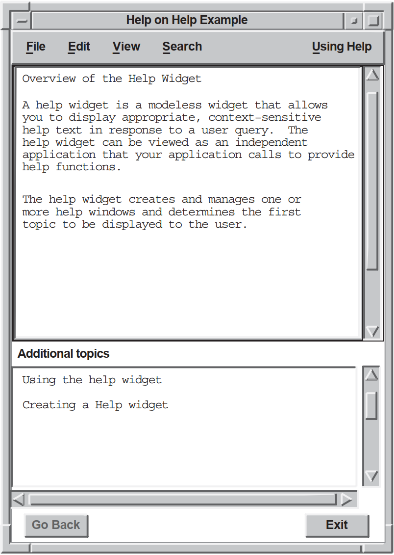 |
The help widget can be viewed as an independent application that your application calls to provide help functions. Using the help widget, you can create and manage one or more help windows and determine the first topic to be displayed to the user. The modeless behavior of the help widget permits an application to support one or more concurrent help widgets.
Your application is responsible for invoking a help pull-down menu widget with push-button widgets (or gadgets) for your chosen help topics. The labels for the push buttons should indicate the types of help available.
On Context—Provides context-sensitive information.
On Help—Provides information about how to use the application's help facility.
On Window—Provides overview information for the window.
On Keys—Provides information about the application's use of keys, mnemonics, and keyboard accelerators.
Index—Provides an index, with search capability, for all help information in the application. Note that the help widget provides its own search function.
Tutorial—Provides access to the application's tutorial, if one exists.
On Version—Provides information about the application, such as its formal name and version number.
You can also add application-specific help topics.
4.1.1. Invoking the Help Widget
The user clicks on a push button in the Help pull-down menu. Your application calls the help widget to create a help window. Your application can use either UIL or the Toolkit help routine to call the help widget.
The user clicks on the On Context push button in the Help pull-down menu and the application enters context-sensitive help mode. The user then moves the pointer to some object and clicks MB1. Your application calls routines to display context-sensitive help on the object or on its nearest ancestor with context-sensitive help available.
You can use a help callback routine to create a help widget (or change an existing help widget) to display appropriate help text. See Section 4.7.1, ''Context-Sensitive Help'' for more information.
The user moves the input location to an object and presses the Help key on the keyboard. The Help key displays context-sensitive help on the object that has input focus or on that object's nearest ancestor with context-sensitive help available. Note that users cannot use the Help key to generate context-sensitive help for widgets that do not accept input focus, such as XmLabel widgets.
The user types a help topic command string in a command window widget. Your application must include a command window widget to support this mechanism.
As an application developer, you must decide which Help invocation methods to support. Most DECwindows applications support invoking the help widget by clicking on a help option in the menu bar and through context-sensitive help.
4.1.2. Help Widget Terminology
|
Term |
Definition |
|---|---|
|
help widget |
The general name for all modules that compose the widget. |
|
help window |
The window that contains all of the help information. There is one help window for each help widget. Help display is synonymous with help window. |
|
help session |
All the help interactions (requests, answers, and so on) that occur while an application is running. A help session can be composed of several help widgets. |
4.2. OpenVMS Help Library Information
Neither UNIX systems nor Windows NT systems have a librarian utility. On these systems, the help widget reads the .HLP file directly. The information contained in this section applies only to OpenVMS systems.
This section describes how to use OpenVMS help libraries with the help widget. For general information about the OpenVMS Librarian Utility, see the VSI OpenVMS Librarian Utility Manual.
$ LIBRARY/HELP/CREATE DECBURGER.HLB DECBURGER.HLP
The help widget includes two resources that you use to specify the OpenVMS help library and its type. The DXmNlibrarySpec resource specifies an OpenVMS help library file specification. An OpenVMS help library has a default file type of HLB and defaults the file type of input files to HLP.
The DXmNlibraryType resource has a predefined value of DXmTextLibrary.
For applications running on OpenVMS, the help widget uses these resources to identify the location and type of the help topic database. Once you have invoked the help widget, you can navigate only within the selected OpenVMS help library.
The help widget includes an OpenVMS help library cache, specified by the
DXmNcacheHelpLibrary resource. The
DXmNcacheHelpLibrary resource is a Boolean attribute that specifies
whether the text of the OpenVMS help library is stored in the help widget's cache memory. If
true, the library is initialized when it is first opened and is cached in memory until the
application closes down.
If DXmNcacheHelpLibrary is false, the text is not stored in cache
memory. The default is false.
4.2.1. OpenVMS Help Library Modules
The files you insert into OpenVMS help libraries are text files you build using a program or a text editor. Each help input file can contain one or more modules; each module contains a group of related keys numbered key 1 to key 9. Each key represents a hierarchical level within the module.
The OpenVMS Librarian Utility stores a key-1 name as its module name. The key-2 through key-9 names identify subtopics related to the key-1 name. For the purpose of making the HLP file easier to maintain, it is good practice to associate top-level help topics with key-1 names. However, there is no requirement to do so.
4.2.1.1. Accessing OpenVMS Help Library Modules
Your OpenVMS application can access a module from the key-1 name or from any key in the module. For example, if you have help push-button widgets for On Window, On Version, and On Help top-level topics, you might maintain the OpenVMS help library as one file called APPLICATION.HLP and create an OpenVMS help library called APPLICATION.HLB. The APPLICATION.HLP file would contain a separate module, identified by a key-1 name, for each top-level topic. You can also maintain the OpenVMS help library modules in multiple HLP files.
When a user asks for help about the On Window topic, your OpenVMS application could
determine from the push-button widget activate callback that the user wanted overview
help. Your OpenVMS application could then create a help widget and, through the
DXmNfirstTopic resource, pass to the help widget the string that
identifies the correct help topic. This string would identify a key-1 name or another key
in the module.
The help widget uses the key-name hierarchy to find the help topic. For example, if you want to directly access the help topic identified by a key-3 name, you must also specify the key-1 and key-2 names that form a path to the key-3 name.
The help widget looks in the specified OpenVMS library for the module defined by the string and displays the text. If the string identifies a key-1 name, any key-2 subentries in the Overview module automatically appear as additional topics.
If the user then asks for help on a key-2 subentry, the help widget displays the key-2 text, and the key-3 subentries appear as additional topics, and so on.
4.2.1.2. Specifying OpenVMS Help Library Key Names
You can directly specify the key name for the help topic in DXmNfirstTopic. The disadvantage to this method is that the key names specified in DXmNfirstTopic must match the key names in the OpenVMS help library. This matching might be difficult to maintain if you have help support for a large number of widgets.
You can specify the key name as a resource name. Create a UIL module that maps the resource names to the key names for the help topics. If you change the key name of the help topic, you do not have to change application code.
4.2.2. OpenVMS Help Library Enhancements
=name operand(s)
Commands should be the first lines of text in a help topic.
The first character of a command line must be an equal sign (=).
The command name must immediately follow the equal sign.
Command names are not case sensitive and cannot be abbreviated.
At least one space must precede the command operand.
The remainder of the line is the command operand.
|
Command Name |
Description |
|---|---|
|
=TITLE |
Permits a case-sensitive title to be associated with the help topic. This title is displayed in situations where a topic is identified. For example, Overview of the Help Widget. If no title is provided, the OpenVMS help library topic key becomes the topic title. The help widget Search menu lets users search by keyword and title. |
|
=KEYWORD |
Permits one or more case-insensitive keywords to be associated with the help topic. If more than one keyword is specified, the individual keywords must be separated by a comma or at least one space. The help widget Search menu lets users search by keyword and title. |
|
=NOSEARCH |
Disables search operations for title and keywords on a specific topic. |
|
=INCLUDE |
Permits help topics to be shared across modules within a single OpenVMS help library. The operand of the INCLUDE command is a help topic key name. See Section 4.6, ''Specifying Help Widget Topics'' for more information about help topic key names. The title of the included topic is automatically added as an additional topic. |
| The name of the key-1 module is overview. You pass the string overview to the help widget. The help widget then searches the OpenVMS help library for a module with this name and displays the text. A module is terminated by either another key-1 name or by an end-of-file record. |
| The title that the help widget displays for the On Window topic is Overview of the Help Widget. |
| The name of the keyword topic to search for with the help widget Search function is overview. |
| The included topic key name from the programming module is programming creating create_help_widget. The title of the key identified by the =INCLUDE tag is displayed as an additional topic. |
| The name of the key-2 subentry in the Overview module is functions_1. The functions_1 subentry appears as an additional topic. |
4.3. Help Widget Components
The help widget is a pop-up dialog box that is preconfigured to contain the child widgets, called subwidgets, it needs to implement its functions. Figure 4.2, ''Help Widget Components'' shows a help widget with its component parts.
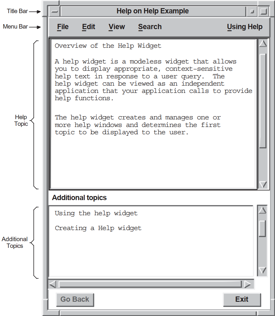 |
4.4. Modifying Help Widget Appearance
XmNbuttonFontList
XmNlabelFontList
XmNtextFontList
DXmNcols
DXmNrows
DXmNdefaultPosition
For example, the DXmNcols resource specifies the width, in characters, of the help text displayed by the help widget. The default is language dependent; the American English default is 55 characters.
object main_help : DXmHelpDialog
{
arguments
{
DXmNapplicationName = compound_string("Help Example");
DXmNglossaryTopic = compound_string("glossary");
DXmNoverviewTopic = compound_string("overview");
DXmNcols = 50;
};
};The help widget appearance resources are described in the DECwindows Extensions to Motif manual.
4.4.1. Modifying Help Widget Labels and Mnemonics
You can use the help widget label resources, described in the DECwindows Extensions to Motif manual, to modify the help widget labels.
For example, the DXmNapplicationName resource specifies the application name to be used in the help widget Help on... title bar. The default is null.
object main_help : DXmHelpDialog
{
arguments
{
DXmNapplicationName = compound_string("Help Example");
DXmNglossaryTopic = compound_string("glossary");
DXmNoverviewTopic = compound_string("overview");
};
};The mnemonics resources allow you to change the key a user presses to activate a help widget menu item. For example, the DXmNhelpLabelMnem resource specifies which key the user can press (instead of clicking MB1) to activate the Help pull-down menu. The default is the letter U.
object main_help : DXmHelpDialog
{
arguments
{
DXmNapplicationName = compound_string("Help Example");
DXmNglossaryTopic = compound_string("glossary");
DXmNoverviewTopic = compound_string("overview");
DXmNhelpLabelMnem = keysym("H");
};
};The help widget mnemonics resources are described in DECwindows Extensions to Motif.
The most common reason to modify the help widget label and mnemonics resources is for internationalization purposes.
4.4.2. Help Widget Messages
The help widget uses messages to provide status information to the user. You can use help widget resources to modify the text of these messages. The help widget message resources are described in DECwindows Extensions to Motif. Note that for OpenVMS applications, the !CS variable is replaced by the relevant compound string in the actual messages.
object main_help : DXmHelpDialog
{
arguments
{
DXmNapplicationName = compound_string("Help Example");
DXmNglossaryTopic = compound_string("glossary");
DXmNoverviewTopic = compound_string("overview");
DXmNlibrarySpec = compound_string("test_help.hlb");
DXmNbadlibMessage = compound_string("TEST_HELP.HLB is missing");
};
};4.5. Help Widget Callbacks
|
Callback |
Description |
|---|---|
|
DXmNunmapCallback |
The callback routine or routines called when the help widget is unmapped. For this callback routine, the reason is Unmap. The default is null. The help widget automatically unmanages itself when a user exits the help session, so the DXmNunmapCallback callback need not do this. You can use the DXmNunmapCallback callback to perform other functions when a user exits the help session. |
|
DXmNmapCallback |
The callback routine or routines called when the help widget is mapped. The default is null. |
4.6. Specifying Help Widget Topics
You can use the help widget resources described in Table 4.4, ''Help Widget Topic Resources'' to specify the topics of the help widget.
If you specify a help topic identified by a subkey name, you must also specify the key names that form the path to the subkey name. The key names must be separated by at least one space.
- 1 programming
- 2 creating
- 3 create_help_widget
|
Resource |
Description |
|---|---|
|
DXmNfirstTopic |
Specifies the first help topic to be displayed. If the DXmNfirstTopic resource is not specified (set to null), the help widget displays an empty window with a list of level 1 topics in the additional topic list box. See Section 4.7.1, ''Context-Sensitive Help'' for information about using DXmNfirstTopic to specify context-sensitive help. |
|
DXmNoverviewTopic |
Specifies the Overview topic to be displayed. The Overview topic is displayed when you select the Go To Overview menu item from the View menu. As described in Section 4.2, ''OpenVMS Help Library Information'', your application uses the DXmNoverviewTopic resource to pass to the help widget a string that identifies the key name of the Overview module. Overview is generally a key-1 name. |
|
DXmNglossaryTopic |
Specifies the Glossary topic to be displayed. Your application uses the DXmNglossaryTopic resource to pass to the help widget a string that identifies the key name of the Glossary module. Glossary is generally a key-1 name. If you pass a null string (the default), the Visit Glossary menu item does not appear in the View pull-down menu. Set DXmNglossaryTopic to null if your application does not support glossary help. |
4.7. Using the Help Widget
This section describes general programming considerations for using the help widget.
The most basic approach to using the help widget is to create it, manage it to cause the help window to appear, and destroy it using the unmap callback routine when the user is finished. However, any changes to the help window, such as resizing, are lost when the widget is destroyed.
If your application destroys a help widget and then re-creates it, your application assumes the help widget creation overhead. On OpenVMS systems, an OpenVMS help library is initialized when it is first opened by the help widget and is cached in memory until the application closes down. Once a help widget initializes an OpenVMS help library on behalf of your application, the library is not reinitialized unless your application is restarted.
DXmNfirstTopic resource (using the XtSetValues routine) and managing
the widget (using the XtManageChild routine) to cause the help window to appear. Note
Your application must avoid reusing a widget that is still active. Because the help widget is modeless, the user can return to the application while a help widget is active and invoke Help a second time. In this situation, the application is obliged to create a new help widget.
One way to determine if a help widget is active is to see if it is managed. A help widget automatically unmanages itself when a user exits the help session. Therefore, if a help widget is already managed, you should create a new instance of the help widget.
If you are creating an application for OpenVMS systems, use the OpenVMS Librarian Utility to create an OpenVMS help library. See Section 4.2, ''OpenVMS Help Library Information'' for more information.
Create a Help menu bar item for your application. To conform with the guidelines of the OSF/Motif Style Guide, use the
menu_help_widgetresource of the menu bar widget to position the Help menu item at the right end of the menu bar. If the menu bar widget wraps onto additional lines, the menu bar widget positions the Help menu item at the bottom right of the menu bar.Create a help pull-down menu widget with items such as On Context, On Window, On Version, and On Help.
An application that does not support a specific Help menu item should not include that item in its help pull-down menu widget.
Create the help buttons for the pull-down menu widget. Create one push button widget for each topic on the help pull-down menu widget. The push button widgets are associated with the routines to call when the buttons are pressed.
- Use any of the widget creation routines listed in Table 4.5, ''Help Widget Creation Routines'' to create an instance of the help widget.
Table 4.5. Help Widget Creation Routines UIL object type
Use the DXmHelpDialog object type identifier to create a help widget in a UIL module.
Toolkit routine
Use the DXmCreateHelpDialog routine to create a help widget.
Optionally, specify the callback routine to be called when the help widget is unmapped.
4.7.1. Context-Sensitive Help
In context-sensitive help, the application presents direct help on the current topic rather than starting at a higher level and working down through a help hierarchy. Users do not have to navigate through several layers of help to find the information they need.
All widgets that are a subclass of the XmPrimitive or XmManager widget class support a help callback with a reason of XmCR_HELP (other widgets can also support the help callback, but there is no requirement to do so). Your application uses this help callback to implement context-sensitive help by associating a help callback routine with the widgets for which you want to provide help.
Note
The OSF/Motif Style Guide recommends that, within dialog boxes, context-sensitive help should be provided for the dialog box as a whole. The first help frame should be an overview of the dialog box, with additional topics about each object in the dialog box.
To be consistent with the recommendations of the OSF/Motif Style Guide, you need to provide a help callback only for the dialog box itself and not for the objects within the dialog box. Because the DXmHelpOnContext routine checks a widget's nearest ancestors until it finds a widget with an associated help callback routine, a user should be able to get context-sensitive help on a dialog box by clicking anywhere within that dialog box.
An example of a help callback routine (sens_help_proc) is described in Example 4.5, ''Specifying a Help Callback—C Module''.
The remainder of this section describes how to implement context-sensitive help.
4.7.1.1. Creating the On Context Push Button in UIL
.
.
.
object help_menu_entry : XmCascadeButton {
arguments {
XmNlabelString = k_help_label_text;
XmNmnemonic = keysym("H");
};
controls {
XmPulldownMenu help_menu;
};
callbacks
{
XmNhelpCallback = procedure sens_help_proc(k_help_help);
};
};
object help_menu : XmPulldownMenu
{
controls
{
XmPushButton help_sensitive;
XmPushButton help_window;
XmPushButton help_version;
XmPushButton help_onhelp;
};
callbacks
{
XmNhelpCallback = procedure sens_help_proc(k_help_help);
};
};
object help_sensitive : XmPushButton
{
arguments
{
XmNlabelString = k_sensitive_label_text;
XmNmnemonic = keysym("C");
};
callbacks
{
XmNactivateCallback = procedure activate_proc (k_help_sensitive);
XmNhelpCallback = procedure sens_help_proc(k_sensitive_help);
};
};
.
.
.
| When the user clicks the On Context push button, the activate callback calls a routine to enter context-sensitive help mode. The On Context push button also has a context-sensitive help callback. |
4.7.1.2. Entering Context-Sensitive Help Mode
.
.
.
static void activate_proc(w, tag, reason)
Widget w;
int *tag;
XmAnyCallbackStruct *reason;
{
int widget_num = *tag; /* Convert tag to widget number. */
int i, value;
XmString topic;
switch (widget_num) {
.
.
.
case k_help_sensitive:
tracking_help();
break;
.
.
.
static void tracking_help()
{
DXmHelpOnContext(toplevel_widget, FALSE);
}
.
.
.
| When the activate_proc routine is called with a tag that identifies the On Context push button, a context-sensitive help routine (tracking_help) is called. |
| The DXmHelpOnContext changes the pointer cursor to the help cursor and grabs it. The application is in context-sensitive help mode. The user then moves the pointer cursor to the object for which context-sensitive help is required and clicks MB1. If the selected widget has a help callback, that help callback is invoked. If the selected widget does not have a help callback, the widget's ancestors are tested until a help callback is found or the top of the widget hierarchy is reached. The DXmHelpOnContext routine is called with the name of the application's top-level widget and a Boolean value that indicates whether you want the locating activity confined to that widget. If you confine the help pointer cursor to the application's top-level widget (a Boolean value of TRUE), the user will not be able to move the help pointer cursor outside the boundaries of the main window. This means that the user cannot get context-sensitive help on pop-up widgets that extend beyond the boundaries of the top-level widget. If you do not confine the help pointer cursor to the application's top-level widget (a Boolean value of FALSE), the user can potentially get context-sensitive help on any of the application's widgets. The previous example does not confine the help pointer cursor. |
4.7.2. Specifying a Help Callback
Your application uses the XmNhelpCallback resource to associate a
help callback routine with the widgets for which you want to provide help.
Your application can use the callback's tag argument to supply
application-specific data. For example, the widgets in the OpenVMS DECburger application
supply the help callback routine with a compound string value that specifies the help topic,
as shown in Example 4.4, ''Specifying a Help Callback—UIL Module''.
.
.
.
!Compound strings to use for context-sensitive help callbacks
value
k_order_help : compound_string ("order");
k_print_help : compound_string ("print");
k_options_help : compound_string ("options");
k_menu_bar_help : compound_string ("menu_bar");
k_file_help : compound_string ("file_menu");
k_edit_help : compound_string ("edit_menu");
k_order_menu_help : compound_string ("order_menu");
k_help_help : compound_string ("help");
k_sensitive_help : compound_string ("sensitive");
k_onhelp_help : compound_string ("onhelp");
k_about_help : compound_string ("about");
k_overview_help : compound_string ("overview");
k_nyi_help : compound_string ("not_implemented");
!String value to use for the Help System callback
value
helpsys_order_help : 'order';
.
.
.
object
s_menu_bar : XmMenuBar {
arguments {
XmNorientation = XmHORIZONTAL;
XmNmenuHelpWidget = XmCascadeButton help_menu_entry;
};
controls {
XmCascadeButton file_menu_entry;
XmCascadeButton edit_menu_entry;
XmCascadeButton order_menu_entry;
XmCascadeButton options_menu_entry;
XmCascadeButton help_menu_entry;
};
callbacks {
MrmNcreateCallback = procedure create_proc (k_menu_bar);
XmNhelpCallback = procedure sens_help_proc(k_menu_bar_help);
};
};
.
.
.
| The help callback routine uses this compound string to set the DXmNfirstTopic resource. |
.
.
.
static void sens_help_proc(w, tag, reason)
Widget w;
XmString *tag;
XmAnyCallbackStruct *reason;
{
create_help(tag);
}
.
.
.4.8. Creating the Help Widget with UIL
.
.
.
!module DECburger_demo
module decburger
version = 'v1.1.1'
names = case_sensitive
objects = {
XmSeparator = gadget ;
XmLabel = gadget ;
XmPushButton = gadget ;
XmToggleButton = gadget ;
}
procedure
toggle_proc (integer);
activate_proc (integer);
create_proc (integer);
scale_proc (integer);
list_proc (integer);
exit_proc (string);
show_hide_proc (integer);
pull_proc (integer);
sens_help_proc (compound_string);
help_system_proc (string);
ok_color_proc ();
apply_color_proc ();
cancel_color_proc ();
value
k_create_order : 1;
k_order_pdme : 2;
k_file_pdme : 3;
k_edit_pdme : 4;
k_nyi : 5;
k_ok : 6; ! NOTE: ok, apply, reset, cancel
k_apply : 7; ! must be sequential
k_reset : 8;
k_cancel : 9;
k_cancel_order : 10;
k_submit_order : 11;
k_order_box : 12;
k_burger_min : 13;
k_burger_rare : 13;
k_burger_medium : 14;
k_burger_well : 15;
k_burger_ketchup : 16;
k_burger_mustard : 17;
k_burger_onion : 18;
k_burger_mayo : 19;
k_burger_pickle : 20;
k_burger_max : 20;
k_burger_quantity : 21;
k_fries_tiny : 22;
k_fries_small : 23;
k_fries_medium : 24;
k_fries_large : 25;
k_fries_huge : 26;
k_fries_quantity : 27;
k_drink_list : 28;
k_drink_add : 29;
k_drink_sub : 30;
k_drink_quantity : 31;
k_total_order : 32;
k_burger_label : 33;
k_fries_label : 34;
k_drink_label : 35;
k_menu_bar : 36;
k_file_menu : 37;
k_edit_menu : 38;
k_order_menu : 39;
k_help_pdme : 40;
k_help_menu : 41;
k_help_overview : 42;
k_help_about : 43;
k_help_onhelp : 44;
k_help_sensitive : 45;
k_print : 46;
k_options_pdme : 47;
k_options_menu : 48;
k_create_options : 49;
k_fries_optionmenu : 50;
value
k_decburger_title : 'DECburger: Order Entry Box';
k_nyi_label_text : 'This feature is not yet implemented.';
k_file_label_text : 'File';
k_print_label_text : 'Print Order..';
k_exit_label_text : 'Exit';
k_edit_label_text : 'Edit';
k_cut_dot_label_text : 'Cut';
k_copy_dot_label_text : 'Copy';
k_paste_dot_label_text : 'Paste';
k_clear_dot_label_text : 'Clear';
k_select_all_label_text : 'Select All';
k_order_label_text : 'Order';
k_cancel_order_label_text : 'Cancel Order';
k_submit_order_label_text : 'Submit Order';
k_options_label_text : 'Options';
k_options_color_label_text : 'Background Color...';
k_help_label_text : 'Help';
k_sensitive_label_text : 'On Context';
k_overview_label_text : 'On Window';
k_about_label_text : 'On Version';
k_onhelp_label_text : 'On Help';
k_hamburgers_label_text : 'Hamburgers';
k_rare_label_text : 'Rare';
k_medium_label_text : 'Medium';
k_well_done_label_text : 'Well Done';
k_ketchup_label_text : 'Ketchup';
k_mustard_label_text : 'Mustard';
k_onion_label_text : 'Onion';
k_mayonnaise_label_text : 'Mayonnaise';
k_pickle_label_text : 'Pickle';
k_quantity_label_text : 'Quantity';
k_fries_label_text : 'Fries';
k_size_label_text : 'Size';
k_tiny_label_text : 'Tiny';
k_small_label_text : 'Small';
k_large_label_text : 'Large';
k_huge_label_text : 'Huge';
k_drinks_label_text : 'Drinks';
k_0_label_text : ' 0';
k_drink_list_text :
string_table ( 'Apple Juice',
'Orange Juice',
'Grape Juice',
'Cola',
'Punch',
'Root beer',
'Water',
'Ginger Ale',
'Milk',
'Coffee',
'Tea');
k_drink_list_select : string_table('Apple Juice');
k_ok_label_text : 'OK';
k_apply_label_text : 'Apply';
k_reset_label_text : 'Reset';
k_cancel_label_text : 'Cancel';
!Compound strings to use for context-sensitive help callbacks
value
k_order_help : compound_string ("order");
k_print_help : compound_string ("print");
k_options_help : compound_string ("options");
k_menu_bar_help : compound_string ("menu_bar");
k_file_help : compound_string ("file_menu");
k_edit_help : compound_string ("edit_menu");
k_order_menu_help : compound_string ("order_menu");
k_help_help : compound_string ("help");
k_sensitive_help : compound_string ("sensitive");
k_onhelp_help : compound_string ("onhelp");
k_about_help : compound_string ("about");
k_overview_help : compound_string ("overview");
k_nyi_help : compound_string ("not_implemented");
.
.
.
object
main_help : DXmHelpDialog {
arguments
{
DXmNapplicationName = compound_string("Help Example");
DXmNglossaryTopic = compound_string("glossary");
DXmNoverviewTopic = compound_string("overview");
DXmNlibrarySpec = compound_string("decburger.hlb");
};
};
.
.
.
object
s_menu_bar : XmMenuBar {
arguments {
XmNorientation = XmHORIZONTAL;
XmNmenuHelpWidget = XmCascadeButton help_menu_entry;
};
controls {
XmCascadeButton file_menu_entry;
XmCascadeButton edit_menu_entry;
XmCascadeButton order_menu_entry;
XmCascadeButton options_menu_entry;
XmCascadeButton help_menu_entry;
};
callbacks {
MrmNcreateCallback = procedure create_proc (k_menu_bar);
XmNhelpCallback = procedure sens_help_proc(k_menu_bar_help);
};
};
.
.
.
object help_menu_entry : XmCascadeButton {
arguments {
XmNlabelString = k_help_label_text;
XmNmnemonic = keysym("H");
};
controls {
XmPulldownMenu help_menu;
};
callbacks
{
XmNhelpCallback = procedure sens_help_proc(k_help_help);
};
};
object help_menu : XmPulldownMenu
{
controls
{
XmPushButton help_sensitive;
XmPushButton help_window;
XmPushButton help_version;
XmPushButton help_onhelp;
};
callbacks
{
XmNhelpCallback = procedure sens_help_proc(k_help_help);
};
};
object help_sensitive : XmPushButton
{
arguments
{
XmNlabelString = k_sensitive_label_text;
XmNmnemonic = keysym("C");
};
callbacks
{
XmNactivateCallback = procedure activate_proc (k_help_sensitive);
XmNhelpCallback = procedure sens_help_proc(k_sensitive_help);
};
};
object help_onhelp : XmPushButton
{
arguments
{
XmNlabelString = k_onhelp_label_text;
XmNmnemonic = keysym("H");
};
callbacks
{
XmNactivateCallback = procedure activate_proc (k_help_onhelp);
XmNhelpCallback = procedure sens_help_proc(k_onhelp_help);
};
};
object help_version : XmPushButton
{
arguments
{
XmNlabelString = k_about_label_text;
XmNmnemonic = keysym("V");
};
callbacks
{
XmNactivateCallback = procedure activate_proc (k_help_about);
XmNhelpCallback = procedure sens_help_proc(k_about_help);
};
};
object help_window : XmPushButton
{
arguments
{
XmNlabelString = k_overview_label_text;
XmNmnemonic = keysym("W");
};
callbacks
{
XmNactivateCallback = procedure activate_proc (k_help_overview);
XmNhelpCallback = procedure sens_help_proc(k_overview_help);
};
};
.
.
.
| The OpenVMS DECburger widgets call the sens_help_proc procedure to implement
context-sensitive help. DECburger assigns a compound string value to use in the
callback's |
| Compound string value declarations for the help push-button labels. Using values for widget labels makes it easier to modify the interface. Putting all of the label definitions at the beginning of the module makes it easier to find a label if you want to change it later. |
| Compound string value declarations for the help callbacks. Putting all of the definitions at the beginning of the module makes it easier to find a string if you want to change it later. |
| Create an instance of the help widget. This example assigns values to the
|
| The menu bar includes the XmNmenuHelpWidget resource, which places the Help menu entry at the far right of the menu bar. If the menu bar widget wraps onto additional lines, the menu bar widget positions the Help menu entry at the bottom right of the menu bar. |
| The menu bar controls a cascade button for the Help menu entry. |
| The sens_help_proc procedure implements context-sensitive help for the menu bar. You use this callback to display context-sensitive help on a given topic. |
| The Help menu entry is a cascade button that controls a Help pull-down menu. |
| The Help pull-down menu includes push-button gadgets for context-sensitive help, overview, version, and on-help menu entries. |
| When activated, the help push-button gadgets call the activate_proc callback routine
with an identifying integer value. The activate_proc callback uses this integer value,
which is the |
4.9. Help Widget Implementation—C Language Module
.
.
.
#include <stdio.h> /* For printf and so on. */
#include <Xm/Text.h>
#include <Mrm/MrmAppl.h>
#include <DXm/DXmHelpB.h>
#include <DXm/DXmPrint.h>
#include <X11/Xlib.h>
#include <X11/Xutil.h>
#include <DXm/DXmColor.h>
#include <DXm/DECspecific.h>
#ifdef VMS
/* For OpenVMS systems, use the following include file: */
#include <sys$library/DECw$Cursor.h>
#else
/* For UNIX systems, use the following include file: */
#include <X11/decwcursor.h>
#endif
/*
* These numbers are matched with corresponding numbers in the
* OpenVMS DECburger UIL module.
*/
#define k_create_order 1
#define k_order_pdme 2
#define k_file_pdme 3
#define k_edit_pdme 4
#define k_nyi 5
#define k_ok 6 /* NOTE: ok, apply, reset, cancel */
#define k_apply 7 /* must be sequential */
#define k_reset 8
#define k_cancel 9
#define k_cancel_order 10
#define k_submit_order 11
#define k_order_box 12
#define k_burger_min 13
#define k_burger_rare 13
#define k_burger_medium 14
#define k_burger_well 15
#define k_burger_ketchup 16
#define k_burger_mustard 17
#define k_burger_onion 18
#define k_burger_mayo 19
#define k_burger_pickle 20
#define k_burger_max 20
#define k_burger_quantity 21
#define k_fries_tiny 22
#define k_fries_small 23
#define k_fries_medium 24
#define k_fries_large 25
#define k_fries_huge 26
#define k_fries_quantity 27
#define k_drink_list 28
#define k_drink_add 29
#define k_drink_sub 30
#define k_drink_quantity 31
#define k_total_order 32
#define k_burger_label 33
#define k_fries_label 34
#define k_drink_label 35
#define k_menu_bar 36
#define k_file_menu 37
#define k_edit_menu 38
#define k_order_menu 39
#define k_help_pdme 40
#define k_help_menu 41
#define k_help_overview 42
#define k_help_about 43
#define k_help_onhelp 44
#define k_help_sensitive 45
#define k_print 46
#define k_custom_pdme 47
#define k_custom_menu 48
#define k_create_custom 49
#define k_fries_optionmenu 50
#define k_max_widget 50
#define MAX_WIDGETS (k_max_widget + 1)
#define NUM_BOOLEAN (k_burger_max - k_burger_min + 1)
#define k_burger_index 0
#define k_fries_index 1
#define k_drinks_index 2
#define k_index_count 3
/*
* Global data
*/
static Cursor watch = NULL;
static Widget
toplevel_widget = (Widget)NULL, /* Root widget ID of our application. */
main_window_widget = (Widget)NULL, /* Root widget ID of main MRM fetch */
widget_array[MAX_WIDGETS], /* Place to keep all other widget IDs */
main_help_widget = (Widget)NULL, /* Primary help widget */
help_widget[MAX_WIDGETS], /* Array of help widgets */
help_array[MAX_WIDGETS], /* Array of help widgets for Toolkit */
print_widget = (Widget)NULL, /* Print widget */
color_widget = (Widget)NULL; /* Color Mix widget */
static Screen *the_screen; /* Pointer to screen data*/
static Display *the_display; /* Pointer to display data */
static XColor savecolor;
static int help_num = 0; /* make sure they start zero */
static int low_num = 0;
.
.
.
/*
* Forward declarations
*/
static void s_error();
static void get_something();
static void set_something();
static void activate_proc();
static void create_proc();
static void list_proc();
static void exit_proc();
static void pull_proc();
static void scale_proc();
static void show_hide_proc();
static void show_label_proc();
static void toggle_proc();
static void create_help();
static void tracking_help();
static void sens_help_proc();
static void help_system_proc();
static void create_print();
static void activate_print();
static void create_color();
static void ok_color_proc();
static void apply_color_proc();
static void cancel_color_proc();
static void xmstring_append();
static void start_watch();
static void stop_watch();
/* The names and addresses of things that Mrm has to bind. The names do
* not have to be in alphabetical order. */
static MrmRegisterArg reglist[] = {
{"activate_proc", (caddr_t) activate_proc},
{"create_proc", (caddr_t) create_proc},
{"list_proc", (caddr_t) list_proc},
{"pull_proc", (caddr_t) pull_proc},
{"exit_proc", (caddr_t) exit_proc},
{"scale_proc", (caddr_t) scale_proc},
{"show_hide_proc", (caddr_t) show_hide_proc},
{"show_label_proc", (caddr_t) show_label_proc},
{"toggle_proc", (caddr_t) toggle_proc},
{"sens_help_proc", (caddr_t) sens_help_proc},
{"help_system_proc", (caddr_t) help_system_proc},
{"cancel_color_proc", (caddr_t) cancel_color_proc},
{"apply_color_proc", (caddr_t) apply_color_proc},
{"ok_color_proc", (caddr_t) ok_color_proc}
};
static int reglist_num = (sizeof reglist / sizeof reglist [0]);
static font_unit = 400;
/*
* OS transfer point. The main routine does all the one-time setup and
* then calls XtMainLoop.
*/
static String fallback =
"DECburger.title: DECburger\nDECburger.x: 100\nDECburger.y: 100";
unsigned int main(argc, argv)
unsigned int argc; /* Command line argument count. */
char *argv[]; /* Pointers to command line args. */
{
XtAppContext app_context;
MrmInitialize(); /* Initialize MRM before initializing
/* the X Toolkit. */
DXmInitialize(); /* Initialize DXm widgets */
/* If we had user-defined widgets, we would register them with Mrm here. */
/* Initialize the X Toolkit. We get back a top level shell widget. */
toplevel_widget = XtAppInitialize(
&app_context, /* App. context is returned */
"DECburger", /* Root class name. */
NULL, /* No option list. */
0, /* Number of options. */
&argc, /* Address of argc */
argv, /* argv */
&fallback, /* Fallback resources */
NULL, /* No override resources */
0); /* No override resources */
/* Open the UID files (the output of the UIL compiler) in the hierarchy*/
if (MrmOpenHierarchy(
db_filename_num, /* Number of files. */
db_filename_vec, /* Array of file names. */
NULL, /* Default OS extension. */
&s_MrmHierarchy) /* Pointer to returned MRM ID */
!=MrmSUCCESS)
s_error("can't open hierarchy");
init_application();
/* Register the items MRM needs to bind for us. */
MrmRegisterNames(reglist, reglist_num);
/* Go get the main part of the application. */
if (MrmFetchWidget(s_MrmHierarchy, "S_MAIN_WINDOW", toplevel_widget,
&main_window_widget, &dummy_class) != MrmSUCCESS)
s_error("can't fetch main window");
/* Save some frequently used values */
the_screen = XtScreen(toplevel_widget);
the_display = XtDisplay(toplevel_widget);
/* If it's a color display, map customize color menu entry */
if ((XDefaultVisualOfScreen(the_screen))->class == TrueColor
|| (XDefaultVisualOfScreen(the_screen))->class == PseudoColor
|| (XDefaultVisualOfScreen(the_screen))->class == DirectColor
|| (XDefaultVisualOfScreen(the_screen))->class == StaticColor)
XtSetMappedWhenManaged(widget_array[k_custom_pdme], TRUE);
/* Manage the main part and realize everything. The interface comes up
* on the display now. */
XtManageChild(main_window_widget);
XtRealizeWidget(toplevel_widget);
.
.
.
/* Sit around forever waiting to process X-events. We never leave
* XtAppMainLoop. From here on, we only execute our callback routines. */
XtAppMainLoop(app_context);
}
/*
* One-time initialization of application data structures.
*/
static int init_application()
{
int k;
int i;
/* Initialize the application data structures. */
for (k = 0; k < MAX_WIDGETS; k++)
widget_array[k] = NULL;
for (k = 0; k < NUM_BOOLEAN; k++)
toggle_array[k] = FALSE;
/* Initialize CS help widgets. */
for (i = 0; i < MAX_WIDGETS; i++)
help_widget[i] = NULL;
.
.
.
| To define the help widget resources, include the DXmHelpB.h file on UNIX systems and the DXMHELPB.H file on OpenVMS systems. |
| Assign an integer value to the help-related widgets so the callback routines can identify which widget called them. The integer values must match those assigned in the decburger.uil file on UNIX systems or the DECBURGER.UIL file on OpenVMS systems. |
| The |
| Declare an array of MAX_NUMBER widgets used to store the help widget IDs. |
| Forward declarations of the help routines. |
| Because the sens_help_proc callback is called through UIL, it is registered in an argument list. The OpenVMS DECburger application stores the names and addresses of the callback routines for later use by the Mrm routine MrmRegisterNames. |
| Initialize the widgets in the VSI extended toolkit. |
| Initialize the array of help widgets to NULL to prevent them from containing invalid data. |
.
.
.
/*
* All push buttons in this application call back to this routine. We
* use the tag to tell us what widget it is, then react accordingly.
*/
static void activate_proc(w, tag, reason)
Widget w;
int *tag;
XmAnyCallbackStruct *reason;
{
int widget_num = *tag; /* Convert tag to widget number. */
int i, value;
XmString topic;
switch (widget_num) {
case k_nyi:
/* The user activated a 'not yet implemented' push button. Send
* the user a message. */
if (widget_array[k_nyi] == NULL) {
/* The first time, fetch from the data base. */
if (MrmFetchWidget(s_MrmHierarchy, "nyi", toplevel_widget,
&widget_array[k_nyi], &dummy_class) != MrmSUCCESS) {
s_error("can't fetch nyi widget");
}
}
/* Put up the message box saying 'not yet implemented'. */
XtManageChild(widget_array[k_nyi]);
break;
case k_submit_order:
/* This would send the order off to the kitchen. In this case,
* we just pretend the order was submitted. */
clear_order();
break;
.
.
.
case k_help_overview:
topic = XmStringCreateLtoR("overview",XmSTRING_ISO8859_1);
create_help(topic);
XmStringFree(topic);
break;
case k_help_about:
topic = XmStringCreateLtoR("about",XmSTRING_ISO8859_1);
create_help(topic);
XmStringFree(topic);
break;
case k_help_onhelp:
topic = XmStringCreateLtoR("onhelp",XmSTRING_ISO8859_1);
create_help(topic);
XmStringFree(topic);
break;
case k_help_sensitive:
tracking_help();
break;
case k_print:
create_print();
break;
case k_create_custom:
create_color();
break;
default:
break;
}
}
.
.
.
/*
* Context sensitive help callback.
*/
static void sens_help_proc(w, tag, reason)
Widget w;
XmString *tag;
XmAnyCallbackStruct *reason;
{
create_help(tag);
}
/* Creates an instance of the help widget for the push buttons in the help
pull-down menu and for context-sensitive help callbacks. */
static void create_help (help_topic)
XmString help_topic;
{
Arg arglist[1];
start_watch();
if (!main_help_widget) {
if (MrmFetchWidget (s_MrmHierarchy, "main_help", toplevel_widget,
&main_help_widget, &dummy_class) != MrmSUCCESS)
s_error ("can't fetch help widget");
}
if (XtIsManaged(main_help_widget)) {
if (MrmFetchWidget (s_MrmHierarchy, "main_help", toplevel_widget,
&help_widget[help_num], &dummy_class) != MrmSUCCESS)
s_error ("can't fetch help widget");
XtSetArg (arglist[0], DXmNfirstTopic, help_topic);
XtSetValues (help_widget[help_num], arglist, 1);
XtManageChild(help_widget[help_num]);
help_num++;
return;
}
XtSetArg (arglist[0], DXmNfirstTopic, help_topic);
XtSetValues (main_help_widget, arglist, 1);
XtManageChild(main_help_widget);
stop_watch();
}
.
.
.
| The On Window push button in the Help pull-down menu. The |
| The sens_help_proc callback is called as a result of a help callback, as described in Section 4.7.1, ''Context-Sensitive Help''. The sens_help_proc calls the generic create_help routine. |
| The create_help routine creates an instance of the help widget for the push buttons in the Help pull-down menu and for context-sensitive help callbacks. If the help widget does not already exist, create_help fetches it. If the help widget exists and is already managed, create_help is obliged to fetch a
new instance of the help widget. The If the help widget now exists but is not already managed, set the DXmNfirstTopic resource using the specified compound string and manage the help widget. |
4.10. Using the Toolkit Help Widget Creation Routine
As described in Section 4.7, ''Using the Help Widget'', you can implement the help widget through UIL or through the Toolkit help widget creation routine.
.
.
.
static Widget
help_array[MAX_WIDGETS], /* Array of help widgets for Toolkit*/
.
.
.
static int low_num = 0; /* make sure it starts zero */
.
.
.
/* Initialize help widgets for Toolkit creation. */
for (i = 0; i < MAX_WIDGETS; i++)
help_array[i] = NULL;
.
.
.
/*
* Context sensitive help callback.
*/
*/
static void sens_help_proc(w, tag, reason)
Widget w;
XmString *tag;
XmAnyCallbackStruct *reason;
{
create_help(tag);
}
.
.
.
/* Toolkit help creation routine */
static void create_help (topic)
            XmString   topic;
{
     unsigned int    ac;
      Arg         arglist[10];
       XmString        appname, glossarytopic, overviewtopic, libspec;
       static Widget   help_widget = NULL;

        if (!help_widget) {
        ac = 0;
        appname = XmStringCreateLtoR("Toolkit Help", XmSTRING_ISO8859_1);
        glossarytopic = XmStringCreateLtoR("glossary", XmSTRING_ISO8859_1);
        overviewtopic = XmStringCreateLtoR("overview", XmSTRING_ISO8859_1);
        libspec = XmStringCreateLtoR("decburger.hlb", XmSTRING_ISO8859_1);

       XtSetArg(arglist[ac], DXmNapplicationName, appname); ac++;
        XtSetArg(arglist[ac], DXmNglossaryTopic, glossarytopic); ac++;
        XtSetArg(arglist[ac], DXmNoverviewTopic, overviewtopic); ac++;
        XtSetArg(arglist[ac], DXmNlibrarySpec, libspec); ac++;
        XtSetArg(arglist[ac], DXmNfirstTopic, topic); ac++;

       help_widget = DXmCreateHelpDialog (toplevel_widget,
                                           "Toolkit Help",
                                            arglist, ac);
        XmStringFree(appname);
        XmStringFree(glossarytopic);
        XmStringFree(overviewtopic);
        XmStringFree(libspec);
XtManageChild(help_widget);
return;
}
if (XtIsManaged(help_widget)) {
ac = 0;
appname = XmStringCreateLtoR("Toolkit Help", XmSTRING_ISO8859_1);
glossarytopic = XmStringCreateLtoR("glossary", XmSTRING_ISO8859_1);
overviewtopic = XmStringCreateLtoR("overview", XmSTRING_ISO8859_1);
libspec = XmStringCreateLtoR("decburger.hlb", XmSTRING_ISO8859_1);
XtSetArg(arglist[ac], DXmNapplicationName, appname); ac++;
XtSetArg(arglist[ac], DXmNglossaryTopic, glossarytopic); ac++;
XtSetArg(arglist[ac], DXmNoverviewTopic, overviewtopic); ac++;
XtSetArg(arglist[ac], DXmNlibrarySpec, libspec); ac++;
XtSetArg(arglist[ac], DXmNfirstTopic, topic); ac++;
help_array[low_num] = DXmCreateHelpDialog (toplevel_widget,
"Toolkit Help",
arglist, ac);
XmStringFree(appname);
XmStringFree(glossarytopic);
XmStringFree(overviewtopic);
XmStringFree(libspec);
XtManageChild(help_array[low_num]);
low_num++;
return;
}
ac = 0;
XtSetArg (arglist[ac], DXmNfirstTopic, topic); ac++;
XtSetValues (help_widget, arglist, ac);
XtManageChild(help_widget);
}
.
.
.
| The help-callback routine (sens_help_proc) calls the create_help routine to create the help widget. |
| The create_help routine tests to see if the help widget already exists. If it does
not already exist, create_help sets the |
| If the help widget already exists and is managed, the create_help routine is obliged to create another instance of the help widget. The help_array array is an array of help widgets equal to the maximum number of widgets in the OpenVMS DECburger application. |
| If the help widget now exists but is not managed, set the
|
Chapter 5. Using the DECwindows Motif Help System
In addition to the help widget described in Chapter 4, "Using the Help Widget", DECwindows Motif applications can use the DECwindows Motif Help System (help system) to display general and context-sensitive information in response to a user request. The help system uses Bookreader and LinkWorks to display and navigate through decw_book (UNIX systems) or DECW$BOOK (OpenVMS systems) format help text and graphics. You can use DECwrite to create the files for Bookreader to display. On OpenVMS for VAX systems, you can also use VAX DOCUMENT to create hyperhelp files. Note that Bookreader is not available on Windows NT systems, so the information in this chapter is not relevant for applications running only on that operating system.
An overview of the help system
Invoking the help system
Help file information
Context-sensitive help callbacks
Implementing the help system
Note
For the purpose of example, the OpenVMS DECburger sample application uses both the help system and the help widget to implement help. To present a consistent user interface, your application should implement only one help model.
5.1. Overview of the Help System
The help system uses the DECwindows Bookreader as its display window. The help system routines allow your application to invoke Bookreader and specify the book, as well as the specific topic or directory within that book, to display first. In addition, once Bookreader is invoked through the help system, it remains available until the user explicitly closes it or ends the DECwindows session.
Proportional fonts
Graphics
Formatted tables
Hotspots
The ability to create links between the online help and other pieces of information, such as mail messages and other Bookreader topics, via LinkWorks
Figure 5.1, ''Comparison of Help Widget and the Help System Windows'' shows a comparison of the help widget and the help system.
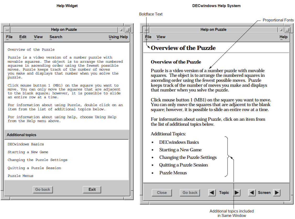 |
Use one of the methods described in Section 5.3, ''Help File Information'' to create a help file.
Create a Help pull-down menu with push-button widgets (or gadgets) for your chosen help topics.
The help menu required to implement the help system is identical to the help menu required for the help widget. If you have already implemented a help menu for the help widget, you can use this menu with only minor modifications to the help callbacks.
The labels for the push buttons should indicate the types of help available. The OSF/Motif Style Guide suggests that applications include the following topics in the help pull-down menu widget, when appropriate to the application:On Context—Provides context-sensitive information.
On Window—Provides overview information for the window.
Index—Provides an index, with search capability, for all help information in the application.
On Keys—Provides information about the application's use of keys, mnemonics, and keyboard accelerators.
Tutorial—Provides access to the application's tutorial, if one exists.
On Help—Provides information about how to use the application's help facility.
On Version—Provides information about the application, such as its formal name and version number.
You can also add application-specific help topics.
Add XmNhelpCallbacks help callbacks for each widget for which you want to provide context-sensitive help, as described in Section 5.5.3, ''Specifying a Help Callback''.
- Implement the three help-system routines in your application:
DXmHelpSystemOpen does all of the initialization work required by LinkWorks and prepares to display a topic from the help file name passed to it. This routine needs to be called just before the main loop of the application.
DXmHelpSystemDisplay displays the topic or directory of the help file in Bookreader, depending on the arguments passed to it. It is also used to open topics and/or directories of books other than the one passed to DXmHelpSystemOpen.
DXmHelpSystemDisplay is called as the result of the activate callback of the push buttons in the help menu or as the result of a widget's context-sensitive help callback.
DXmHelpSystemClose is used to close all of the remaining topic and navigation windows in Bookreader. This routine should be called when the application is closing down all of its other windows.
5.2. Invoking the Help System
The user clicks on a push button in the Help pull-down menu. The push button's activate callback routine calls a routine to invoke the help system.
The user clicks on the On Context push button in the Help pull-down menu. The push button's activate callback routine invokes the DXmOnContext routine to enter context-sensitive help mode. The user then moves the pointer to some object and clicks MB1. The selected object's help callback is then invoked to display context-sensitive help on the object or on its nearest ancestor with context-sensitive help available. This is called context-sensitive help.
The user moves the input location to an object and presses the Help key on the keyboard. The selected object's help callback is then invoked to display context-sensitive help on the object or on its nearest ancestor with context-sensitive help available.
Note that users cannot use the Help key to generate context-sensitive help for widgets that do not accept input focus, such as XmLabel widgets.
The user types a help topic command string in a command window widget. Your application must include a command window widget to support this mechanism.
As an application developer, you must decide which help invocation methods to support. Most DECwindows applications support invoking help by clicking on a help option in the menu bar and through context-sensitive help.
5.3. Help File Information
You can use VAX DOCUMENT on OpenVMS for VAX systems or DECwrite to create Bookreader files for the help system. The remainder of this section uses a help file created using VAX DOCUMENT for the purpose of example.
5.4. Help File Information—VAX DOCUMENT Example
Help-system help files created with VAX DOCUMENT are standard SDML files processed with the SOFTWARE.ONLINE document type for Bookreader output.
You can use any standard section tag (<HEADn>) as a help topic. The
symbol name associated with the tag HEADn\symbolic_name must match the topic
identifier specified in the UIL file.
<HOTSPOT> tags in the SDML file. Also note that for the
help system you need to specify only the topic identifier in the symbolic name. The help
widget uses the key name hierarchy to find the help topic and requires the key names that
form a path to the topic.Note
The DECBURGER_HELP.SDML file is presented only as an example; refer to the DECwindows Companion to the OSF/Motif Style Guide for the recommended content and style of a help file.
| Because it is processed as a Bookreader book, the file must include front
matter tags. The file must also be processed with the |
| Subordinate |
When you invoke the help system, you pass a help file specification to the DXmHelpSystemOpen routine. The default location is SYS$HELP and the default file extension is DECW$BOOK, but you can provide your own location or extension along with the help file name. The help system uses this specification to locate and read the help file.
#define decburger_help "decw$examples:decburger_help.decw$book"
DXmHelpSystemOpen(&help_context, toplevel_widget, decburger_help,
help_error, "Help System Error");5.5. Context-Sensitive Help Callbacks
In context-sensitive help, the application presents direct help on the current topic rather than starting at a higher level and working down through a help hierarchy. Users do not have to navigate through several layers of help to find the information they need.
All widgets that are a subclass of the XmPrimitive or XmManager widget class support a help callback with a reason of XmCR_HELP. Other widgets can also support the help callback, but there is no requirement to do so. Your application uses this help callback to implement context-sensitive help by associating a help callback routine with the widgets for which you want to provide help.
Note
The OSF/Motif Style Guide recommends that, within dialog boxes, context-sensitive help should be provided for the dialog box as a whole. The first help frame should be an overview of the dialog box, with additional topics about each object in the dialog box.
To be consistent with the recommendations of the OSF/Motif Style Guide, you need to provide a help callback only for the dialog box itself, not for the objects within the dialog box. Because the DXmHelpOnContext routine checks a widget's nearest ancestors until it finds a widget with an associated help callback routine, a user should be able to get context-sensitive help on a dialog box by clicking anywhere within that dialog box.
Example 5.4, ''Specifying a Help Callback—UIL Module'' shows a sample help callback routine.
The remainder of this section describes how to implement context-sensitive help.
5.5.1. Creating the On Context Push Button in UIL
.
.
.
object help_menu_entry : XmCascadeButton {
arguments {
XmNlabelString = k_help_label_text;
XmNmnemonic = keysym("H");
};
controls {
XmPulldownMenu help_menu;
};
callbacks
{
XmNhelpCallback = procedure help_system_proc(k_help_help);
};
};
object help_menu : XmPulldownMenu
{
controls
{
XmPushButton help_sensitive;
XmPushButton help_window;
XmPushButton help_version;
XmPushButton help_onhelp;
};
callbacks
{
XmNhelpCallback = procedure help_system_proc(k_help_help);
};
};
object help_sensitive : XmPushButton
{
arguments
{
XmNlabelString = k_sensitive_label_text;
XmNmnemonic = keysym("C");
};
callbacks
{
XmNactivateCallback = procedure activate_proc (k_help_sensitive);
XmNhelpCallback = procedure help_system_proc(k_sensitive_help);
};
};
.
.
.
| When the user clicks on the On Context push button, the activate callback calls a routine to enter context-sensitive help mode. The On Context push button also has a context-sensitive help callback. |
5.5.2. Entering Context-Sensitive Help Mode
.
.
.
static void activate_proc(w, tag, reason)
Widget w;
int *tag;
XmAnyCallbackStruct *reason;
{
int widget_num = *tag; /* Convert tag to widget number. */
int i, value;
XmString topic;
switch (widget_num) {
.
.
.
case k_help_sensitive:
tracking_help();
break;
.
.
.
static void tracking_help()
{
DXmHelpOnContext(toplevel_widget, FALSE);
}
.
.
.
| When the activate_proc routine is called with a tag that identifies the On Context push button, a context-sensitive help routine (tracking_help) is called. |
| DXmHelpOnContext changes the pointer cursor to the help cursor and grabs it. The application is in context-sensitive help mode. The user then moves the pointer cursor to the object for which context-sensitive help is required and clicks MB1. If the selected widget has a help callback, that help callback is invoked. If the selected widget does not have a help callback, the widget's ancestors are tested until a help callback is found or the top of the widget hierarchy is reached. The DXmHelpOnContext routine is called with the name of the application's top-level widget and a Boolean value that indicates whether you want the locating activity confined to that widget. If you confine the help pointer cursor to the application's top-level widget (a Boolean value of TRUE), the user will not be able to move the help pointer cursor outside the boundaries of the main window. This means that the user could not get context-sensitive help on pop-up widgets that extend beyond the boundaries of the top-level widget. If you do not confine the help pointer cursor to the application's top-level widget (a Boolean value of FALSE), the user can potentially get context-sensitive help on any of the application's widgets. The example does not confine the help pointer cursor. |
5.5.3. Specifying a Help Callback
Your application uses the XmNhelpCallback resource to
associate a context-sensitive help callback routine with the widgets for which you want
to provide help.
Your application can use the callback's tag argument to supply
help-topic-specific data. The help system DXmHelpSystemDisplay routine uses a string
value to specify the help topic to display. Therefore, your application must supply the
help callback routine with a string value that specifies the help topic, as shown in
Example 5.4, ''Specifying a Help Callback—UIL Module''.
.
.
.
!String value to use for the help system callback
value
helpsys_order_help : 'order';
.
.
.
object ! The control panel. All order entry
! is done through this dialog box.
control_box : XmFormDialog {
arguments {
XmNdialogTitle = k_decburger_title;
XmNdialogStyle = XmDIALOG_MODELESS;
XmNnoResize = true;
XmNdefaultPosition = false;
XmNx = 525;
XmNy = 100;
XmNautoUnmanage = false;
XmNallowOverlap = false;
XmNdefaultButton = XmPushButton ok_button;
XmNcancelButton = XmPushButton cancel_button;
XmNhorizontalSpacing = 10;
XmNverticalSpacing = 10;
XmNnavigationType = XmEXCLUSIVE_TAB_GROUP;
};
controls {
XmForm burger_form;
XmForm fries_form;
XmForm drinks_form;
XmSeparator button_separator;
XmPushButton ok_button;
XmPushButton apply_button;
XmPushButton reset_button;
XmPushButton cancel_button;
XmSeparator button_separator;
};
callbacks {
MrmNcreateCallback = procedure create_proc (k_order_box);
XmNhelpCallback = procedure help_system_proc (helpsys_order_help);
};
};
.
.
.
| The help callback routine uses this string to set the DXmHelpSystemDisplay
|
.
.
.
/* Creates a help system session */
static void help_system_proc(w, tag, reason)
Widget w;
char *tag;
XmAnyCallbackStruct *reason;
{
DXmHelpSystemDisplay(help_context, decburger_help, "topic", tag,
help_error, "Help System Error");
}
.
.
.keyword argument, the
name argument must specify the character string identifying
the Bookreader directory to open. You could use this feature to present the user
directly with a list of examples, open the help file at the index, and so forth. The
Bookreader directory can be "Contents", "Index", "Examples", "Figures", or "Tables", as
shown in the following example.
DXmHelpSystemDisplay(help_context, decburger_help, "dir", "Contents",
help_error, "Help System Error");5.6. Implementing the Help System
.
.
.
!module DECburger_demo
module decburger
version = 'v1.1.1'
names = case_sensitive
objects = {
XmSeparator = gadget ;
XmLabel = gadget ;
XmPushButton = gadget ;
XmToggleButton = gadget ;
}
procedure
toggle_proc (integer);
activate_proc (integer);
create_proc (integer);
scale_proc (integer);
list_proc (integer);
exit_proc (string);
show_hide_proc (integer);
pull_proc (integer);
help_system_proc (string);
ok_color_proc ();
apply_color_proc ();
cancel_color_proc ();
value
k_create_order : 1;
k_order_pdme : 2;
k_file_pdme : 3;
k_edit_pdme : 4;
k_nyi : 5;
k_ok : 6; ! NOTE: ok, apply, reset, cancel
k_apply : 7; ! must be sequential
k_reset : 8;
k_cancel : 9;
k_cancel_order : 10;
k_submit_order : 11;
k_order_box : 12;
k_burger_min : 13;
k_burger_rare : 13;
k_burger_medium : 14;
k_burger_well : 15;
k_burger_ketchup : 16;
k_burger_mustard : 17;
k_burger_onion : 18;
k_burger_mayo : 19;
k_burger_pickle : 20;
k_burger_max : 20;
k_burger_quantity : 21;
k_fries_tiny : 22;
k_fries_small : 23;
k_fries_medium : 24;
k_fries_large : 25;
k_fries_huge : 26;
k_fries_quantity : 27;
k_drink_list : 28;
k_drink_add : 29;
k_drink_sub : 30;
k_drink_quantity : 31;
k_total_order : 32;
k_burger_label : 33;
k_fries_label : 34;
k_drink_label : 35;
k_menu_bar : 36;
k_file_menu : 37;
k_edit_menu : 38;
k_order_menu : 39;
k_help_pdme : 40;
k_help_menu : 41;
k_help_overview : 42;
k_help_about : 43;
k_help_onhelp : 44;
k_help_sensitive : 45;
k_print : 46;
k_options_pdme : 47;
k_options_menu : 48;
k_create_options : 49;
k_fries_optionmenu : 50;
value
k_decburger_title : 'DECburger: Order Entry Box';
k_nyi_label_text : 'This feature is not yet implemented.';
k_file_label_text : 'File';
k_print_label_text : 'Print Order..';
k_exit_label_text : 'Exit';
k_edit_label_text : 'Edit';
k_cut_dot_label_text : 'Cut';
k_copy_dot_label_text : 'Copy';
k_paste_dot_label_text : 'Paste';
k_clear_dot_label_text : 'Clear';
k_select_all_label_text : 'Select All';
k_order_label_text : 'Order';
k_cancel_order_label_text : 'Cancel Order';
k_submit_order_label_text : 'Submit Order';
k_options_label_text : 'Options';
k_options_color_label_text : 'Background Color...';
k_help_label_text : 'Help';
k_sensitive_label_text : 'On Context';
k_overview_label_text : 'On Window';
k_about_label_text : 'On Version';
k_onhelp_label_text : 'On Help';
k_hamburgers_label_text : 'Hamburgers';
k_rare_label_text : 'Rare';
k_medium_label_text : 'Medium';
k_well_done_label_text : 'Well Done';
k_ketchup_label_text : 'Ketchup';
k_mustard_label_text : 'Mustard';
k_onion_label_text : 'Onion';
k_mayonnaise_label_text : 'Mayonnaise';
k_pickle_label_text : 'Pickle';
k_quantity_label_text : 'Quantity';
k_fries_label_text : 'Fries';
k_size_label_text : 'Size';
k_tiny_label_text : 'Tiny';
k_small_label_text : 'Small';
k_large_label_text : 'Large';
k_huge_label_text : 'Huge';
k_drinks_label_text : 'Drinks';
k_0_label_text : ' 0';
k_drink_list_text :
string_table ( 'Apple Juice',
'Orange Juice',
'Grape Juice',
'Cola',
'Punch',
'Root beer',
'Water',
'Ginger Ale',
'Milk',
'Coffee',
'Tea');
k_drink_list_select : string_table('Apple Juice');
k_ok_label_text : 'OK';
k_apply_label_text : 'Apply';
k_reset_label_text : 'Reset';
k_cancel_label_text : 'Cancel';
.
.
.
!String value to use for the Help System callbacks
value
k_order_help : 'order';
k_print_help : 'print';
k_options_help : 'options';
k_menu_bar_help : 'menu_bar';
k_file_help : 'file_menu';
k_edit_help : 'edit_menu';
k_order_menu_help : 'order_menu';
k_help_help : 'help';
k_sensitive_help : 'sensitive';
k_onhelp_help : 'onhelp';
k_about_help : 'about';
k_overview_help : 'overview';
k_nyi_help : 'not_implemented';
.
.
.
object
s_menu_bar : XmMenuBar {
arguments {
XmNorientation = XmHORIZONTAL;
XmNmenuHelpWidget = XmCascadeButton help_menu_entry;
};
controls {
XmCascadeButton file_menu_entry;
XmCascadeButton edit_menu_entry;
XmCascadeButton order_menu_entry;
XmCascadeButton options_menu_entry;
XmCascadeButton help_menu_entry;
};
callbacks {
MrmNcreateCallback = procedure create_proc (k_menu_bar);
XmNhelpCallback = procedure help_system_proc(k_menu_bar_help);
};
};
.
.
.
object help_menu_entry : XmCascadeButton {
arguments {
XmNlabelString = k_help_label_text;
XmNmnemonic = keysym("H");
};
controls {
XmPulldownMenu help_menu;
};
callbacks
{
XmNhelpCallback = procedure help_system_proc(k_help_help);
};
};
object help_menu : XmPulldownMenu
{
controls
{
XmPushButton help_sensitive;
XmPushButton help_window;
XmPushButton help_version;
XmPushButton help_onhelp;
};
callbacks
{
XmNhelpCallback = procedure help_system_proc(k_help_help);
};
};
object help_sensitive : XmPushButton
{
arguments
{
XmNlabelString = k_sensitive_label_text;
XmNmnemonic = keysym("C");
};
callbacks
{
XmNactivateCallback = procedure activate_proc (k_help_sensitive);
XmNhelpCallback = procedure help_system_proc(k_sensitive_help);
};
};
object help_onhelp : XmPushButton
{
arguments
{
XmNlabelString = k_onhelp_label_text;
XmNmnemonic = keysym("H");
};
callbacks
{
XmNactivateCallback = procedure activate_proc (k_help_onhelp);
XmNhelpCallback = procedure help_system_proc(k_onhelp_help);
};
};
object help_version : XmPushButton
{
arguments
{
XmNlabelString = k_about_label_text;
XmNmnemonic = keysym("V");
};
callbacks
{
XmNactivateCallback = procedure activate_proc (k_help_about);
XmNhelpCallback = procedure help_system_proc(k_about_help);
};
};
object help_window : XmPushButton
{
arguments
{
XmNlabelString = k_overview_label_text;
XmNmnemonic = keysym("W");
};
callbacks
{
XmNactivateCallback = procedure activate_proc (k_help_overview);
XmNhelpCallback = procedure help_system_proc(k_overview_help);
};
};
object ! The control panel. All order entry
! is done through this dialog box.
control_box : XmFormDialog {
arguments {
XmNdialogTitle = k_decburger_title;
XmNdialogStyle = XmDIALOG_MODELESS;
XmNnoResize = true;
XmNdefaultPosition = false;
XmNx = 375;
XmNy = 100;
XmNautoUnmanage = false;
XmNallowOverlap = false;
XmNdefaultButton = XmPushButton ok_button;
XmNcancelButton = XmPushButton cancel_button;
XmNhorizontalSpacing = 10;
XmNverticalSpacing = 10;
XmNnavigationType = XmEXCLUSIVE_TAB_GROUP;
};
controls {
XmForm burger_form;
XmForm fries_form;
XmForm drinks_form;
XmSeparator button_separator;
XmPushButton ok_button;
XmPushButton apply_button;
XmPushButton reset_button;
XmPushButton cancel_button;
XmSeparator button_separator;
};
callbacks {
MrmNcreateCallback = procedure create_proc (k_order_box);
XmNhelpCallback = procedure help_system_proc (k_order_help);
};
};
.
.
.
| The help_system_proc routine is used to implement context-sensitive help. |
| Compound string value declarations for the help push-button labels. Using values for widget labels makes it easier to modify the interface. Putting all of the label definitions at the beginning of the module makes it easier to find a label if you want to change it later. |
| String value declarations for the help callbacks. Putting the definitions at the beginning of the module makes it easier to find a string if you want to change it later. |
| To conform with the guidelines of the OSF/Motif Style Guide, use the XmNmenuHelpWidget resource to position the Help menu item at the far right of the menu bar. If the menu bar widget wraps onto additional lines, the menu bar widget positions the Help menu item at the bottom right of the menu bar. |
| The menu bar controls a cascade button for the Help menu entry. |
| The Help menu entry is a cascade button that controls a Help pull-down menu. |
| The Help pull-down menu includes push-button gadgets for context-sensitive help, overview, version, and on-help menu entries. An application that does not support a specific help menu item should not include that item in its Help pull-down menu. |
| When activated, the help push-button gadgets call the activate_proc callback
routine with an identifying integer value. The activate_proc callback uses this
integer value, which is the |
| The help callback routine uses this string to set the DXmHelpSystemDisplay
|
5.7. Help System Implementation—C Language Module
.
.
.
#include <stdio.h> /* For printf and so on. */
#include <Xm/Text.h>
#include <Mrm/MrmAppl.h>
#include <DXm/DXmHelpB.h>
#include <DXm/DXmPrint.h>
#include <X11/Xlib.h>
#include <X11/Xutil.h>
#include <DXm/DXmColor.h>
#include <DXm/DECspecific.h>
#ifdef VMS
/* For OpenVMS systems, use the following include file: */
#include <sys$library/DECw$Cursor.h>
#else
/* For UNIX systems, use the following include file: */
#include <X11/decwcursor.h>
#endif
.
.
.
/*
* Global data
*/
/* Book file for help system */
/* Use the following define command on OpenVMS systems: */
#define decburger_help "decw$examples:decburger_help.decw$book"
/* Global help system context */
Opaque help_context;
.
.
.
/*
* Forward declarations
*/
static void s_error();
static void help_error();
static void get_something();
static void set_something();
static void activate_proc();
static void create_proc();
static void list_proc();
static void exit_proc();
static void pull_proc();
static void scale_proc();
static void show_hide_proc();
static void show_label_proc();
static void toggle_proc();
static void tracking_help();
static void help_system_proc();
static void create_print();
static void activate_print();
static void create_color();
static void ok_color_proc();
static void apply_color_proc();
static void cancel_color_proc();
static void xmstring_append();
static void start_watch();
static void stop_watch();
/* The names and addresses of things that Mrm has to bind. The names do
* not have to be in alphabetical order. */
static MrmRegisterArg reglist[] = {
{"activate_proc", (caddr_t) activate_proc},
{"create_proc", (caddr_t) create_proc},
{"list_proc", (caddr_t) list_proc},
{"pull_proc", (caddr_t) pull_proc},
{"exit_proc", (caddr_t) exit_proc},
{"scale_proc", (caddr_t) scale_proc},
{"show_hide_proc", (caddr_t) show_hide_proc},
{"show_label_proc", (caddr_t) show_label_proc},
{"toggle_proc", (caddr_t) toggle_proc},
{"help_system_proc", (caddr_t) help_system_proc},
{"cancel_color_proc", (caddr_t) cancel_color_proc},
{"apply_color_proc", (caddr_t) apply_color_proc},
{"ok_color_proc", (caddr_t) ok_color_proc}
};
static int reglist_num = (sizeof reglist / sizeof reglist [0]);
static font_unit = 400;
/*
* OS transfer point. The main routine does all the one-time setup and
* then calls XtMainLoop.
*/
static String fallback =
"DECburger.title: DECburger\nDECburger.x: 100\nDECburger.y: 100";
unsigned int main(argc, argv)
unsigned int argc; /* Command line argument count. */
char *argv[]; /* Pointers to command line args. */
{
XtAppContext app_context;
MrmInitialize(); /* Initialize MRM before initializing
/* the X Toolkit. */
DXmInitialize(); /* Initialize DXm widgets */
/* If we had user-defined widgets, we would register them with Mrm here. */
/* Initialize the X Toolkit. We get back a top level shell widget. */
toplevel_widget = XtAppInitialize(
&app_context, /* App. context is returned */
"DECburger", /* Root class name. */
NULL, /* No option list. */
0, /* Number of options. */
&argc, /* Address of argc */
argv, /* argv */
&fallback, /* Fallback resources */
NULL, /* No override resources */
0); /* No override resources */
/* Open the UID files (the output of the UIL compiler) in the hierarchy*/
if (MrmOpenHierarchy(
db_filename_num, /* Number of files. */
db_filename_vec, /* Array of file names. */
NULL, /* Default OS extension. */
&s_MrmHierarchy) /* Pointer to returned MRM ID */
!=MrmSUCCESS)
s_error("can't open hierarchy");
init_application();
/* Register the items MRM needs to bind for us. */
MrmRegisterNames(reglist, reglist_num);
/* Go get the main part of the application. */
if (MrmFetchWidget(s_MrmHierarchy, "S_MAIN_WINDOW", toplevel_widget,
&main_window_widget, &dummy_class) != MrmSUCCESS)
s_error("can't fetch main window");
/* Save some frequently used values */
the_screen = XtScreen(toplevel_widget);
the_display = XtDisplay(toplevel_widget);
/* If it's a color display, map customize color menu entry */
if ((XDefaultVisualOfScreen(the_screen))->class == TrueColor
|| (XDefaultVisualOfScreen(the_screen))->class == PseudoColor
|| (XDefaultVisualOfScreen(the_screen))->class == DirectColor
|| (XDefaultVisualOfScreen(the_screen))->class == StaticColor)
XtSetMappedWhenManaged(widget_array[k_custom_pdme], TRUE);
/* Manage the main part and realize everything. The interface comes up
* on the display now. */
XtManageChild(main_window_widget);
XtRealizeWidget(toplevel_widget);
/* Set up Help System environment */
DXmHelpSystemOpen(&help_context, toplevel_widget, decburger_help,
help_error, "Help System Error");
/* Sit around forever waiting to process X-events. We never leave
* XtAppMainLoop. From here on, we only execute our callback routines. */
XtAppMainLoop(app_context);
}
.
.
.
/*
* Help System errors are also fatal.
*/
static void help_error(problem_string, status)
char *problem_string;
int status;
{
printf("%s, %x\n", problem_string, status);
exit(0);
}
.
.
.
/*
* All push buttons in this application call back to this routine. We
* use the tag to tell us what widget it is, then react accordingly.
*/
static void activate_proc(w, tag, reason)
Widget w;
int *tag;
XmAnyCallbackStruct *reason;
{
int widget_num = *tag; /* Convert tag to widget number. */
int i, value;
XmString topic;
switch (widget_num) {
case k_nyi:
/* The user activated a 'not yet implemented' push button. Send
* the user a message. */
if (widget_array[k_nyi] == NULL) {
/* The first time, fetch from the data base. */
if (MrmFetchWidget(s_MrmHierarchy, "nyi", toplevel_widget,
&widget_array[k_nyi], &dummy_class) != MrmSUCCESS) {
s_error("can't fetch nyi widget");
}
}
/* Put up the message box saying 'not yet implemented'. */
XtManageChild(widget_array[k_nyi]);
break;
.
.
.
case k_help_overview:
DXmHelpSystemDisplay(help_context, decburger_help, "topic",
"overview", help_error, "Help System Error");
break;
case k_help_about:
DXmHelpSystemDisplay(help_context, decburger_help, "topic",
"about", help_error, "Help System Error");
break;
case k_help_onhelp:
DXmHelpSystemDisplay(help_context, decburger_help, "topic",
"onhelp", help_error, "Help System Error");
break;
case k_help_sensitive:
tracking_help();
break;
.
.
.
/* Switches DECburger into context-sensitive mode and calls the selected
** widget's context-sensitive help callback
*/
static void tracking_help()
{
DXmHelpOnContext(toplevel_widget, FALSE);
}
/* Help system callback. Creates a help system session */
static void help_system_proc(w, tag, reason)
Widget w;
int *tag;
XmAnyCallbackStruct *reason;
{
DXmHelpSystemDisplay(help_context, decburger_help, "topic", tag,
help_error, "Help System Error");
}
.
.
.
/*
* The user pushed the exit button, so the application exits.
*/
static void exit_proc(w, tag, reason)
Widget w;
char *tag;
XmAnyCallbackStruct *reason;
{
if (tag != NULL)
printf("Exit - %s\n", tag);
DXmHelpSystemClose(help_context, help_error, "Help System Error");
exit(1);
}
| Define a macro for the help file specification. | ||||||
| Declare the context for the help system. This context must be defined globally. | ||||||
| Forward declarations of the help system callback. | ||||||
| Because the help_system_proc callback is called through UIL, it is registered in an argument list. OpenVMS DECburger stores the names and addresses of the callback routines for later use by the MRM routine MrmRegisterNames. | ||||||
| Initialize the widgets in the VSI extended toolkit. | ||||||
| Call DXmHelpSystemOpen to initialize the help system environment before calling the XtAppMainLoop routine. DECburger defines a macro (decburger_help) for the help file specification. Note that you pass the address of the help system context. | ||||||
| The help_error routine is used for error processing. If an error occurs within the Help System and it cannot be processed by either LinkWorks or Bookreader, the Help System calls this error processing routine. You must specify an error handling routine; if an error cannot be processed by either LinkWorks or Bookreader and you have not specified an error handling routine, your system will generate an access violation. The Help System passes in an integer, or status, to
indicate the status of the error processing operation, as follows:
The example uses the | ||||||
| When activated, the help push-button gadgets call the activate_proc callback
routine with an identifying integer value. The activate_proc callback uses this
integer value, which is the The activate_proc routine calls the DXmHelpSystemDisplay routine with the
appropriate | ||||||
| When a user requests context-sensitive help for an object, this callback routine is invoked. The If "dir" is used for the | ||||||
| When a user exits from DECburger, this callback routine is invoked. The DXmHelpSystemClose routine closes the help system. Note that DXmHelpSystemClose closes any remaining Bookreader windows but does not close Bookreader itself. |
Chapter 6. Using the Color Mixing Widget
An overview of the color mixing widget in the DECwindows Motif Toolkit
A description of the support routines for the color mixing widget
In addition, the chapter describes how to modify the color mixing widget to support various color models.
6.1. Overview of the Color Mixing Widget
The color mixing widget gives your DECwindows Motif applications a mechanism for querying end users for a color. For example, if your application includes a pie chart, you can use the color mixing widget to query users for the colors to be used in the pie chart. The color mixing widget gives users immediate feedback, displaying each new color as it is selected.
The color mixing widget lets a user choose from up to five different color models. It supports static color browsing, dynamic color interpolation (blending of hues), and standard color mixing. The different color models can be used separately or together. By default, the color mixing widget supports the color models described in Section 6.3, ''Color Models''. However, you can customize the color mixing widget to support other color models. See Section 6.5, ''Supporting Other Color Models''.
Although the color mixing widget supports a wide variety of color models, it communicates with your application in RGB (red, green, blue) values because, in the X Window System Version 11 colors are specified in terms of intensities of red, green, and blue. Intensity is expressed as a value of between 0 and 65535. As an application programmer, you need not care which color model the user uses to specify a color choice because the color mixing widget always translates that color into X11 RGB values.
The color mixing widget is intended for use by both novice and sophisticated color users. Novice color users do not need to understand color theory to generate their desired colors, while sophisticated color users can use their knowledge of RGB values or X11 named colors to choose colors.
The color mixing widget is designed to run optimally on an 8-plane color system that can display 256 colors simultaneously. However, the color mixing widget runs on all DECwindows supported configurations, including true color, grayscale, and monochrome systems. The color mixing widget automatically adjusts to the display, providing whatever color functionality the hardware can support.
DECwindows applications that use the color mixing widget include the Session and Window Managers, DECpaint, DECwindows Mail, and the OpenVMS DECburger demo application. You can run any of these applications to become familiar with the function of the color mixing widget.
6.2. Color Mixing Widget Resources
1 cell for the new color.
1 cell for the original color.
1 cell for the background color.
10 cells for the Color Picker color spectrum. If these 10 cells are not available, the Color Picker model option is dimmed.
10 cells for the Color Picker color interpolator. If these 10 cells are not available, the Color Picker model is functional, but the color interpolator feature is dimmed.
5 cells for the visible items in the Browser's list of named colors. If these cells are not available, the named colors appear in black and white instead of in their respective colors.
1 color cell for the scratch pad.
Note
The color mixing widget does not allocate any resources on your application's behalf. Your application is responsible for allocating the required system color resources to display colors.
6.3. Color Models
Color Picker
HLS (hue, lightness, saturation)
RGB (red, green, blue)
Browser (X11 named colors)
Greyscale Mixer
Users of your application can use the color models independently to select a color. Users can also use any of the color models to select a color and then use the Color Picker model to smear (blend) the selected color into the color of choice.
The following sections describe the supported color models.
6.3.1. Color Picker Model
The Color Picker is the default color model for the color mixing widget on color systems. Note that the Color Picker model does not display on noncolor systems or on systems with too few resources. The Color Picker allows a user to pick a color from a static color spectrum (or another color model) and either use that color without change or use it to generate a new color. Users can also pick colors from the spectrum and smear them into each other to create their color of choice.
Users can select any color displayed by the Color Picker model as their color of choice.
The Color Picker consists of a 10-color spectrum and its title, a color interpolator and its title, a smear button, an undo button, two paint bucket buttons, and arrow buttons to control the warmth and lightness of interpolator colors.
Figure 6.1, ''Components of the Color Mixing Widget (Color Picker Model)'' shows the components in a color mixing widget with the Color Picker model selected.
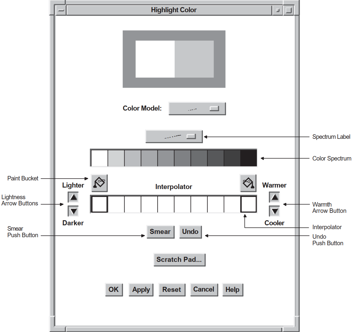 |
6.3.1.1. Color Picker Model Spectrum
The typical "rainbow" spectrum (white, red, orange, yellow, green, blue, blue-violet, violet, brown, and black)
Pastels
Vivids
Earthtones
These four color palettes allow users to select from a wide variety of colors. The application can also add another palette, which becomes the default palette accessible to the user through this menu. The other palettes still remain available.
6.3.1.2. Selecting a Color Using the Color Picker Model
In the context of the color mixing widget, the term current selection refers to the color to be used as the new color, unless the user performs some action to modify that color or selects another color.
When a user clicks and releases MB1 on a spectrum tile or interpolator tile, that color becomes the current selection, and the tile becomes highlighted, identifying it as the selected color.
Use the interpolator to smear (blend) the selected color into the color of choice. The interpolator is particularly useful in the instance where the user has a particular color in mind, for example a shade of purple, but wants to see a range of purples before making a final selection.
Use the arrow buttons to make the color lighter or darker, warmer or cooler.
Switch to another color model and use the features of that model to modify the current selection.
6.3.1.3. Using the Interpolator
Two paint buckets are used to load the interpolator with the color or colors to smear. First, the user clicks MB1 on a spectrum tile or interpolator tile. The color display widget displays the color of that tile. Clicking on a paint bucket then fills the interpolator end tile below it with the selected color. The user can fill both interpolator end tiles or one, in which case the color of the empty interpolator end tile defaults to white.
As an alternative to the paint buckets, the user can use an eyedropper to load the interpolator. Pressing and holding MB1 on a spectrum or interpolator tile, the original color tile, or the new color tile causes the pointer to become an eyedropper filled with the color of that tile. This eyedropper can then be moved to the interpolator and used to fill one of the two end tiles by releasing MB1. If the eyedropper is not positioned directly on one of the two end tiles, the closest end tile is filled with the eyedropper color.
When the interpolator end points are filled with the selected colors, activating the smear button causes a linear interpolation between these two colors. The results of this interpolation appear in the central interpolator tiles. The new colors generated by this process can then be selected, picked up with the eyedropper, smeared, and so forth.
The warmer, cooler, lighter, and darker buttons apply changes to each tile in the interpolator array. The warmer button adds red to the color of each tile, while the cooler button adds blue. The lighter and darker buttons modify the lightness component of each interpolator tile.
The undo button is used to undo the last interpolator action, which can be a smear, the filling of an end tile, or the activation of one of the warmth or lightness adjustment buttons.
6.3.2. HLS Color Model
In the HLS (hue, lightness, saturation) color model, a color is specified by three characteristics: hue, lightness, and saturation. Hue is color. Lightness describes the intensity of the color, that is, the amount of the color. Saturation describes the purity of the color or how much the color is diluted by white.
HLS expresses hue as a continuous spectrum of values arranged in a circular pattern. Red appears at 0 degrees (and again at 360 degrees), magenta is at 60 degrees, blue is at 120 degrees, cyan is at 180 degrees, green is at 240 degrees, and yellow is at 300 degrees. HLS expresses the lightness or intensity of a color as a percentage between 0 and 100 percent. One hundred percent lightness creates white light; zero percent lightness creates black.
To support the HLS color model, the color mixer subwidget contains three scales that represent the ranges of hue, lightness, and saturation. The hue scale presents color values as a range between 0 and 360. The lightness and saturation scales present their values as a range of percentages between 0 and 100.
Figure 6.2, ''Components of the Color Mixing Widget (HLS Color Model)'' shows the components in a color mixing widget with the HLS color model selected.
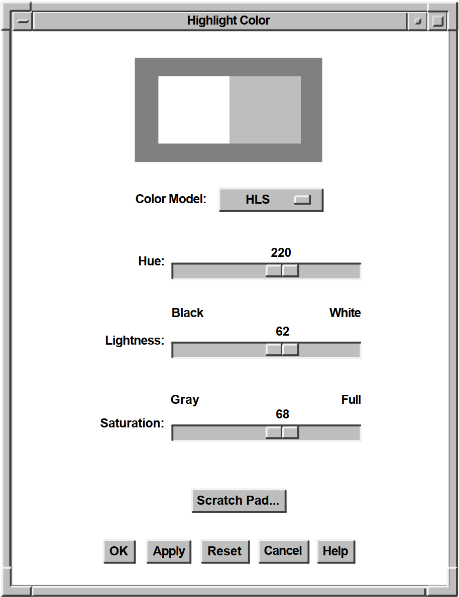 |
One oddity of the HLS color model is that full intensity colors are specified at 50 percent lightness. HLS expresses the saturation or purity of a color also as a percentage between 0 and 100 percent. One hundred percent saturation is a pure color. A zero-saturated color is a shade of gray, determined by the value of lightness.
6.3.3. RGB Color Model
The RGB color model is the default color model for the color mixing widget.
In the RGB color model, a color is specified as a mixture of different intensities of red, green, and blue. In the X Window System Version 11 (X11), you specify the intensity of red, green, or blue as a value between 0 and 65,535. Zero is the lowest intensity. Black is defined as a zero-intensity value for all three colors; white is 100 percent intensity for all three colors.
The color mixing widgets shown in Figure 6.2, ''Components of the Color Mixing Widget (HLS Color Model)'' and Figure 6.3, ''Components of the Color Mixing Widget (RGB Color Model)'' illustrate how the color "LightBlue" is specified in each color model. X11 specifies a number of "named" colors, such as LightBlue, by their RGB values.
In the HLS color model, LightBlue is specified as 220 on the Hue scale, 62 percent lightness, and 68 percent saturation. In the RGB color model, LightBlue is specified at 24672 intensity, green at 35209 intensity, and blue at 57825 intensity. Figure 6.3, ''Components of the Color Mixing Widget (RGB Color Model)'' illustrates how the scales in the color mixer subwidget express these X11 RGB values as percentages.
To support the RGB color model, the color mixer subwidget contains three scales that represent the ranges of intensity of red, green, and blue. Each scale presents these color values as a percentage between 0 and 100. In addition, when supporting the RGB color model, the color mixer subwidget also contains text widgets in which users of your application can enter RGB values directly as text. The text widgets and the scales are linked; a change in one effects a corresponding change in the other.
Figure 6.3, ''Components of the Color Mixing Widget (RGB Color Model)'' shows the components in a color mixing widget with the RGB color model selected.
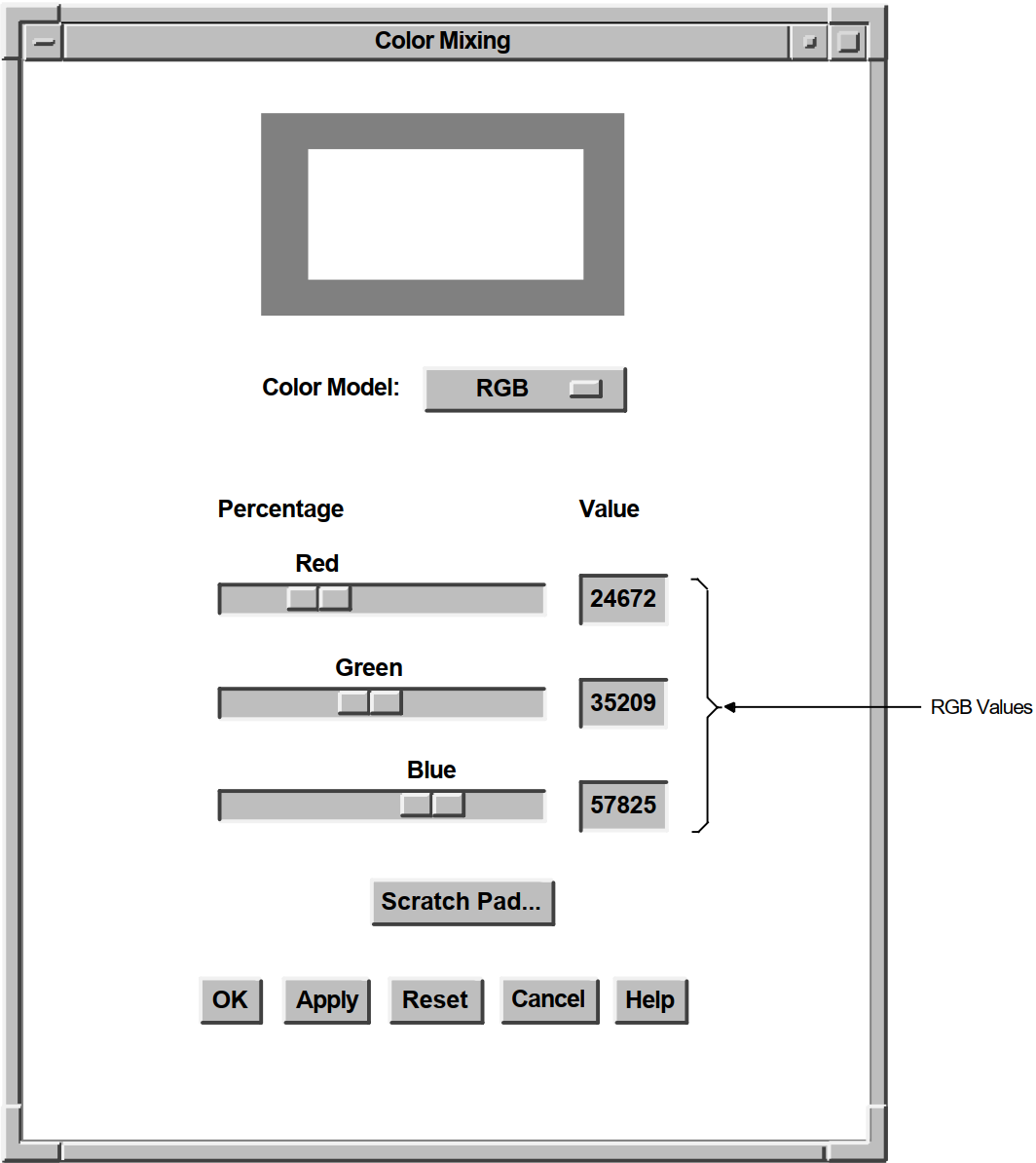 |
6.3.4. Browser Color Model
The Color Browser is a scrolled window that displays a list of X11 named colors. Each button in the scrolled window shows the name of an X11 color. If enough resources are available, the background is set to that color. You can use the scroll bar to scroll through this color list. Clicking MB1 on a color in the list causes the color display subwidget to become filled with that color. The Color Browser is available on all systems.
Figure 6.4, ''Components of the Color Mixing Widget (Browser Color Model)'' shows the components in a color mixing widget with the Color Browser color model selected.
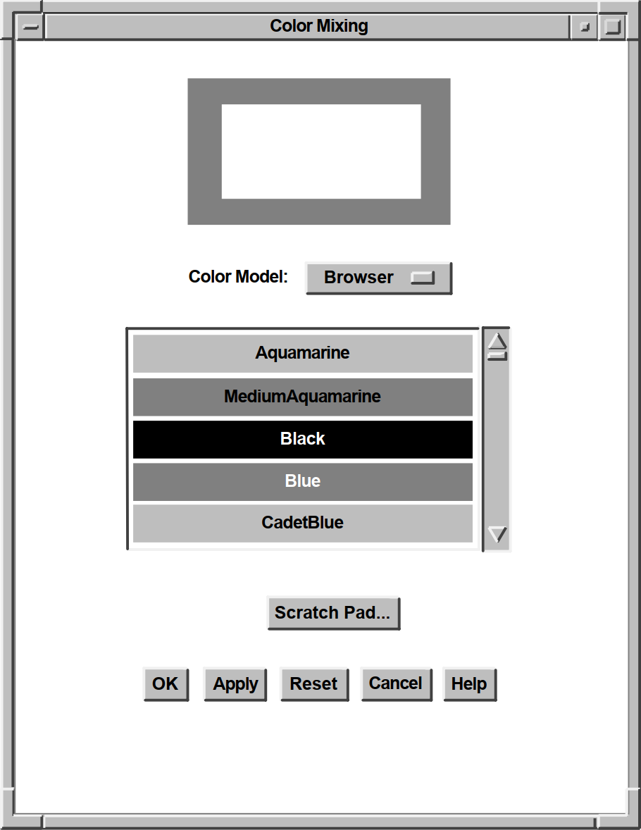 |
If the new color is not further modified by other color models, the X11 name of this color is also returned to the application as part of the colormix callback structure. Note that, in this callback, the Color Browser differs from the other color models, which return only RGB values and have a null value in the name field.
The location of the file containing the list of available colors depends on which X server is being used. On UNIX systems, the file /usr/lib/X11/rgb.txt contains a list of the available DECwindows named colors. For OpenVMS systems, this information is in the VMS DECwindows Guide to Xlib(Release 4) Programming: MIT C Binding. If you are creating applications with eXcursion for Windows NT, check the documentation for that product to determine the X server that is being used. The RGB values for named colors are not guaranteed to exactly match the named colors for all server implementations. Not all servers support all of the named colors.
The DXmNbrowserItemCount resource determines the number of
visible items in the browser's color list. This resource can be set only at widget
creation time. The default is 5. Note that, if you increase this number, each visible
item requires the color mixing widget to allocate an additional color cell.
6.3.5. Greyscale Mixer
The Greyscale mixer is a scale widget that allows generation of gray shades ranging from black to white. When the Greyscale mixer is selected, the current color selection is converted to an appropriate shade of gray, which can then be adjusted with the scale widget. All shades of gray generated by this model are a mixture of equal portions of red, green, and blue, which means they appear identically on both color and grayscale systems.
Figure 6.5, ''Components of the Color Mixing Widget (Greyscale Mixer)'' shows the components in a color mixing widget with the Greyscale mixer selected.
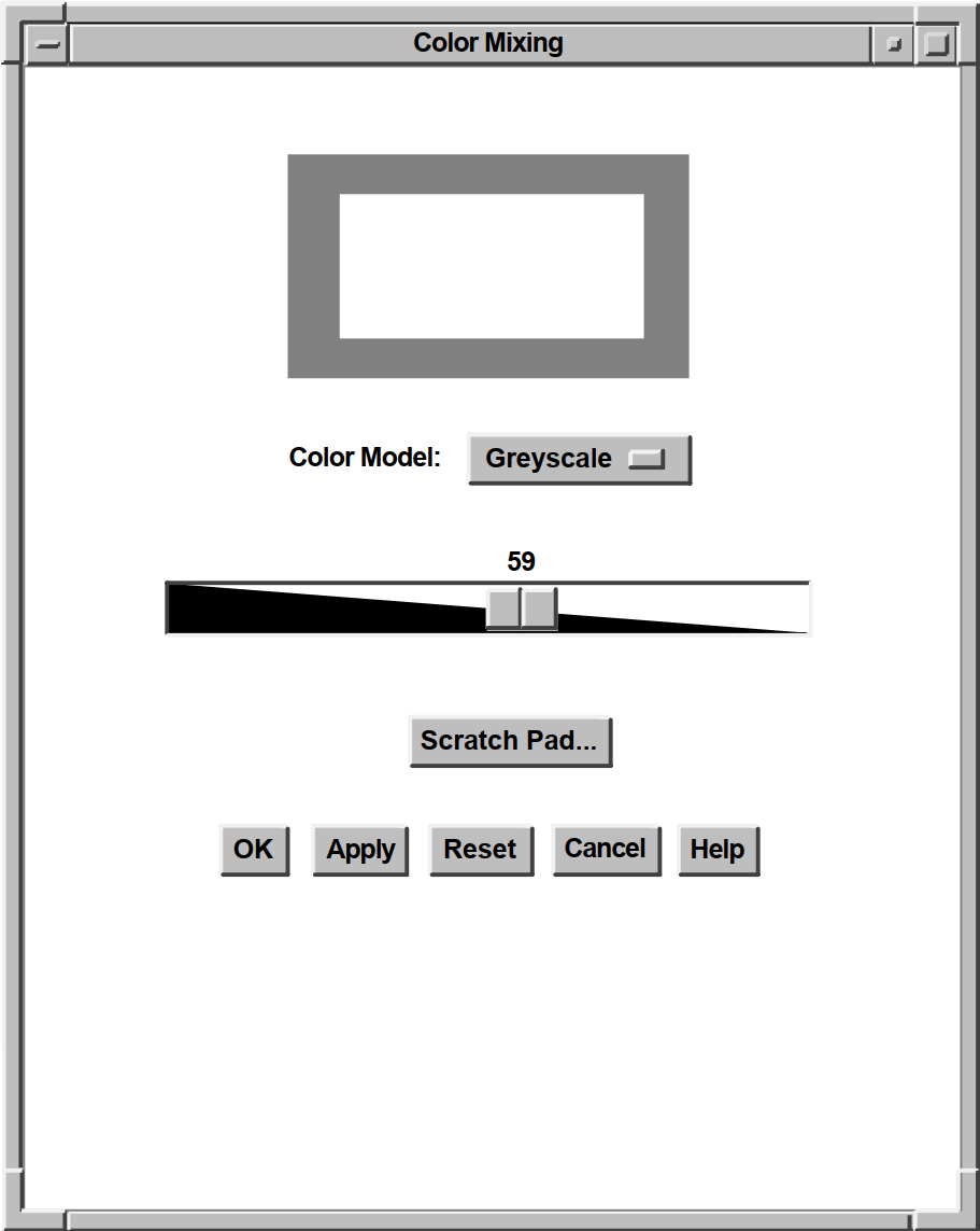 |
The DXmNgreyscaleOnGreyscale Boolean resource, when true,
causes the grayscale mixing color model to be the default on grayscale systems. The
default is true. The Greyscale mixer is available on all systems.
6.4. Color Mixing Widget Components
Scratch pad – Stores intermediate colors for possible later use in color mixing.
Color display subwidget – Displays the original color and the new color.
Color model option menu subwidget – Implements choice of a color model.
Color mixer subwidget – Provides graphic tools with which users can define new colors.
Push-button subwidgets – Activate color mixing widget functions.
Label subwidgets – Provide descriptive information.
Work area subwidget – Supplies additional functions defined by application (optional).
6.4.1. Scratch Pad
The scratch pad dialog box lets users pass colors among color models. For example, a user might use the scratch pad to save a series of colors selected with the Color Picker model and then get the RGB values for those colors in the RGB color model.
The user can also use the scratch pad to store intermediate colors for later use in color mixing. For example, the user might use the scratch pad to store five different shades of blue and then pick the preferred shade from the stored shades.
The scratch pad is accessible from all of the color models. Figure 6.6, ''Components of the Scratch Pad'' shows the components of the scratch pad.
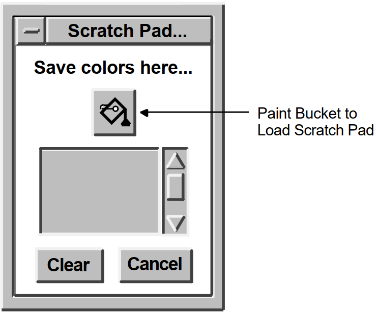
Note
Note that, for the Color Picker model, the currently selected color can be derived from any of the color tiles in the model. However, when using other color models, only the new or original color tiles can be selected.
To set the new-color tile of the color display subwidget to a scratch pad color, a user scrolls to that color and clicks on the scratch pad color tile. The new-color tile changes and the scratch pad tile becomes highlighted. In the Color Picker model, this highlighting indicates that the user can use the paint bucket buttons to put the scratch pad color into one of the interpolator end tiles.
The Clear button resets the list of stored colors and sets the scratch pad back to its initial state. The Cancel button unmanages the scratch pad dialog box without changing its contents.
6.4.2. Color Display Subwidget
The default color display subwidget is a dialog box widget (work area style) that contains two window widgets: one to display the original color and one to display the new color. The color displayed in the new-color window widget changes to represent the new color as it is defined.
When you create the color mixing widget, you can specify the initial values of both the original color and the new color. If you do not specify an initial value for the new color, the color mixing widget sets it to match the original color. The DXmNmatchColors resource is a Boolean value that, when true, causes the new-color tile to match the color of the original color tile when the color mix widget first becomes visible. DXmNmatchColors is true by default.
You can also specify the background color of the color display subwidget (which is gray by default).
When displayed on a grayscale device, the color display subwidget represents the color values as shades of gray. On static gray and monochrome devices, the color display subwidget is not visible in the color mixing widget.
You can replace the default color display subwidget with a widget of your own design. For information about this topic, see Section 6.5.1, ''Replacing the Color Display Subwidget''.
6.4.3. Color Model Option Menu Subwidget
The color model option menu subwidget lets users of your application choose the color model supported by the color mixer subwidget. For information about the color mixer subwidget, see Section 6.4.4, ''Color Mixer Subwidget''. The color models appear as items in the option menu. Users can switch among color models at any time.
When the color model is changed, the color mixing widget preserves the current color definition, translating the values that define the color in the current color model into values appropriate to the new-color model.
The color model option menu subwidget appears in the color mixing widget only when the default color mixer subwidget is used.
6.4.4. Color Mixer Subwidget
The color mixer subwidget provides graphic tools that users can use to define colors. When a user changes a value in the color mixer subwidget, the color mixing widget immediately updates the color displayed in the new-color window of the color display subwidget.
The default color mixer subwidget supports the Color Picker, HLS, RGB, Browser, and
Greyscale mixer color models. You can specify which color model the color mixer
subwidget initially supports by assigning a value to the
DXmNcolorModel resource. If you do not specify a color model,
the color mixer subwidget default is determined by the system type of the display
device.
DXmNcolorModel resource. Table 6.1, ''Color Model Constants'' also describes when the various color models are used as
the default. |
Color Model |
Constant |
When Default |
|---|---|---|
|
Color Picker |
DXmColorModelPicker |
Color systems |
|
HLS |
DXmColorModelHLS |
Not used as a default |
|
RGB |
DXmColorModelRGB |
Monochrome systems |
|
Browser |
DXmColorModelBrowser |
Not used as a default |
|
Greyscale |
DXmColorModelGreyscale |
Grayscale systems |
The Color Picker model does not display on noncolor systems. If you specify the Color
Picker color model in the DXmNcolorModel resource and the
application is displayed on a noncolor system, the color mixer subwidget uses the
default color model for that system.
The HLS, RGB, and Browser color models and the Greyscale mixer display on color, grayscale, and monochrome systems. However, the color display subwidget is not visible on static gray and monochrome devices.
For information about replacing the default color mixer subwidget with a widget of your own design, see Section 6.5.2, ''Replacing the Color Mixer Subwidget''.
6.4.5. Push-Button Subwidgets
Note
The Reset and Help push buttons do not trigger a callback to your application because they have built-in functions that are internal to the color mixing widget.
When activated, the Reset button changes the values in the color mixer subwidget and the color displayed in the new-color window of the color display subwidget back to their initial values. The Help button displays help on using the color mixing widget.
The OK push button makes the newly defined color appear in your application and then removes the color mixing widget from the display.
The Apply push button makes the newly defined color appear in your application while the color mixing widget remains active on the display.
The Cancel push button removes the color mixing widget from the display without implementing any of the changes a user might have made.
Use callback routines to implement the functions you want associated with these push
buttons. You associate these callback routines with the callback resources of the color
mixing widget. For example, to associate a function with the OK push button, use the
XmNactivateCallback resource. For more information about
associating callback routines with the color mixing widget, see Section 6.6, ''Associating Callbacks with a Color Mixing Widget''.
Note that you can change the text displayed in the push-button subwidgets. For details, see Section 6.4.6, ''Label Subwidgets''. You can also remove any of the push-button subwidgets by specifying a null value for the text label.
6.4.6. Label Subwidgets
The color mixing widget contains more than a dozen labels you can use to provide descriptive text for the components of the color mixing widget. Section 6.4.6, ''Label Subwidgets'' describes how to specify text for these labels.
6.4.7. Work Area Subwidget
The color mixing widget can contain a work area subwidget, if your application supplies one. The color mixing widget manages this subwidget and positions it below the color mixer subwidget and above the push-button subwidgets.
The work area subwidget can be any other Toolkit widget, such as a label, push button, or dialog box widget. If you use a dialog box widget, use only the work area style of this widget.
For example, your application can use this additional subwidget to include additional push-button widgets to extend the functions of the color mixing widget.
6.4.8. Setting and Retrieving New Color Values
If your application does not use the default color display subwidget, you might need to set or retrieve the RGB values of the new color displayed in the color display subwidget. You can use the XtSetValues and XtgetValues intrinsic routines for this purpose. However, the DECwindows Motif Toolkit provides support routines that let you perform these tasks much faster.
To set the values of the DXmNnewRedValue,
DXmNnewGreenValue, and DXmNnewBlueValue
resources, use the DXmColorMixSetNewColor support routine. You specify the values of
these resources as arguments to the routine. The default color display subwidget updates
the new-color window to represent the newly defined color.
To retrieve the value of the new-color resources, use the DXmColorMixGetNewColor
support routine. This support routine writes the current values of the
DXmNnewRedValue, DXmNnewGreenValue, and
DXmNnewBlueValue resources into variables that you pass as
arguments to the routine.
|
Routine |
Description |
|---|---|
|
DXmColorMixGetNewColor |
Retrieves the current values of the new-color resources. |
|
DXmColorMixSetNewColor |
Assigns values to the new-color resources. |
6.4.9. Customizing the Color Mixing Widget
Size
Margins
Labels
Background color
Work area subwidget
6.4.9.1. Specifying Size
The color mixing widget sizes itself to fit the subwidgets that it contains. For
example, if you specify long compound strings as values for the label subwidgets, the
color mixing widget increases its size to accommodate the labels. Note that you do
not need to set the common widget resources XmNwidth and
XmNheight to 0 [zero] to get the default size.
In the default color display subwidget, you can specify the size of the windows in
which the original and new colors are displayed. By default, each of these windows is
80 pixels square. Use the DXmNdisplayColWinWidth resource and
the DXmNdisplayColWinHeight resource to specify the dimensions
of these windows. Specify these dimensions in pixels. These resources affect only the
default color display subwidget.
DXmNpickerTileHeight—Specifies the height of each
individual Color Picker spectrum tile in pixels. The default is 30 pixels.
DXmNpickerTileWidth—Specifies the width of each
individual Color Picker spectrum tile in pixels. The default is 30 pixels.
DXmNinterpTileHeight—Specifies the height of each
individual Color Picker interpolator tile in pixels. The default is 30 pixels.
DXmNinterpTileWidth—Specifies the width of each
individual Color Picker interpolator tile in pixels. The default is 30 pixels.
6.4.9.2. Specifying Margins
You can specify the amount of space surrounding the subwidgets contained in the
color mixing widget. Use the common widget resource
XmNmarginWidth to specify the amount of space between the
left and right edges of the subwidgets (the default is 10 pixels). Use the common
widget resource XmNmarginHeight to specify the amount of space
between the top and bottom edges of the subwidgets (the default is 10 pixels).
Specify these margins in pixels.
In addition, you can specify the amount of space surrounding the two window
widgets in the default display subwidget. Use the
DXmNdispWinMargin resource to specify the size for all the
margins in the display subwidget (the default is 20 pixels). The
DXmNdispWinMargin resource affects only the default color
display subwidget.
6.4.9.3. Labeling the Color Mixing Widget
You can specify the text in each of the labels contained in the color mixing widget by assigning values to the color mixing widget label resources, described in DECwindows Extensions to Motif. You must specify these labels as compound strings.
DXmNmainLabel resource specifies the text
that appears at the top of the color mixing widget, centered between the left and
right borders. The following UIL code fragment sets the value of the DXmNmainLabel
resource to "Colormix Example":
object main_color : DXmColorMixDialog
{
arguments
{
XmNdialogTitle = "DECburger: Background Color";
DXmNmainLabel = compound_string("Colormix Example");
};
callbacks
{
XmNhelpCallback = procedure sens_help_proc(k_options_help);
XmNcancelCallback = procedure cancel_color_proc();
XmNokCallback = procedure ok_color_proc();
XmNapplyCallback = procedure apply_color_proc();
};
};If you do not specify values for the DXmNmainLabel,
DXmNdisplayLabel, or DXmNmixerLabel
resources, the color mixing widget does not include these label subwidgets. If you
specify a null value for the XmNokLabelString,
XmNapplyLabelString,
DXmNresetLabelString, or
XmNcancelLabelString resources, the color mixing widget
deletes the push-button subwidget.
Note that the resources that specify the text labels in the color mixer subwidget work only with the default color mixer subwidget.
6.4.9.4. Defining the Background Color of the Color Display Subwidget
Use the DXmNbackRedValue,
DXmNbackGreenValue, and
DXmNbackBlueValue resources to define the background color
of the display subwidget. These resources work only with the default color display
subwidget.
6.4.9.5. Adding a Work Area to the Color Mixing Widget
To specify that the color mixing widget contain a work area subwidget, create the
widget that you want to be the subwidget and assign the widget identifier as the
value of the XmNworkWindow resource.
You do not have to manage the work area subwidget.
6.4.9.6. Customizing the Color Picker Color Model
|
Resource Name |
Description |
|---|---|
|
DXmNpickerColors |
A palette of 10 colors available through the user palette menu option. If not specified, the user palette does not appear in the menu. If a user palette is specified, it is the default palette accessible to the user through this menu. The other palettes remain available. DXmNpickerColors is an array of 10 colors in the following order: white, red, orange, yellow, green, blue, blue-violet, violet, brown, black. The first item in the array is the red value of the first spectrum tile, the second item is its green value, the third item is its blue value, the fourth item is the second tile's red value, and so forth. Because there are 10 colors by default and each color has red, green, and blue values, DXmNpickerColors has a default value of 30. DXmNpickerColors can be set only at creation time. |
|
DXmNinterpTileCount |
The number of interpolator tiles used. The default is 10. DXmNinterpTileCount can be set only at creation time. |
|
DXmNwarmthIncrement |
The amount of red or blue added to the color of each interpolator tile when the warmer or cooler buttons are pressed. The default is 5000. |
|
DXmNlightnessIncrement |
The percentage by which to increase or decrease the lightness of the color of each interpolator tile when the lighter or darker buttons are pressed. The default is 5 percent. |
6.5. Supporting Other Color Models
You can extend the color mixing widget to support other color models by replacing the default color mixer subwidget and the color display subwidget with widgets of your own design. Section 6.5.1, ''Replacing the Color Display Subwidget'' and Section 6.5.2, ''Replacing the Color Mixer Subwidget'' describe how to replace these subwidgets.
Whatever color system you choose to support, remember that X11 defines colors by their RGB values. Your custom subwidget must convert whatever values it accepts into RGB values and provide these values to the color mixing widget, which returns the values to the application as callback data. On OpenVMS systems, you can find more information about obtaining color resources as well as an example of converting color values from another color model to RGB by looking at the color example program in the VMS DECwindows Xlib Programming Volume.
6.5.1. Replacing the Color Display Subwidget
To replace the default color display subwidget, specify the identifier of the
new-color display subwidget as the value of the DXmNdisplayWindow
resource. Note that if you do not specify a value for this resource, the color mixing
widget uses the default color display subwidget.
Note that you cannot specify a replacement for the default color display subwidget
when you create the color mixing widget; you must first create (but not manage) the
color mixing widget and then use XtSetArg and XtSetValues to specify a value for the
DXmNdisplayWindow resource.
Create the colormix widget without specifying the
DXmNdisplayWindowresource.Create your custom color display subwidget. Specify the colormix widget as the parent.
Use XtSetArg and XtSetValues to set the new values.
Manage the color mixing widget.
You can switch back to the default color display subwidget at any time by setting the
DXmNdisplayWindow resource to null.
If you replace the default color display subwidget, you must provide a procedure to
update the new-color window when a user changes the color mixer widget. The color mixing
widget calls this routine whenever a user changes a value in the color mixer subwidget.
Pass the address of this routine as the value of the
DXmNsetNewColorProc resource.
The default value for the DXmNsetNewColorProc resource is the routine that updates the new-color window. If your application supplies a DXmNsetNewColorProc routine, your routine is used even if your application does not replace the default color display subwidget.
6.5.2. Replacing the Color Mixer Subwidget
To replace the default color mixer subwidget with one of your own design, assign the
widget identifier of the new subwidget as the value of the
DXmNmixerWindow resource. If you do not specify a value for
this resource, the color mixing widget uses the default color mixer subwidget.
Note that you cannot specify a replacement for the default color mixer subwidget when
you create the color mixing widget; you must first create (but not manage) the color
mixing widget and then use XtSetArg and XtSetValues to specify a value for the
DXmNmixerWindow resource.
Create the colormix widget without specifying the
DXmNmixerWindowresource.Create your custom color mixer subwidget. Specify the colormix widget as the parent.
Use XtSetArg and XtSetValues to set the new values.
Manage the color mixing widget.
You can switch back to the default color mixer subwidget at any time by setting the
DXmNmixerWindow resource to null.
The DXmNsetMixerColorProc resource specifies a procedure that is called whenever the new color is updated by some means other than direct manipulation of the mixing model (such as pressing the Reset button). The procedure makes any necessary changes to the current mixing model, such as setting the sliders in the RGB or HLS models to match the new-color value. DXmNsetMixerColorProc is generally used when your application supplies its own color mixing model rather than using the default mixers.
6.6. Associating Callbacks with a Color Mixing Widget
When a user presses the OK, Apply, or Cancel push button, the color mixing widget performs a callback to your application (however, activating the Reset or Help buttons does not trigger a callback).
When the color mixing widget performs a callback, it returns data to your application,
including the RGB values that define the original color (specified in the
DXmNorigRedValue, DXmNorigGreenValue, and
DXmNorigBlueValue resources) and the RGB values that define the
new color (specified in the DXmNnewRedValue,
DXmNnewGreenValue, and DXmNnewBlueValue
resources).
For complete information about the data returned in the callback by the color mixing widget, see DECwindows Extensions to Motif.
The color mixing callback also supports passing named colors to your application if the user has selected the Browser color model. If the user selects a named color from the Browser and then triggers a callback to the application without modifying the new color, the newname field of the callback data structure is filled in with a pointer to an ASCII, null-terminated string that contains the color's X11 name. This string is read only and should not be freed or modified.
If a color is generated in one of the other color models or generated in the Browser and subsequently modified, the newname field in the callback structure is set to NULL.
typedef struct
{
int reason;
XEvent *event;
unsigned short newred;
unsigned short newgrn;
unsigned short newblu;
char *newname;
unsigned short origred;
unsigned short origgrn;
unsigned short origblu;
} DXmColorMixCallbackStruct;|
Callback Resource |
Conditions for Callback |
|---|---|
|
XmNokCallback |
The user clicked the OK push-button widget in the color mixing widget. |
|
XmNapplyCallback |
The user clicked the Apply push-button widget in the color mixing widget. |
|
XmNcancelCallback |
The user clicked the Cancel push-button widget in the color mixing widget. |
6.7. Creating a Color Mixing Widget
Create the color mixing widget using any of the widget creation mechanisms listed in Table 6.5, ''Mechanisms for Creating the Color Mixing Widget''.
Manage the color mixing widget using the intrinsic routine XtManageChild.
|
Mechanism |
Routine Name or Object Type |
|---|---|
|
Toolkit routine |
Use the DXmCreateColorMixDialog routine to create a color mixing widget in a pop-up dialog box. |
|
Toolkit routine |
Use the DXmCreateColorMix routine to create a color mixing widget in a
dialog box. You might want to use this routine to add a color mixing
widget inside one of your existing widgets. There are two side effects of
using this version of the color mixing widget:
|
|
UIL object type |
Use the UIL object type DXmColorDialog to define a color mixing widget in a pop-up dialog box. At run time, the MrmFetchWidget routine creates the widget according to this definition. |
|
UIL object type |
Use the UIL object type DXmColor to define a dialog box color mixing widget. At run time, the MrmFetchWidget routine creates the widget according to this definition. The side effects described for the DXmCreateColorMix routine also apply to DXmColor. |
6.7.1. Creating a Color Mixing Widget—UIL Example
.
.
.
! The options pull-down entry and its associated pull-down menu.
object
options_menu_entry : XmCascadeButton {
arguments {
XmNlabelString = k_options_label_text;
XmNmnemonic = keysym("O");
XmNmappedWhenManaged = false;
};
controls {
XmPulldownMenu options_menu;
};
callbacks {
MrmNcreateCallback = procedure create_proc (k_options_pdme);
XmNhelpCallback = procedure sens_help_proc(k_options_help);
};
};
object
options_menu : XmPulldownMenu {
controls {
XmPushButton m_options_control_button;
};
callbacks {
MrmNcreateCallback = procedure create_proc (k_options_menu);
XmNhelpCallback = procedure sens_help_proc(k_options_help);
};
};
object
m_options_control_button : XmPushButton {
arguments
{
XmNlabelString = k_options_color_label_text;
XmNmnemonic = keysym("C");
};
callbacks {
MrmNcreateCallback = procedure create_proc (k_create_options);
XmNactivateCallback = procedure activate_proc (k_create_options);
XmNhelpCallback = procedure sens_help_proc(k_options_help);
};
};
object main_color : DXmColorMixDialog
{
arguments
{
XmNdialogTitle = "DECburger: Background Color";
DXmNmainLabel = compound_string("Colormix Example");
};
callbacks
{
XmNhelpCallback = procedure sens_help_proc(k_options_help);
XmNcancelCallback = procedure cancel_color_proc();
XmNokCallback = procedure ok_color_proc();
XmNapplyCallback = procedure apply_color_proc();
};
};
.
.
.
| The object declaration defines a cascade button named options_menu_entry.
The |
| The object declaration defines a pull-down menu named options_menu. |
| The options_menu pull-down menu controls the Background Color push button. The create_color routine is called as a result of the activate callback for this push button. |
| The object declaration defines a pop-up color mixing widget named main_color. The UIL keyword for the color mixing widget is DXmColorMixDialog. |
| The callbacks list section of the UIL object declaration assigns values to each of the primary callbacks performed by the color mixing widget. |
. . .
| Include the color mixing widget resource file. |
| The color mixing widget is declared in the global data section because it is referenced by more than one routine within the module. |
| The savecolor XColor data structure is declared in the global data section because it is referenced by more than one routine within the module. |
| Forward declaration to the color mixing routines. When a user presses the OK, Apply, or Cancel push button, the color mixing widget performs a callback to your application. The ok, apply, and cancel callback routines are provided for this purpose. |
| Test to see if OpenVMS DECburger is displaying on a color system. DECburger implements the customize background color feature only for color systems. |
| If DECburger is displaying on a color system, set the Options cascade button to be mapped when managed. |
| Make sure that the color mixing widget starts with a null value. The create_color routine tests to see if the color mixing widgets exists. Initializing the widget to NULL makes sure that it does not contain invalid data. |
| The create_color routine is called as a result of the activate callback for the Background Color push button. |
| If the color mixing widget does not already exist, fetch it. |
| When the color mixing widget is first managed, the original color of the Color Display Subwidget should match the color of the object to be changed, in this case the main window widget. Therefore, the example calls the XtSetArg and XtGetValues intrinsic routines to get the background color of the main window widget and store it in the newcolor.pixel pixel field. |
| The example then calls the Xlib XQueryColor routine to get the RGB values associated with the pixel value in newcolor.pixel. The XQueryColor routine fills in the red, green, and blue fields of the newcolor data structure. This implementation allows the application to determine the initial color
for the Color Display Subwidget at run time. NoteThe only way to set the DXmNorigRedValue, DXmNorigGreenValue, and DXmNorigBlueValue resources through UIL is to use hard coded RGB values. This practice is not recommended because there is no way to guarantee that the hard coded RGB values will match the actual color of the object to be changed. |
| Call the XtSetArg and XtSetValues routines to set the original colors for the color mixing widget. |
| Save the original XmNbackground color of the main window widget in case you need to restore it. |
| If the color mixing widget already exists, get the current XmNbackground
pixel value for the main window widget, and then call XQueryColor to get the
associated RGB values. The |
| Manage the color mixing widget. The color mixing widget callbacks update the color mixing widget as needed. |
6.7.2. Color Mixing Widget—OK Callback
. . . /* Color Mix OK Callback */
| The ok_color callback routine is called as a result of a user pressing the OK push button. |
| The red, green, and blue members of the newcolor data structure are
initialized to the RGB values selected by the user and returned by the color
mixing widget in the |
| Allocate a color cell entry. You pass the Xlib XAllocColor routine the display identifier and color map to use, and a pointer to an XColor data structure. XAllocColor fills in the XColor.pixel member with the RGB value determined by the red, green, and blue RGB values of the data structure. |
| Set the Set the |
6.7.3. Color Mixing Widget—Apply Callback
.
.
.
/* Color Mix Apply Callback */
static void apply_color_proc(widget_id, tag, reason)
Widget widget_id;
int *tag;
DXmColorMixCallbackStruct *reason;
{
int ac;
Arg arglist[10];
XColor newcolor;
newcolor.red = reason->newred;
newcolor.green = reason->newgrn;
newcolor.blue = reason->newblu;
if (XAllocColor(the_display,
XDefaultColormapOfScreen(the_screen), &newcolor)) {
ac = 0;
XtSetArg (arglist[ac], XmNbackground, newcolor.pixel);ac++;
XtSetValues(widget_array[k_total_order], arglist, ac);
XtSetValues(main_window_widget, arglist, ac);
}
else
s_error ("can't allocate color cell");
}
.
.
.6.7.4. Color Mixing Widget—Cancel Callback
.
.
.
/* Color Mix Cancel Callback */
static void cancel_color_proc(widget_id, tag, reason)
Widget widget_id;
int *tag;
DXmColorMixCallbackStruct *reason;
{
int ac;
Arg arglist[10];
XtUnmanageChild(color_widget);
ac = 0;
XtSetArg (arglist[ac], XmNbackground, savecolor.pixel);ac++;
XtSetValues(widget_array[k_total_order], arglist, ac);
XtSetValues(main_window_widget, arglist, ac);
}
.
.
.
| Unmanage the color mixing widget. |
| Restore the k_total_order widget to the state it was in when it was last managed. The k_total_order widget is on top of the main window widget in the window hierarchy. Therefore, the background color of this widget must match the background color of the main window widget. |
| Restore the main window widget to the state it was in when it was last managed. |
6.7.5. Creating a Color Mixing Widget—Toolkit Example
.
.
.
/* Color Mix Widget Creation */
static void create_color()
{
unsigned int ac;
Arg arglist[10];
XtCallbackRec ok_callback_arg[2];
XtCallbackRec apply_callback_arg[2];
XtCallbackRec cancel_callback_arg[2];
XColor newcolor;
Arg al[1];
if (!color_widget) {
apply_callback_arg[0].callback = apply_color_proc;
apply_callback_arg[0].closure = 0;
apply_callback_arg[1].callback = NULL;
apply_callback_arg[1].closure = NULL;
cancel_callback_arg[0].callback = cancel_color_proc;
cancel_callback_arg[0].closure = 0;
cancel_callback_arg[1].callback = NULL;
cancel_callback_arg[1].closure = NULL;
ok_callback_arg[0].callback = ok_color_proc;
ok_callback_arg[0].closure = 0;
ok_callback_arg[1].callback = NULL;
ok_callback_arg[1].closure = NULL;
XtSetArg(al[0], XmNbackground, &newcolor.pixel);
XtGetValues(main_window_widget, al, 1);
XQueryColor(the_display,
                  XDefaultColormapOfScreen(the_screen), &newcolor);
ac = 0;
XtSetArg (arglist[ac], XmNcancelCallback, cancel_callback_arg);ac++;
XtSetArg (arglist[ac], XmNokCallback, ok_callback_arg); ac++;
XtSetArg (arglist[ac], XmNapplyCallback, apply_callback_arg); ac++;
XtSetArg (arglist[ac], DXmNorigRedValue, newcolor.red); ac++;
XtSetArg (arglist[ac], DXmNorigGreenValue, newcolor.green); ac++;
XtSetArg (arglist[ac], DXmNorigBlueValue, newcolor.blue); ac++;
XtSetArg (arglist[ac], DXmNcolorModel, DXmColorModelPicker); ac++;
color_widget = DXmCreateColorMixDialog (toplevel_widget,
"Color Mix Widget",
arglist, ac);
savecolor.red = newcolor.red;
savecolor.green = newcolor.green;
savecolor.blue = newcolor.blue;
savecolor.pixel = newcolor.pixel;
XtManageChild(color_widget);
return;
}
else {
ac = 0;
XtSetArg(arglist[ac], XmNbackground, &savecolor.pixel);
XtGetValues(main_window_widget, arglist, 1);
XQueryColor(the_display,
XDefaultColormapOfScreen(the_screen), &savecolor);
XtManageChild(color_widget);
}
}
.
.
.
| If the color mixing widget does not exist, assign values to elements of the callback routine lists. Each callback routine data structure contains the address of a callback routine and a tag. In this case, the callback routines are ok_color_proc, apply_color_proc, and cancel_color_proc. The tag value is not used. Each callback routine data structure is also null terminated. |
| When the color mixing widget is first managed, the original color of the Color Display subwidget should match the color of the object to be changed, in this case the main window widget. Therefore, call the XtSetArg and XtGetValues intrinsic routines to get the background color of the main window widget and store it in the newcolor.pixel pixel field. |
| Calls the Xlib XQueryColor routine to get the RGB values associated with the
pixel value in newcolor.pixel. The XQueryColor
routine fills in the red, green, and blue fields of the newcolor data
structure. NoteThis implementation allows the application to determine the initial color for the Color Display subwidget. If you set the DXmNorigRedValue, DXmNorigGreenValue, and DXmNorigBlueValue values through UIL, you must hard-code RGB values to match the background of the main window widget. |
| Call the XtSetArg routine to set the initial resources for the color mixing widget. Note that, if you specify the Color Picker color model in the
|
| Call the DXmCreateColorMixDialog routine to create a pop-up dialog box version of the color mixing widget and then manage it. |
| Save the original XmNbackground color of the main window widget in case you need to restore it. |
| Manage the color mixing widget. The color mixing widget callbacks update the color mixing widget as needed. |
| If the color mixing widget already exists, get the current XmNbackground
pixel value for the main window widget and then call XQueryColor to get the
associated RGB values. The |
| Manage the color mixing widget. The color mixing widget callbacks update the color mixing widget as needed. |
Chapter 7. Using the Print Widget
This chapter describes how to use the print widget in an application program. It includes a description of the print widget resources and also provides both UIL and Toolkit print widget programming examples.
7.1. Overview of the Print Widget
The print widget is a modeless widget that provides DECwindows applications with a fast, convenient method of printing one or more files in multiple formats. As an application programmer, you need only to create an instance of the print widget, using either the UIL DXmPrintDialog object type or the Toolkit DXmCreatePrintDialog routine, and then submit the print job by calling the DXmPrintWgtPrintJob routine.
Your application can also use the UIL DXmPrintBox object type or the DXmCreatePrintBox routine to create a print widget without a dialog shell. You might want to use this object type or routine to add a print widget inside one of your existing widgets.
Because the print widget uses a graphical interface to prompt users for print options, users do not have to know the syntax of the UNIX print command or the OpenVMS PRINT command to print files. In addition, because the print widget uses OpenVMS logical names to determine and display the available print queues, users do not have to know about the print queues on a given OpenVMS system.
Note
The print widget does not format or convert files for printing; your application must provide the files in a suitable print format.
7.2. Print Widget Walk-Through
This section describes a walk-through of how to use the print widget in an application. Subsequent sections describe this process in more detail.
If using UIL, declares an instance of the print widget in the UIL module.
Includes a way to invoke the print widget, usually a print push button on a cascade menu. The activate callback of this push button either fetches an instance of the print widget or calls the Toolkit routine to create a print widget.
Manages and realizes the print widget.
Waits for the user to interact with the print widget to select the print options.
When OK or Cancel is selected, invokes the appropriate application callback. For the OK push button, the application is now free to perform any application-specific preparation of the affected files. For the Cancel push button, the application can perform processing to indicate that the file was not printed.
Calls the DXmPrintWgtPrintJob routine when it is ready to submit the print job.
DXmPrintWgtPrintJob completes the actual submission of the identified files to the appropriate print service and returns the status of the print job to the application.
Unmanages the print widget. This saves re-creation time and allows the print widget to reappear on the screen with the same settings the user set up on a previous appearance. The application could destroy the print widget instead of unmanaging it.
7.3. Print Widget Components
The main print widget dialog box contains the primary print options. When the Options... push button is selected, a secondary dialog box containing additional printer options is fetched and managed. The options shown on the secondary dialog box are tailored to the kind of file being submitted and the printer on which it is to be printed.
The components of the print widget created by the OpenVMS DECburger example program are shown in Figure 7.1, ''Print Widget Main Dialog Box'' and Figure 7.2, ''Print Widget Secondary Dialog Box''.
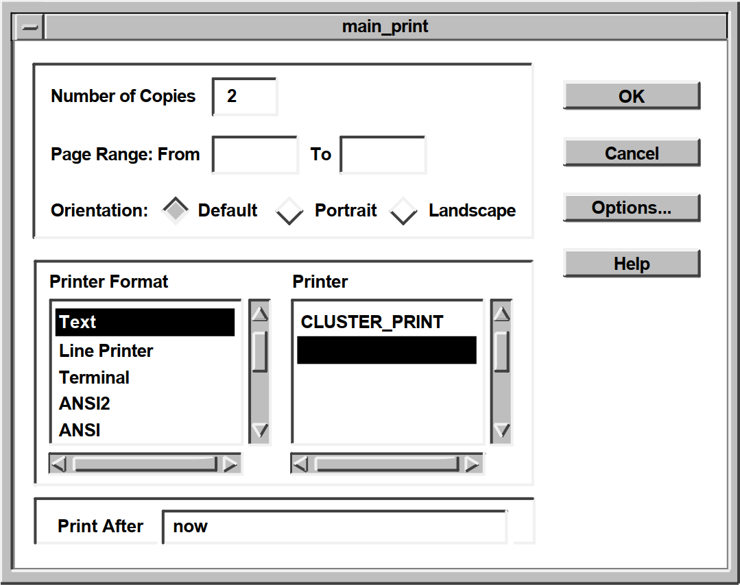 |
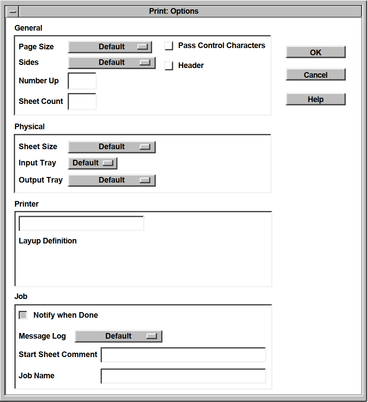 |
7.4. Print Widget Callbacks
|
Callback |
Description |
|---|---|
|
XmNokCallback |
The user clicked on the OK push button in the print widget main dialog box. If the DXmNunmanageOnOk resource is set, the print widget automatically unmanages itself when the OK button in the main box is pressed. Your application can use the XmNokCallback callback to perform other functions, such as calling the XtGetValues routine to get and store the user's print choices, or calling DXmPrintWgtPrintJob to submit the print job. |
|
XmNcancelCallback |
The user clicked on the Cancel push button in the print widget main dialog box. If the DXmNunmanageOnCancel resource is set, the print widget automatically unmanages itself when the Cancel button in the main box is pressed. Your application can use the XmNcancelCallback callback to perform other functions. |
7.5. Print Widget File-Type Guesser
If your application program specifies the DXmNfileNameList resource, the print widget uses the file extension, when one exists, to guess the type and the associated print format of the first file to be printed. The print widget then establishes some print defaults based on this file type. Therefore, if you use the DXmNfileNameList resource to specify a list of files, those files should all be of one type; that is, they should all be text files, or they should all be PostScript files, and so forth.
Applications that do not know the attributes of the files to be printed should use the DXmNfileNameList resource and rely on the print widget file-type guesser. If the print widget incorrectly guesses the format of the file to be printed, the user can select the correct print format.
7.6. Print Widget Resources
You can specify print widget resources, described in the DECwindows Extensions to Motif manual, that define how the print widget first appears to the user. The user then has the option to modify the print options as needed.
General
Print Format
Printer
Job
General
Physical
Printer
Job
Note
DXmNprinterFormList
DXmNprinterFormCount
DXmNprinterList
DXmNprinterCount
Your application should not attempt to set these resources. If your application needs the value of this resource, call the XtGetValues routine to obtain the value.
.
.
.
object myprint_widget : DXmPrintDialog
{
arguments
{
XmNnoResize = true;
DXmNnumberCopies = 13;
DXmNpageRangeFrom = compound_string("3");
DXmNpageRangeTo = compound_string("20");
DXmNprintFormatList = compound_string_table
("PostScript(R)",
"DDIF",
"ANSI");
DXmNprintFormatCount = 3;
DXmNprintFormatChoice = compound_string("ANSI");
DXmNorientation = DXmORIENTATION_PORTRAIT;
DXmNprintAfter = compound_string("23-JUN-1990 17:30");
DXmNdeleteFile = true;
DXmNpageSize = DXmSIZE_LEDGER;
DXmNsides = DXmSIDES_SIMPLEX_ONE;
DXmNnumberUp = 0;
DXmNsheetCount = 1;
DXmNfileStartSheet = DXmFILE_SHEET_NONE;
DXmNfileEndSheet = DXmFILE_SHEET_ONE;
DXmNfileBurstSheet = DXmFILE_SHEET_ALL;
DXmNmessageLog = DXmMESSAGE_LOG_DEFAULT;
DXmNholdJob = true;
DXmNnotify = false;
DXmNsheetSize = DXmSIZE_LEGAL;
DXmNinputTray = DXmINPUT_TRAY_DEFAULT;
DXmNoutputTray = DXmOUTPUT_TRAY_DEFAULT;
DXmNjobName = compound_string("This is the Job Name");
DXmNoperatorMessage = compound_string("This is the Operator Message");
DXmNheader = true;
DXmNdoubleSpacing = true;
DXmNstartSheetComment = compound_string("This is the Start Sheet Comment");
DXmNpriority = 12;
DXmNunmanageOnOk = true;
DXmNunmanageOnCancel = true;
DXmNfileNameList = compound_string_table
("order.txt",
"test.txt");
DXmNfileNameCount = 2;
DXmNsuppressOptionsMask = DXmSUPPRESS_NUMBER_COPIES;
DXmNoptionsDialogTitle = compound_string("Secondary Dialog Box");
};
.
.
.Generally, you should not set user-choice and default resources such as DXmNprinterChoice and DXmNdefaultPrinter in the UIL file because they vary from system to system. As described in the OSF/Motif Programmer's Guide, your application can use application-specific default files to specify resources that are not explicitly set in the C or UIL modules. You might want to specify user-choice and printer default resources in a defaults file.
7.6.1. Suppressing Print Widget Features
The print widget includes a DXmNsuppressOptionsMask
argument that you can use to suppress print widget features. As an applications
programmer, you might want to use the DXmNsuppressOptionsMask
argument to limit the print choices available to the user.
DXmNsuppressOptionsMask argument is a bitmask; you
perform a logical OR operation on the resources you want to suppress. When using the
Toolkit routines, this means that you would OR the resources in a call to XtSetArg,
as shown in the following C example:XtSetArg (arglist[ac], DXmNsuppressOptionsMask,
DXmSUPPRESS_DELETE_FILE | DXmSUPPRESS_OPERATOR_MESSAGE); ac++;
object main_print : DXmPrintDialog
{
arguments
{
XmNdialogTitle = "DECburger: Print";
DXmNoptionsDialogTitle = "DECburger: Print Options";
DXmNnumberCopies = 2;
DXmNunmanageOnOk = true;
DXmNunmanageOnCancel = true;
DXmNsuppressOptionsMask = DXmSUPPRESS_DELETE_FILE +
DXmSUPPRESS__OPERATOR_MESSAGE;
};
callbacks
{
XmNhelpCallback = procedure sens_help_proc(k_print_help);
};
};DXmNsuppressOptionsMask are as
follows: DXmSUPPRESS_NONE
DXmSUPPRESS_DELETE_FILE
DXmSUPPRESS_NUMBER_COPIES
DXmSUPPRESS_PAGE_RANGE
DXmSUPPRESS_PRINT_FORMAT
DXmSUPPRESS_ORIENTATION
DXmSUPPRESS_PRINTER
DXmSUPPRESS_PRINT_AFTER
DXmSUPPRESS_PAGE_SIZE
DXmSUPPRESS_SIDES
DXmSUPPRESS_NUMBER_UP
DXmSUPPRESS_SHEET_COUNT
DXmSUPPRESS_FILE_START_SHEET
DXmSUPPRESS_FILE_END_SHEET
DXmSUPPRESS_FILE_BURST_SHEET
DXmSUPPRESS_MESSAGE_LOG
DXmSUPPRESS_HOLD_JOB
DXmSUPPRESS_NOTIFY
DXmSUPPRESS_SHEET_SIZE
DXmSUPPRESS_INPUT_TRAY
DXmSUPPRESS_OUTPUT_TRAY
DXmSUPPRESS_JOB_NAME
DXmSUPPRESS_OPERATOR_MESSAGE
DXmSUPPRESS_HEADER
DXmSUPPRESS_AUTOMATIC_PAGINATION
DXmSUPPRESS_DOUBLE_SPACING
DXmSUPPRESS_LAYUP_DEFINITION
DXmSUPPRESS_START_SHEET_COMMENT
DXmSUPPRESS_PASS_ALL
DXmSUPPRESS_PRINTER_FORM
DXmSUPPRESS_PRIORITY
DXmSUPPRESS_SETUP
7.6.2. Adding Print Widget Functions
unsigned long int DXmPrintWgtAugmentList(pw,list,data)
Widget pw;
int list;
caddr_t data;pw argument identifies the print
widget. You must choose the DXmPrintWgtAugmentList list
argument from the following constants: DXmPRINT_FORMAT
DXmPAGE_SIZE
DXmSIDES
DXmFILE_START_SHEET
DXmFILE_END_SHEET
DXmFILE_BURST_SHEET
DXmMESSAGE_LOG
DXmSHEET_SIZE
DXmINPUT_TRAY
DXmOUTPUT_TRAY
data argument is a data structure (passed by reference)
of type DXmPrintFormatStruct or DXmPrintOptionMenuStruct. The
DXmPrintFormatStruct data structure is declared as follows:
typedef struct _DXmPrintFormatStruct
{
XmString ui_string;
XmString os_string;
XmString var_string;
} DXmPrintFormatStruct;The ui_string field is the label displayed in the user interface. The os_string field is passed to the operating system to identify the print format. The var_string field is the OpenVMS logical or UNIX environment variable that identifies the printer list to use for the print format.
typedef struct _DXmPrintOptionMenuStruct
{
XmString ui_string;
XmString os_string;
} DXmPrintOptionMenuStruct;The ui_string field is the label displayed in the user interface and the os_string field identifies the print option to the operating system.
DXmPrintWgtAugmentList returns NULL if the request fails. If the request is successful, DXmPrintWgtAugmentList returns an integer that identifies the new element. This integer is not needed when adding print formats. However, the integer can be used in subsequent XtGetValues and XtSetValues calls on the option menus.
For example, if an application added an option to an option menu and wanted to select the added option, it would use the returned integer in an XtSetValues call.
7.6.2.1. Adding Print Formats
When adding print formats, use the constant DXmPRINT_FORMAT for the
list argument and a variable of type
DXmPrintFormatStruct for the data argument. All fields in
the DXmPrintFormatStruct structure must contain valid compound strings; null
compound strings are not allowed.
The DXmNpassAll resource is set to FALSE (off) and DXmNautoPagination is set to TRUE (on) if the added format is selected. If this is not the desired behavior, your application must set DXmNpassAll and DXmNautoPagination to the desired settings in the XmNokCallback callback.
.
.
.
DXmPrintFormatStruct r_my_struct;
r_my_struct.ui_string = XmStringCreateLtoR("User String",
XmSTRING_DEFAULT_CHARSET);
r_my_struct.os_string = XmStringCreateLtoR("OS String",
XmSTRING_DEFAULT_CHARSET);
r_my_struct.var_string = XmStringCreate("Logical",
XmSTRING_DEFAULT_CHARSET);
DXmPrintWgtAugmentList(print_widget, DXmPRINT_FORMAT, &r_my_struct));
.
.
.7.6.2.2. Adding to Option Menus
When adding options to print widget option menus, use one of the constants
(other than DXmPRINT_FORMAT) for the list argument and a
variable of type DXmPrintOptionMenuStruct for the data
argument.
The ui_string field of the DXmPrintOptionMenuStruct data structure must contain a valid compound string. The os_string field of the DXmPrintOptionMenuStruct data structure must be either a valid compound string or NULL.
If the field is not NULL, the print widget sends the os_string field string to the operating system when the option is selected by the user.
If the field is NULL, the print widget does not send anything to the operating system if the option is selected by the user. That is, the print widget functions as though the default had been selected.
Applications can add only a limited number of options to each option menu. If an application tries to add more options than allowed, DXmPrintWgtAugmentList returns a status of 0.
.
.
.
DXmPrintOptionMenuStruct r_my_struct;
r_my_struct.ui_string = XmStringCreateLtoR("User String",
XmSTRING_DEFAULT_CHARSET);
r_my_struct.os_string = XmStringCreateLtoR("OS String",
XmSTRING_DEFAULT_CHARSET);
DXmPrintWgtAugmentList(print_widget, DXmPAGE_SIZE, &r_my_struct));
.
.
.7.7. Creating the Print Widget with UIL
.
.
.
!The print widget object
object main_print : DXmPrintDialog
{
arguments
{
XmNdialogTitle = "DECburger: Print";
DXmNoptionsDialogTitle = "DECburger: Print Options";
DXmNnumberCopies = 2;
DXmNunmanageOnOk = true;
DXmNunmanageOnCancel = true;
};
callbacks
{
XmNhelpCallback = procedure sens_help_proc(k_print_help);
};
};
.
.
.
| Create an instance of the print widget. By default, print two copies of the file or files and unmanage the print widget when the OK or Cancel push buttons are pressed. |
.
.
.
#include <DXm/DXmPrint.h>
.
.
.
/* Print Widget Creation */
static void create_print()
{
unsigned int ac;
Arg arglist[10];
XtCallbackRec callback_arg[2];
start_watch();
if (!print_widget) {
if (MrmFetchWidget (s_MrmHierarchy, "main_print", toplevel_widget,
&print_widget, &dummy_class) != MrmSUCCESS)
s_error ("can't fetch print widget");
callback_arg[0].callback = activate_print;
callback_arg[0].closure = 0;
callback_arg[1].callback = NULL;
callback_arg[1].closure = NULL;
ac = 0;
XtSetArg (arglist[ac], XmNokCallback, callback_arg);ac++;
XtSetArg (arglist[ac], DXmNsuppressOptionsMask,
DXmSUPPRESS_DELETE_FILE | DXmSUPPRESS_OPERATOR_MESSAGE); ac++;
XtSetValues (print_widget, arglist, ac);
}
XtManageChild(print_widget);
stop_watch();
}
.
.
.
| If an instance of the print widget does not already exist, fetch one. |
| Assign values to elements of the callback routine list. Each callback routine data structure contains the address of a callback routine and a tag. In this case the callback routine is activate_print and there is no tag value. The null values signify the end of the callback routine list. |
| The XmNokCallback resource uses the null-terminated argument list to determine what routines to call when a user presses the OK push button. |
| Suppress the delete file and operator message resources. |
| Call XtSetValues to set the values for the print widget. |
| Manage the print widget. |
7.8. Creating the Print Widget with a Toolkit Routine
. . . #include <DXm/DXmPrint.h> . . .
| The OpenVMS DECburger application defines the print widget in its global data section so that it can be referenced throughout the source file. DECburger explicitly initializes print_widget to null to make sure that it does not contain a garbage value. DECburger later tests print_widget to see if it exists, thereby preventing a garbage value from producing unexpected results. |
| The num_copies variable is used to set the DXmNnumberCopies resource. This example sets the number of copies to 2 by default. |
| DECburger declares the callback routine list as an array of callback routine data structures. Note that the array contains two elements. All callback routine lists must contain at least two elements because a callback routine list is a null-terminated list. |
| Test to see if the print widget already exists. If the print widget already exists, DECburger only needs to manage it. |
| Assign values to elements of the callback routine list. Each callback routine data structure contains the address of a callback routine and a tag. In this case, the callback routine is activate_print and there is no tag value. The null values signify the end of the callback routine list. |
| Call the XtSetArg intrinsics routine once for each resource you want to specify. DECburger sets the DXmNunmanageOnOk and DXmNunmanageOnCancel resources to unmanage the print widget when the OK or Cancel push button in the print widget main dialog box is pressed. |
| DECburger suppresses the Delete File and Operator Message options; the user cannot use the print widget to delete the file being printed, and operator messages are suppressed. |
| Call the DXmCreatePrintDialog routine to create the print widget. DXmCreatePrintDialog returns the widget ID of the print widget. |
| Manage the newly created print widget. |
| If the print widget already existed, DECburger only needs to manage the existing print widget. |
7.9. Submitting Print Jobs
After you have created an instance of the print widget through either UIL or the Toolkit routine, you must submit the print job to the printer queue. The DXmPrintWgtPrintJob routine is provided for this purpose. You pass the ID of the print widget, a list of the files to print, and the number of files to print to the DXmPrintWgtPrintJob routine.
.
.
.
static void activate_print(w, tag, reason)
Widget w;
int *tag;
XmAnyCallbackStruct *reason;
{
unsigned long int l_status;
XmString file_pointer[1];
int l_num_names,l_i;
char at_buffer[30];
FILE *fopen(), *fp;
if ((fp = fopen("order.txt", "w")) != NULL) {
fprintf(fp, "Function Not Yet Implemented\n");
fclose(fp);
file_pointer[0] = XmStringCreateLtoR("order.txt",
XmSTRING_DEFAULT_CHARSET);
l_status = DXmPrintWgtPrintJob(print_widget, file_pointer, 1);
printf("DXmPrintWgtPrintJob return status: %x\n",l_status);
}
}
.
.
.
| Open a file called order.txt for writing. If the open is successful, print the "Function Not Yet Implemented" message in the file and close it. |
| Create a compound string from the file name. |
| Call the DXmPrintWgtPrintJob routine, specifying the print widget ID, an XmString array containing the order.txt file, and the number of files to print (1). |
| Print the print-job status on the standard output. |
Chapter 8. Using the Compound String Text Widget
An overview of the compound string text widget in the DECwindows Motif Toolkit
A description of the support routines used with the compound string text widget
8.1. Overview of the CSText Widget
A compound string is a string stored with character set and writing information. A compound string can consist of multiple segments, where each segment in the string can have a different character set and writing direction properties.
In a compound string, you specify not only the characters in the text string, but also the character set and writing direction you want for displaying the text string on a workstation screen. All DECwindows Motif Toolkit widgets that contain text labels use compound strings to represent these labels. By using the compound string text widget, you enable users of your application to enter and edit text in the same character set and writing direction used throughout the user interface for your application.
DXmCreateScrolledCSText
DXmCreateCSText
Both versions of the CSText widget let users of your application enter text or edit existing text using the keyboard. The difference between the two widgets is that the DXmCreateScrolledCSText widget supports horizontal and vertical scroll bars, while DXmCreateCSText does not.
With the exception of the scroll bars, both versions of the CSText widget have the same visual appearance. The text entry area contains a text cursor that indicates where text will be inserted. When the widget has input focus, the text cursor blinks and is displayed at full brightness. When the widget does not have input focus, the text cursor appears dimmed and does not blink.
The text cursor in the CSText widget can also indicate the current editing
direction. The editing direction is the direction in which characters
can be inserted or deleted. If your application sets the
DXmNbidirectionalCursor resource to true, users of your
application can switch between the left-to-right and right-to-left editing directions by
pressing the toggle key (F17). DXmNbidirectionalCursor is FALSE
by default.
Whenever a user changes the editing direction in a CSText widget, the shape of the text cursor, called a bidirectional text cursor, can change to indicate the new editing direction. When the CSText widget does not have input focus, it contains a dimmed, standard text cursor. For information on how to create a CSText widget with a bidirectional text cursor, see Section 8.2.2.7, ''Identifying the Current Writing and Editing Directions''.
The widget uses the callback mechanism to notify your application when the text it contains changes. Note, however, that the widget does not return the text in the callback. To retrieve the text, you must use the XtGetValues intrinsic routine or one of the support routines provided by the DECwindows Motif Toolkit for use with the CSText widget. For more information about this topic, see Section 8.2.1.2, ''Retrieving Compound Strings from a CSText Widget''.
|
Routine Name |
Description |
|---|---|
|
Manipulating the Text Content of the Widget | |
|
DXmCSTextCopy |
Copies the currently selected (highlighted) text to the clipboard. |
|
DXmCSTextCut |
Deletes the currently selected (highlighted) text after copying it to the clipboard. |
|
DXmCSTextGetString |
Returns the compound string that is the current value of the CSText widget. |
|
DXmCSTextInsert |
Inserts the new compound string into the compound string at the specified position. |
|
DXmCSTextNumLines |
Returns the number of output lines in the compound string text widget. |
|
DXmCSTextPaste |
Pastes the data on the clipboard into the text at the current cursor position. |
|
DXmCSTextRemove |
Removes the currently selected (highlighted) text. |
|
DXmCSTextReplace |
Replaces the compound string characters between "from" and "to" with the given string; "from" and "to" are zero-based character offsets that include new lines. |
|
DXmCSTextSetString |
Replaces the text of the CSText widget with completely new text. |
|
DXmCSTextHorizontalScroll |
Scrolls text by the given number of pixels. |
|
DXmCSTextGetEditable |
Returns a Boolean value that indicates whether the user of the application can edit the current text contents of the widget. When this routine returns TRUE (1), the user can edit the text; when it returns FALSE (0), the user cannot edit the text. |
|
DXmCSTextGetInsertionPosition |
Returns the position (offset) of the insertion cursor. |
|
DXmCSTextGetLastPosition |
Returns the position (offset) corresponding to the last character in the string. |
|
DXmCSTextGetMaxLength |
Returns the maximum length of text that the widget will allow a user to enter. |
|
DXmCSTextGetTopPosition |
Returns the position (offset) of the top left (or top right) character in the displayed text. |
|
DXmCSTextPosToXY |
Identifies the |
|
DXmCSTextXYToPos |
Identifies the position in the text of the character nearest
to a specified |
|
DXmCSTextHorizontalScroll |
Scrolls text by the given number of pixels. |
|
DXmCSTextSetAddMode |
Controls whether the CSText widget is in Add Mode, which allows the user to move the insert cursor without affecting the primary selection. |
|
DXmCSTextSetEditable |
Sets the Boolean value that indicates whether the user can edit the current text contents of the CSText widget. To allow editing, set this value to TRUE. |
|
DXmCSTextSetHighlight |
Changes the highlighting mode of a compound string. |
|
DXmCSTextSetInsertionPosition |
Sets the insertion cursor to the given position (offset) in the source. |
|
DXmCSTextSetMaxLength |
Sets a size limit in characters, including newline characters, that the user can enter in the widget. |
|
DXmCSTextSetTopPosition |
Sets the position (offset), which will be at the top left (or top right) of the displayed text. |
|
DXmCSTextShowPosition |
Forces the given position to be displayed. |
|
DXmCSTextVerticalScroll |
Scrolls text by the specified number of lines. |
|
DXmCSTextClearSelection |
Cancels the selection of compound string text in the widget and turns off highlighting of the text. |
|
DXmCSTextGetSelection |
Gets the portion of the compound string text that has been selected using the selection mechanism. Selected text is highlighted on the display. |
|
DXmCSTextGetSelectionInfo |
Returns the left and right positions (offsets) corresponding to the currently selected (highlighted) text. Returns FALSE if there is no currently selected text. |
|
DXmCSTextHasSelection |
Returns TRUE if the compound string text widget currently owns the primary selection. |
|
DXmCSTextSetSelection |
Sets the portion of the compound string text specified by the start and end point positions as the selection, and highlights the text on the screen. |
8.2. Modifying CSText Widget Resources
The following sections describe how to use the resources of the CSText widget and the CSText widget support routines.
8.2.1. Manipulating the Text Contents of the CSText Widget
XtSetValues or XtGetValues intrinsic routines
CSText widget support routines
The support routines use fewer system resources and, therefore, are more efficient.
The support routines do not require that you create an argument list.
8.2.1.1. Placing a Compound String in a CSText Widget
To place a compound string in a CSText widget after the widget has been created, you can use the XtSetValues intrinsic routine or a support routine.
To use the XtSetValues intrinsic routine, specify the address of the compound
string as the value of the XmNvalue resource in an
argument list (the default value is null). Then pass this argument list to the
XtSetValues intrinsic routine to assign the value to the widget resource.
You can use the CSText widget support routines to either modify the text the widget contains or replace the text entirely.
The identifier of the CSText widget
The position in the text where the text to be replaced begins
The position in the text after the text to be replaced ends
The new text that you want to put in place of the existing text
Specify the position in the text as an offset from the beginning. Determine the offset by counting the characters, including spaces and new lines. The first character is numbered 0 (zero). Successive characters are numbered sequentially.
Use the DXmCSTextInsert routine to insert a new compound string into the compound string text source at the specified position. Specify the same position for both the start and the end points. If the start and end points are not specified as the same position, the text in the section defined by the start and end points is replaced by the new text.
Use the DXmCSTextPaste routine to insert the data on the clipboard into the text at the current cursor position.
Use the DXmCSTextSetString routine to replace all the text in a CSText widget.
This routine places the address of the new text in the
XmNvalue resource.
8.2.1.2. Retrieving Compound Strings from a CSText Widget
To retrieve the current value of a CSText widget, you can use the XtGetValues intrinsic routine or a support routine.
To use the XtGetValues intrinsic routine, create a variable to hold the
address of the compound string and specify this variable as the value of the
XmNvalue resource in an argument list. Then pass this
argument list to the XtGetValues intrinsic routine. The XtGetValues intrinsic
routine writes the address contained in the XmNvalue
resource into the variable that you specified in the argument list. Do not free
the returned pointer.
Use the DXmCSTextGetString support routine to retrieve the current contents of
the CSText widget. This support routine returns the value of the
XmNvalue resource. Free the returned pointer.
.
.
.
static void change_cs(w, tag, reason)
Widget w;
int *tag;
XmNanyCallbackStruct *reason;
{
int ac = 0;
Arg arglist[15];
XmString new_text;
XtCallbackRec ok_arg[2];
new_text = DXmCSTextGetString(w);
ac = 0;
XtSetArg( arglist[ac], XmNdialogTitle, new_text);ac++;
XtSetValues (text_shell, arglist, ac);
.
.
.
XtFree(new_text);
.
.
.
} 8.2.1.3. Disabling Text Editing
By default, users can edit the text contained in the CSText widget. However,
you can disable text editing by setting the XmNeditable
resource to FALSE (by default, this resource is TRUE). To change this value
after the widget has been created, use the XtSetValues intrinsic routine or the
support routines.
Use the DXmCSTextSetEditable and DXmCSTextGetEditable support routines to set
and read the XmNeditable resource.
8.2.1.4. Limiting the Length of the Text
You can specify the maximum amount of text that the user can enter in the
CSText widget by using the XmNmaxLength resource. To
assign a value to this resource at run time, use the XtSetValues intrinsic
routine or the DXmCSTextSetMaxLength support routine. To read the value of this
resource at run time, use the XtGetValues intrinsic routine or the
DXmCSTextGetMaxLength support routine. Example 8.6, ''Toolkit CSText Creation Routine''
includes an example of setting the XmNmaxLength
resource.
8.2.2. Customizing the Appearance of the CSText Widget
Size
Margins
Resizing behavior
Scroll bar positioning
Text cursor appearance
Position of the insertion point
Current writing direction
Current editing direction
The sections that follow describe these resources.
8.2.2.1. Specifying Size
To specify the dimensions of the CSText widget, use the
XmNcolumns and XmNrows
resources. These resources specify the size of the widget in relation to the
size of the characters they contain, which is determined by the fonts used to
display the characters.
Use the XmNcolumns resource to specify the width of the
CSText widget (each character width is referred to as a column). With this
attribute, you can specify the width by the number of characters that the widget
can contain horizontally. The default is 20 characters.
Use the XmNrows resource to specify the height of the
CSText widget. The height of each row is determined by the height of a
character. The overall height dimension of the CSText widget is determined by
the number of rows that you specify in the XmNrows
resource. The default is 1.
The exact measurement in pixels of these two dimensions depends on the font
being used. In the DECwindows Motif Toolkit, fonts are specified in font lists,
in this case in the XmNfontList argument. The CSText
widget, which can use as many fonts as are specified in the font list, uses the
maximum dimensional values from all of the specified fonts as the unit of the
XmNcolumns and XmNrows
resources.
Although you can specify the size of the CSText widget in pixels by using the
common widget resources XmNwidth and
XmNheight, this method is not recommended. Fixing the
size of the widget in this way creates a dependency on the font. The size you
specify might work well with a particular font, but if the font size is
increased, the text characters might no longer fit inside the widget.
8.2.2.2. Specifying Margins
You can specify the amount of space around the text entry area of the CSText
widget by using the XmNmarginWidth and
XmNmarginHeight resources.
Use the XmNmarginWidth resource to specify the amount
of space between the border of the widget and the beginning of the array of
characters. The length of the text determines the amount of space between the
end of the text and the border. Specify this margin in pixels. The default value
is 6.
Use the XmNmarginHeight resource to specify the amount
of space between the top and bottom borders of the widget and the top and bottom
edges of the text entry area. Specify this margin in pixels. The default value
is 6.
8.2.2.3. Controlling Resizing Behavior
Setting the resize resources to TRUE
Making the text wrap
Using the DXmCreateScrolledCSText routine
You can turn on the automatic resizing behavior of the CSText widget by using
the XmNresizeHeight,
XmNresizeWidth, or XmNwordWrap
resource. The default for these resources is FALSE.
To allow the CSText widget to increase its height, set the
XmNresizeHeight resource to TRUE. The
XmNresizeHeight resource is ignored if the
XmNscrollVertical resource is TRUE.
To allow the CSText widget to increase its width, set the
XmNresizeWidth resource to TRUE. Note that if
XmNresizeWidth is TRUE, the CSText widget will grow
to display all text even if you set XmNcolumns to 1. The
XmNresizeWidth resource is ignored if
XmNwordWrap is TRUE.
The XmNstringDirection resource determines in which
direction the CSText widget expands. For example, if the writing direction is
right-to-left, the widget attempts to expand to the left, keeping the rightmost
column fixed in its place. The default is left-to-right.
You can specify that the widget wrap words to the next line that would
otherwise extend beyond the edge of the line by setting the
XmNwordWrap resource to TRUE. This resource is
ignored if the XmNeditMode resource is set to
XmSINGLE_LINE_EDIT.
8.2.2.4. Scroll Bar Positioning
XmNscrollVertical or
XmNscrollHorizontal resource. Note that these
resources do not affect a non-scrolled CSText widget. Example 8.2, ''Creating a Scrolled CSText Widget'' demonstrates creating a scrolled CSText
widget. .
.
.
ac = 0;
XtSetArg( arglist[ac], XmNfontList, font_list ); ac++;
XtSetArg( arglist[ac], XmNx, 40);ac++;
XtSetArg( arglist[ac], XmNy, 100);ac++;
XtSetArg( arglist[ac], XmNrows, 2 ); ac++;
XtSetArg( arglist[ac], XmNcolumns, 35 ); ac++;
XtSetArg( arglist[ac], XmNmaxLength, 10 ); ac++;
XtSetArg( arglist[ac], XmNactivateCallback, callback_arg);ac++;
XtSetArg( arglist[ac], XmNscrollVertical, TRUE);ac++;
text_w = DXmCreateScrolledCSText(text_shell, "textwidget", arglist, ac );
XmFontListFree (font_list );
XtManageChild(text_w);
.
.
.
}If you include a vertical and a horizontal scroll bar in a CSText widget, the widget will not resize its height or width to fit additional text. The scroll bar enables the user to scroll through text that is not currently visible.
By default, the vertical scroll bar appears on the right side of the widget,
but you can make the scroll bar appear on the left side of the widget by setting
the XmNscrollLeftSide resource to TRUE. The default is
FALSE.
By default, the horizontal scroll bar appears on the bottom side of the
widget, but you can make the scroll bar appear on the top side of the widget by
setting the XmNscrollTopSide resource to TRUE. The
default is FALSE.
Your application can call the DXmCSTextHorizontalScroll and/or DXmCSTextVerticalScroll routines to scroll text horizontally by the specified number of pixels and/or vertically by the specified number of lines.
8.2.2.5. Controlling Text Cursor Appearance
How fast the text cursor blinks
Whether the text cursor is visible
Use the XmNblinkRate resource to specify how fast the
text cursor should blink. Specify this value in milliseconds. The default is 500
milliseconds.
Use the XmNcursorPositionVisible resource to determine
whether the text cursor is visible in the widget. The text cursor is visible
when it is drawn in the foreground color. Set this value to TRUE if you want the
text cursor to be visible. The default is TRUE.
Note that the XmNcursorPositionVisible argument
specifies only whether the text cursor should be drawn in the foreground color.
If the text cursor is positioned in a portion of the text that is not currently
visible in the CSText widget, the text cursor will not be visible. To ensure
that the text cursor is always in the visible portion of the text widget, use
the XmNautoShowCursorPosition resource (described in
Section 8.2.2.6, ''Positioning the Insertion Point'').
You can also specify whether the shape of the text cursor indicates the current editing direction. For information about this topic, see Section 8.2.2.7, ''Identifying the Current Writing and Editing Directions''.
8.2.2.6. Positioning the Insertion Point
Use the XmNcursorPosition resource to position the text
cursor within the text contents of the widget. Specify the position of the
insertion point as an offset from the beginning of the compound string.
Determine the offset by counting the number of characters in the string,
including spaces and new lines. The first character in a string is numbered 0
(zero). Successive characters are numbered sequentially.
To specify that the insertion point should always be in the visible portion of
a scrollable CSText widget, set the
XmNautoShowCursorPosition to TRUE. The default is
TRUE. This causes the widget to scroll as the position of the insertion point
changes, keeping the insertion point in the visible portion of the text.
The DXmCSTextGetInsertionPosition routine returns the current position of the insertion cursor. The position is an offset determined by counting the characters, including spaces and new lines. The first character is numbered 0 (zero). Successive characters are numbered sequentially.
To insert text at the end of the current compound string, call the DXmCSTextGetLastPosition routine to return the position of the last character in the compound string. Then, call the DXmCSTextSetInsertionPosition routine to set the insertion cursor to this position.
8.2.2.7. Identifying the Current Writing and Editing Directions
You can identify the current writing and editing directions of the text
contained in a CSText widget by reading the value of the
DXmNtextPath and
DXmNeditingPath resources.
The DXmNtextPath resource indicates the main writing
direction of the text in the CSText widget. The default is left to right. The
CSText widget sets the value of the DXmNtextPath resource
to the writing direction specified in the compound string that it contains when
it is created. If this compound string has multiple segments, the CSText widget
uses the value of the first segment.
The DXmNeditingPath resource indicates the writing
direction enabled for text entry and editing. For example, if the value of the
DXmNeditingPath resource is left to right, the delete
key deletes characters to the left of the insertion point. If the value is right
to left, the delete key deletes the character to the right of the insertion
point.
At widget creation time, the CSText widget sets the value of the
DXmNeditingPath resource to be the same as the value
of the DXmNtextPath resource. However, the value of the
DXmNeditingPath resource changes whenever a user
changes the editing direction.
Note
Users of your application can switch between the left-to-right and right-to-left editing directions by pressing the toggle key [F17].
The CSText widget can indicate the current editing direction by changing the
shape of the cursor. To use this feature, set the
DXmNbidirectionalCursor resource to TRUE. By default,
the text cursor does not indicate editing direction.
8.2.3. Multiline Editing in a CSText Widget
Like the XmText widget, the CSText widget supports multiline editing. See the OSF/Motif Programmer's Guide for a description of XmText multiline editing.
XmNeditMode resource to
XmMULTI_LINE_EDIT to enable multiline editing. Example 8.3, ''CSText Widget with Multiline Editing'' demonstrates how to create a CSText widget that implements multiline
editing. .
.
.
cstring = XmStringCreateLtoR("Line number 1\nLine number 2",
XmSTRING_ISO8859_1);
ac = 0;
XtSetArg( arglist[ac], XmNfontList, font_list ); ac++;
XtSetArg( arglist[ac], XmNx, 40);ac++;
XtSetArg( arglist[ac], XmNy, 100);ac++;
XtSetArg( arglist[ac], XmNrows, 2 ); ac++;
XtSetArg( arglist[ac], XmNcolumns, 35 ); ac++;
XtSetArg( arglist[ac], XmNactivateCallback, callback_arg);ac++;
XtSetArg( arglist[ac], XmNscrollVertical, TRUE);ac++;
XtSetArg( arglist[ac], XmNeditMode, XmMULTI_LINE_EDIT);ac++;
XtSetArg( arglist[ac], XmNvalue, cstring);ac++;
text_w = DXmCreateScrolledCSText(text_shell, "textwidget", arglist, ac );
XmStringFree(cstring);
.
.
.This example creates a scrolled CSText widget with multiline editing capability.
The XmNrows argument limits the CSText widget to two rows;
the user can use the scroll bar to view additional rows.
The initial compound string is displayed on two lines; the XmStringCreateLtoR routine scans the text for newline characters. When one is found, the text up to that point (Line number 1) is put into a segment followed by a separator component. Each segment can be individually selected.
XmNeditable resource to FALSE. By default, this resource
is TRUE.Note
The Enter key on the keypad generates the activate callback while in multiline editing mode.
8.2.4. Handling Text Selections
All applications running in the DECwindows or X Window System environment have access to a global selection facility. This facility allows users of applications to select portions of the display by moving the pointer cursor. Selected portions appear highlighted on the display.
Select text in the CSText widget.
Retrieve the selected text.
Copy selected text to the clipboard.
Cut selected text from the clipboard.
Paste selected text from the clipboard into your application.
Get position information about the selection.
Determine if the CSText widget owns the primary selection.
Cancel the current selection.
8.2.4.1. Selecting Text
The widget identifier of the CSText widget
The position in the text where you want to start the selection
The position in the text where you want to end the selection
The time of the event that led to the call to the selection
Section 8.2.1.2, ''Retrieving Compound Strings from a CSText Widget'' describes how to determine positions in a compound string.
You obtain the time stamp of the event that triggered the selection from the X Event data structure.
If the selected text contains the insertion point, the selected text is
deleted when new text is entered by the user. You can specify that this selected
text not be deleted by setting the XmNpendingDelete
resource to FALSE. By default, this resource is set to TRUE.
8.2.4.2. Retrieving Selected Text
Use the DXmCSTextGetSelection to retrieve the selected text in a CSText widget. The selected text is returned as a compound string.
8.2.4.3. Copy Selected Text to the Clipboard
The DXmCSTextCopy routine copies the selected (highlighted) text to the clipboard.
8.2.4.4. Pasting Selected Text from the Clipboard
The DXmCSTextPaste routine pastes the data on the clipboard into the text at the current cursor position.
8.2.4.5. Deleting Selected Text from the Clipboard
The DXmCSTextCut routine deletes the selected (highlighted) text after copying it to the clipboard.
8.2.4.6. Getting Position Information About the Selection
Use the DXmCSTextGetSelectionInfo routine to return the left and right positions of the selected (highlighted) text. As for the insertion cursor routines, the positions in the text are offsets determined by counting the characters, including spaces and new lines. The first character is numbered 0 (zero). Successive characters are numbered sequentially.
DXmCSTextGetSelectionInfo returns FALSE if there is no currently selected text.
Use the DXmCSTextPosToXY routine to identify the x and
y position of a specified character in the text. Use the
DXmCSTextXYToPos routine to identify the position in the text of the character
nearest to a specified x and y
position.
8.2.4.7. Determining Primary Selection Ownership
Use the DXmCSTextHasSelection routine to determine if the CSText widget owns the primary selection. See the OSF/Motif Programmer's Guide for a description of the primary selection mechanism.
8.2.4.8. Canceling the Selection of Text
Use the DXmCSTextClearSelection support routine to cancel the selection of text in the compound string text widget. DXmCSTextClearSelection turns off the selected text highlighting.
8.2.5. Associating Callbacks with CSText Widgets
When the text contained in a CSText widget changes, the widget uses the callback mechanism to notify your application. The text in the widget can change as the result of a user interaction, such as entering new text or editing existing text. Your program can also cause a callback by changing the text in a CSText widget using the XtSetValues intrinsic routine or a support routine.
In addition, the CSText widget performs callbacks whenever it accepts or loses input focus. Users can enter text from the keyboard only when the CSText widget has input focus. The CSText widget gets input focus when the user clicks MB1 anywhere within its borders.
The CSText widget performs a callback if it cannot find in its font list the character set required to display a segment of text. In this callback, the CSText widget identifies the required character set for which there is no entry in the font list. The CSText widget searches its font list a second time for the character set when the callback routine returns.
If you update the CSText widget's font list in the callback routine, the widget will find the character set in its font list and be able to display the text tagged with this character set. If you do not associate a callback routine with this callback reason, the CSText widget does not perform the second search of the font list. The CSText widget uses the first font found in the font list.
For complete information about the data returned in the callbacks performed by the CSText widget, see DECwindows Extensions to Motif.
|
Callback Resource |
Conditions for Callback |
|---|---|
|
XmNactivateCallback |
Specifies the list of callbacks that are called when the user performs an action (such as pressing Return). |
|
XmNmodifyVerifyCallback |
Specifies the list of callbacks called before text is deleted from or inserted into the CSText widget. |
|
XmNmotionVerifyCallback |
Specifies the list of callbacks called before the insert cursor is moved to a new position. |
|
XmNvalueChangedCallback |
Specifies the list of callbacks called when the text contained in the CSText widget has changed. This callback can be triggered by a user interaction or because your application has changed the text in the widget using the XtSetValues intrinsic routine or one of the CSText widget support routines. |
|
XmNfocusCallback |
Specifies the callback routine or routines called before the CSText widget has accepted the input focus. The default is null. |
|
XmNlosingFocusCallback |
Specifies the callback routine or routines called when the CSText widget is about to lose input focus. |
|
XmNhelpCallback |
Specifies the callback routine or routines called when a user has triggered a help callback. |
|
DXmNnoFontCallback |
Specifies the callback routine or routines called when the CSText widget cannot find a character set in its font list that is needed to display the text in a compound string. |
8.3. Conversion Routines
|
Routine Name |
Description |
|---|---|
|
DXmCvtCStoFC |
Converts a compound string to a file-compatible format string. Currently uses text format. |
|
DXmCvtFCtoCS |
Converts a string in the file-compatible format to a compound string. |
|
DXmCvtCStoOS |
Converts a compound string to an operating-system specific format. Currently uses text format. |
|
DXmCvtOStoCS |
Converts a string in the operating-system specific format to a compound string. |
|
DXmCvtCStoDDIF |
Converts a compound string into a DDIF format string. |
|
DXmCvtDDIFtoCS |
Converts a string in DDIF format to a compound string. |
8.4. Creating CSText Widgets
Create the CSText widget using any of the widget creation mechanisms listed in Table 8.4, ''Mechanisms for Creating CSText Widgets''.
Choose the mechanism that provides access to the widget resources you need to set.Table 8.4. Mechanisms for Creating CSText Widgets Mechanism
CSText Widget
Toolkit routine
Use the DXmCreateCSText routine to create a CSText widget without scroll bars.
Toolkit routine
Use the DXmCreateScrolledCSText routine to create a CSText widget with horizontal and/or vertical scroll bars. Your application must also set the XmNscrollVertical and/or XmNscrollVertical resource.
UIL object type
Use the UIL object type DXmCSText to define a CSText widget in a UIL module. At run time, the MRM routine MrmFetchWidget creates the widget according to this definition.
UIL object type
Use the UIL object type DXmScrolledCSText to define a scrolled CSText widget in a UIL module. At run time, the MRM routine MrmFetchWidget creates the widget according to this definition.
Manage the CSText widget by using the intrinsic routine XtManageChild.
After you complete these steps, the CSText widget appears on the display if its parent has been realized.
Toolkit routines and UIL provide access to the complete set of resources at widget creation time.
When you create a CSText widget, you can specify aspects of the initial appearance of the widget by assigning values to widget resources.
8.4.1. Using UIL to Create a CSText Widget
cs_font variable. .
.
.
module cstext
version = 'v1.0'
names = case_sensitive
procedure
cstext_activate();
value
cs_font : font('-ADOBE-Courier-Bold-R-Normal--14-140-*-*-M-90-ISO8859-1');
object
cstext_main : DXmCSText {
arguments
{
XmNfontList = cs_font;
XmNvalue = compound_string("Sample Text");
XmNx = 20;
XmNy = 20;
XmNrows = 2;
XmNcolumns = 25;
};
};
end module;
.
.
. .
.
.
#include <stdio>
#include <Mrm/MrmAppl.h>
#include <DXm/DXmCSText.h>
Widget toplevel, text_w;
static MrmHierarchy s_MrmHierarchy;
static MrmType *dummy_class;
static char *db_filename_vec[] =
{"cstext.uid"
};
int main(argc, argv)
unsigned int argc;
char **argv;
{
XtAppContext app_context;
MrmInitialize();
DXmInitialize();
toplevel = XtAppInitialize(&app_context, "example", NULL, 0,
                           &argc, argv, NULL, NULL, 0);
/* Open the UID files (the output of the UIL compiler) in the hierarchy*/
if (MrmOpenHierarchy(1,
db_filename_vec,
NULL,
&s_MrmHierarchy)
!=MrmSUCCESS)
printf("can't open hierarchy");
if (MrmFetchWidget(s_MrmHierarchy, "cstext_main", toplevel,
&text_w, &dummy_class) != MrmSUCCESS)
printf("can't fetch widget");
XtManageChild(text_w);
XtRealizeWidget(toplevel);
XtAppMainLoop(app_context);
}
.
.
.8.4.2. Using the Toolkit CSText Widget Creation Routine
   .
   .
   .
#include <stdio>
#include <Mrm/MrmAppl.h>
#include <DXm/DXmCSText.h>


static void change_cs();
static void ok_text();
XmString       cstring;


Widget toplevel, text_shell,
       text_label, text_w,
       ok_button;


int main(argc, argv)
    unsigned int argc;
    char **argv;
{
    XtAppContext   app_context;
    Arg            arglist[15];
    int            ac = 0;
    XFontStruct    *font;
    XmFontList     font_list;
    XtCallbackRec  callback_arg[2];

    toplevel = XtAppInitialize(&app_context, "example", NULL, 0, &argc,
                               argv, NULL, NULL, 0);

    ac = 0;
    cstring = XmStringCreateLtoR("User Defined", XmSTRING_ISO8859_1);
    XtSetArg( arglist[ac], XmNdialogTitle, cstring);ac++;
    XtSetArg( arglist[ac], XmNallowOverlap, TRUE);ac++;
    XtSetArg( arglist[ac], XmNheight, 300);ac++;
    XtSetArg( arglist[ac], XmNwidth, 300);ac++;
    XtSetArg( arglist[ac], XmNresizePolicy, XmRESIZE_GROW);ac++;

    text_shell = XmCreateBulletinBoard(toplevel, "CSText", arglist, ac );
    XmStringFree(cstring);


    ac = 0;
    cstring = XmStringCreateLtoR("Enter a 10-letter title\nfor this widget",
                                  XmSTRING_ISO8859_1);
    XtSetArg( arglist[ac], XmNlabelString, cstring);ac++;
    XtSetArg( arglist[ac], XmNx, 90);ac++;
    XtSetArg( arglist[ac], XmNy, 20);ac++;
    text_label = XmCreateLabel(text_shell, "textlabel", arglist, ac );
    XmStringFree(cstring);


    font = DXmLoadQueryFont( XtDisplay (toplevel),
                "-ADOBE-Courier-Bold-R-Normal--14-140-*-*-M-90-ISO8859-1");

    if (font == NULL){
               printf("Fonts Are Not Available");
               exit(0);
       }


    font_list = XmStringCreateFontList(font, XmSTRING_ISO8859_1);

    callback_arg[0].callback = change_cs;
    callback_arg[0].closure = 0;
    callback_arg[1].callback = NULL;
    callback_arg[1].closure = NULL;


    ac = 0;
    XtSetArg( arglist[ac], XmNfontList, font_list ); ac++;
    XtSetArg( arglist[ac], XmNx, 40);ac++;
    XtSetArg( arglist[ac], XmNy, 100);ac++;
    XtSetArg( arglist[ac], XmNrows, 2 ); ac++;
    XtSetArg( arglist[ac], XmNcolumns, 35 ); ac++;
    XtSetArg( arglist[ac], XmNmaxLength, 10 ); ac++;
    XtSetArg( arglist[ac], XmNactivateCallback, callback_arg);ac++;

    text_w = DXmCreateCSText(text_shell, "textwidget", arglist, ac );
    XmFontListFree (font_list );

    XtManageChild(text_w);

    XtManageChild(text_label);
    XtManageChild(text_shell);

    XtRealizeWidget(toplevel);


    XtAppMainLoop(app_context);

 }


 /* The user entered a new title*/


static void change_cs(w, tag, reason)
     Widget             w;
     int               *tag;
     unsigned long     *reason;
{
    int ac = 0;
    Arg arglist[15];
    XmString  new_text;
    XtCallbackRec   ok_arg[2];


    new_text = DXmCSTextGetString(w);
    XtUnmanageChild(w);

    ac = 0;
    XtSetArg( arglist[ac], XmNdialogTitle, new_text);ac++;
    XtSetValues (text_shell, arglist, ac);

    ac = 0;
    cstring = XmStringCreateLtoR("Thank you.\nPress OK to Exit",
                                  XmSTRING_ISO8859_1);
    XtSetArg( arglist[ac], XmNlabelString, cstring);ac++;
    XtSetValues (text_label, arglist, ac);
    XmStringFree(cstring);


    ok_arg[0].callback = ok_text;
    ok_arg[0].closure = 0;
    ok_arg[1].callback = NULL;
    ok_arg[1].closure = NULL;

    ac = 0;
    cstring = XmStringCreateLtoR("OK", XmSTRING_ISO8859_1);
    XtSetArg( arglist[ac], XmNlabelString, cstring);ac++;
    XtSetArg( arglist[ac], XmNactivateCallback, ok_arg);ac++;
    XtSetArg( arglist[ac], XmNheight, 60);ac++;
    XtSetArg( arglist[ac], XmNwidth, 60);ac++;
    XtSetArg( arglist[ac], XmNx, 125);ac++;
    XtSetArg( arglist[ac], XmNy, 150);ac++;
    ok_button = XmCreatePushbutton(text_shell, "ok", arglist, ac);

    XtFree(new_text);
    XmStringFree(cstring);

    XtManageChild(text_label);
    XtManageChild(ok_button);
    XtManageChild(text_shell);

}


 /* The user pressed OK*/


static void ok_text(w, tag, reason)
     Widget             w;
     int               *tag;
     unsigned long     *reason;
{
     exit(1);

}

   .
   .
   .
| Create a BulletinBoard widget to use as the parent. This example
program uses the CSText widget to change the title of the BulletinBoard
widget. The |
| Create a Label widget. The |
| Create a CSText widget with 2 rows, 35 columns, and a maximum length
of 10 characters. Note that the CSText widget is created with 35
columns, not 10, for appearance. The |
| Manage the CSText widget, the XmLabel widget, and the BulletinBoard widget. Realize the top-level widget. |
| As a result of an activate callback on the CSText widget, the change_cs callback is invoked. The change_cs callback calls DXmCSTextGetString to get the compound string derived from the user-entered value of the CSText widget and unmanages the CSText widget. |
| The compound string is used as the title of BulletinBoard widget. |
| The label of the XmLabel widget is then changed to "Thank you. Press OK to Exit" and the BulletinBoard, XmLabel, and XmPushbutton widgets are managed. When the user presses the OK push button, the program exits. |
Chapter 9. Using the SVN Widget
This chapter describes how to use the Structured Visual Navigation (SVN) widget in an application. The chapter includes examples from the demo SVN widget implementation found in the /usr/examples/motif directory on UNIX systems and in the DECW$EXAMPLES directory on OpenVMS systems. The demo uses many of the SVN resources and associated routines. Note that the SVN demo example is not available with Windows NT.
9.1. Overview of the SVN Widget
The SVN widget presents data in a hierarchical structure and lets the user navigate in, and select from, the structure.
You can use the SVN widget to present hierarchies of information in an organized manner, as shown in Figure 9.1, ''The SVN Widget'' from the SVN demo application. Your application need only tell the SVN widget about the organization of the data and respond to SVN widget callbacks; the SVN widget is responsible for actually displaying the data.
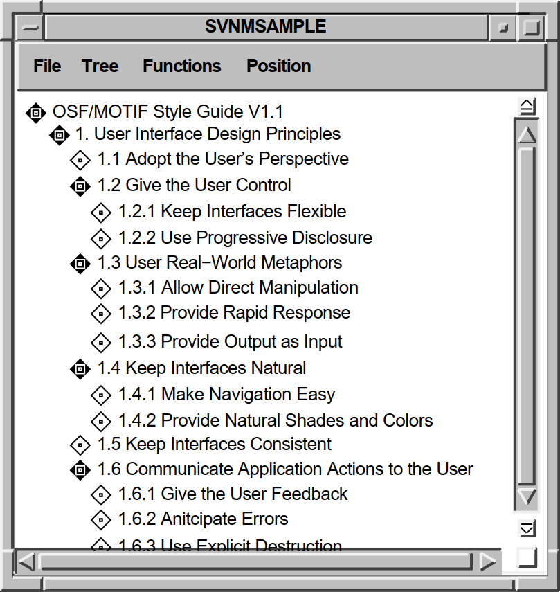
As another example, the DECwindows Mail application uses the SVN widget to create drawers that contain folders and folders that contain messages. In displaying this hierarchy, you can show just the drawers (the highest level of information hierarchy); you can open a drawer to display all the folders within it; and you can open a folder to display all the mail messages in the folder.
Your application is responsible for creating the hierarchy and supplying the data to the SVN widget; the actual data in the hierarchy is transparent to the SVN widget.
Outline format, as shown in Figure 9.1, ''The SVN Widget''.
Tree format, as shown in Figure 9.2, ''Tree Format''. The tree style can be oriented from the top, the left, in outline form, and in a user-defined style.
Column format, as shown in Figure 9.3, ''Column Format''. The difference between the outline and column formats is that in column format, a window pane separates a set of components from the rest of the display. You can scroll horizontally on each side, independently of the other side. However, you have only one vertical scroll bar.
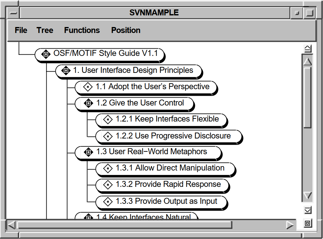
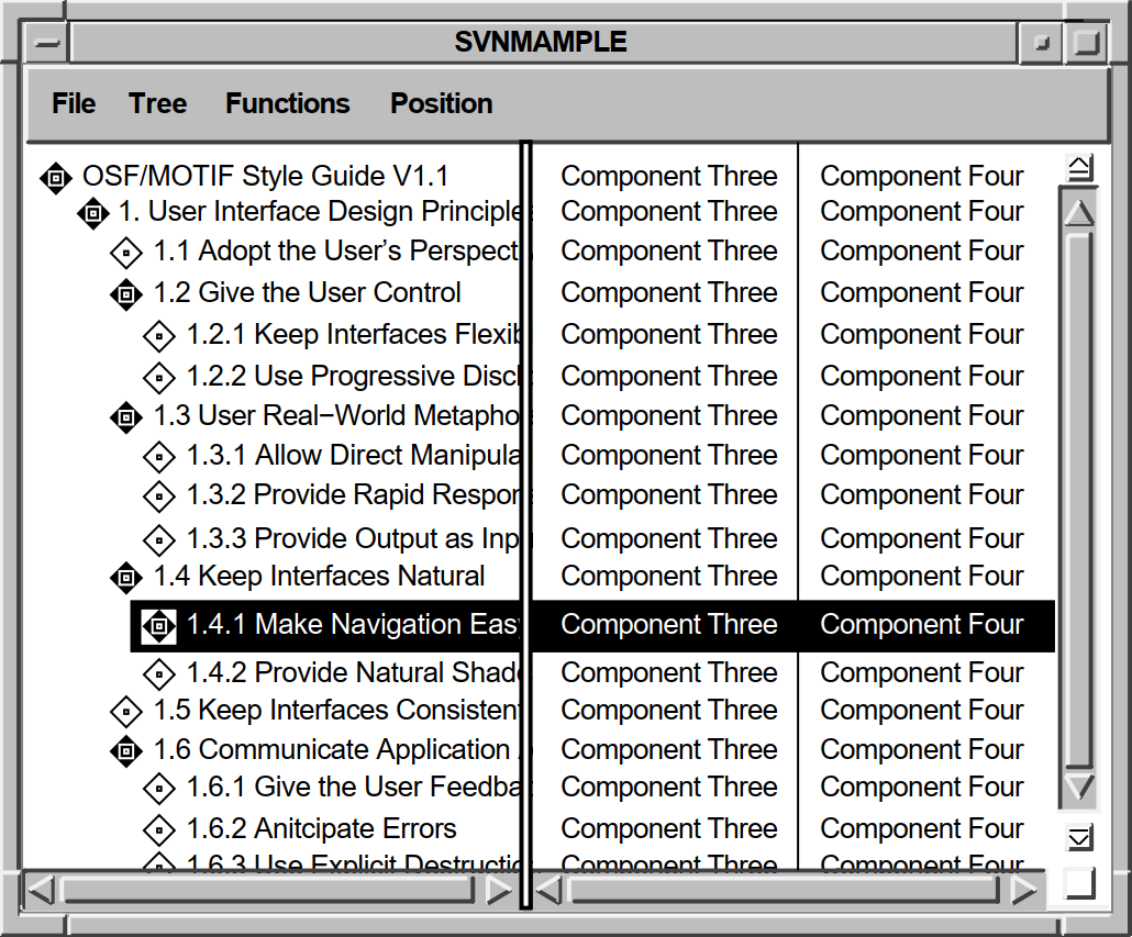
9.1.1. Components of an Entry
Each SVN line, or entry, in your hierarchy can display as many as 30 pieces of information, called components, depending upon the amount of information users need. The components can be of three data types: text, pixmaps, and widgets.
Icon—Depicts the state (expanded or collapsed) of an entry. For example, the folder icon in DECwindows Mail can show either a closed folder or an open folder. This component is set via the DXmSvnSetComponentPixmap routine.
Entry number—Gives the position of the entry within its sublevel, as set with the DXmSvnAddEntries routine.
Description—A short line of text that describes the entry. This resource is set via the DXmSvnSetComponentText or DXmSvnSetComponentWidget routines. You can use the
xandyarguments of the DXmSvnSetComponentText and DXmSvnSetComponentWidget routines to align the descriptions.Child summary—Lists the number and type of entries revealed when an entry is expanded. If an entry is expanded, this number reflects the number and type of children revealed. You can use the DXmSvnGetComponentTag routine to get the child summary information.
Not all of the components are always relevant to users. For example, the child summary would not be a relevant piece of information for a nonexpandable entry.
The SVN widget includes routines that allow your application to insert and remove components as necessary. Additional support routines allow you to set the text associated with a component, set a component hidden, set and determine a component's width, and determine a component's number.
9.1.2. Selection Mode
The term selection mode refers to the portion of an entry that is selected and displayed in reverse video in response to a user action. Mode selection (other than DXmSvnKselectEntry) is probably most useful in column mode. Note that you can select only the complete entry from the primary work window; the secondary work window lets you select individual components within an entry.
DXmSvnKselectEntry—Select the entire entry.
DXmSvnKselectComp—Select a component within an entry.
DXmSvnKselectCompAndPrimary—Select a component within the secondary work window and select the entire entry from the primary work window.
DXmSvnKselectEntryOrComp—Select the entire entry if in the primary work window or select the component if in the secondary work window.
The SVN widget includes support routines that allow your application to select entries chosen by users. Your application can call the DXmSvnGetNumSelections routine to determine how many entries are selected and the DXmSvnGetSelections routine to return the selected entry numbers. Additional routines set and clear selected entries and hide and show selections.
9.1.3. Tree-Mode Navigation Window
As a user navigates through the data hierarchy using tree display mode, it is possible to lose track of an entry's relative position within the hierarchy. The SVN widget includes a navigation window that users can use to find their relative position within the tree display mode. This navigation window is activated by a push button in the SVN widget. An example navigation window is shown in Figure 9.4, ''SVN Tree-Mode Navigation Window''.
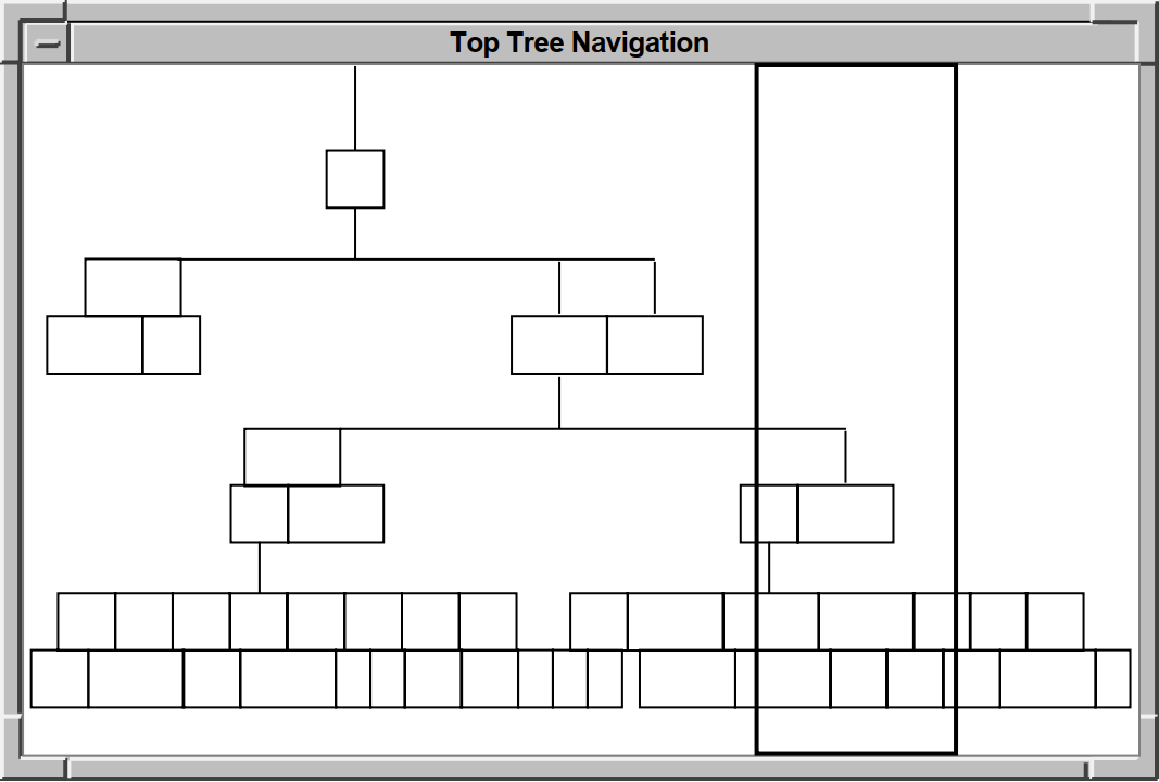 |
You can set the DXmSvnNnavWindowTitle resource to specify a title for this navigation window.
9.1.4. Location Cursor
The location cursor is a solid rectangle around the current entry. When the SVN widget is created, the location cursor is on the first entry in the display by default. Your application can set the DXmSvnNstartLocationCursor resource to specify which entry the location cursor should be first drawn on. This resource can be set only when the SVN widget is created.
After the first entry, the location cursor is always located on the last selected or toggled entry. In addition, all callbacks report which entry has the location cursor in the callback structure.
9.1.5. Highlighting Entries
The SVN widget includes support routines that allow your application to highlight entries chosen by users by enclosing them in dashed rectangular boxes. Your application decides how to treat the highlighted entries; the SVN widget does not assign any special significance to highlighted entries.
Your application can call the DXmSvnGetNumHighlighted routine to determine how many entries are highlighted and the DXmSvnGetHighlighted routine to return the highlighted entry numbers.
9.1.6. Editable Text
The SVN widget supports both read-only and read/write text in components.
Your application can call the DXmSvnSetComponentText routine to set a read-only compound string component and the DXmSvnGetComponentText routine to get the address of this compound string component.
For read/write text, your application can call the DXmSvnSetComponentWidget to use a subwidget as a component.
if (Editable)
   if (node->stext == 0)
      {

        Widget primary_window;
        XtSetArg (args[0], DXmSvnNprimaryWindowWidget, &primary_window);
        XtGetValues (svnw, args, 1);

        XtSetArg (args[0], XmNvalue,    node->text);
        XtSetArg (args[1], XmNcolumns,  50        );
        XtSetArg (args[2], XmNrows,     1         );
        XtSetArg (args[3], XmNwordWrap, FALSE     );
        node->stext = DXmCreateCSText(primary_window, "TextWidget", args, 4);
      };

   if (Editable)
        DXmSvnSetComponentWidget (svnw, data->entry_number, 2,
                                  pixmap_width+4, 0, node->stext);
    else
        DXmSvnSetComponentText (svnw, data->entry_number, 2,
                                pixmap_width+4, 0, node->text, fontlist);
9.1.7. Sensitive Entries
The SVN widget lets your application alter the sensitivity of an entry. The DXmSvnSetEntrySensitivity routine lets you make an entry sensitive or insensitive; the DXmSvnGetEntrySensitivity routine returns the sensitivity of an entry.
9.1.8. Disabling/Enabling the SVN Widget
The SVN widget provides routines that lock (DXmSvnDisableDisplay) and unlock (DXmSvnEnableDisplay) the SVN widget. These routines allow your application to make changes to the SVN widget and update the display without the user making additional changes. For example, if a user expands an entry, the DXmSvnDisableDisplay routine makes sure that further user actions are not processed until the expansion is completed and your application calls the DXmSvnEnableDisplay routine.
Your application does not need to disable and enable the SVN widget in response to a callback. The SVN widget automatically disables the widget prior to issuing the callback and automatically enables the widget upon return.
9.1.9. Invalidating the SVN widget
The SVN widget is unlike other widgets in that, when your application needs to change one or more components in an entry, the application calls the DXmSvnInvalidateEntry routine to make the SVN widget reflect the change.
Update the data hierarchy to reflect the new text.
Call XtSetArg and XtSetValues to use the new value in the CSText widget.
Call DXmSvnDisableDisplay to disable the SVN widget.
Call the DXmSvnInvalidateEntry routine. DXmSvnInvalidateEntry invokes the DXmSvnNgetEntryCallback callback, which should call the DXmSvnSetComponentWidget routine to use the revised CSText widget. Your application does not explicitly manage either the CSText or SVN widgets.
Call DXmSvnEnableDisplay to enable the SVN widget.
The components of an entry are internal to the SVN widget and cannot be set by calls to XtSetArg and XtSetValues. However, SVN resources not related to the components of an entry—for example, DXmSvnNtreePerpendicularLines—can be set by calls to XtSetArg and XtSetValues.
Your application can also call the DXmSvnValidateAll routine to make the SVN widget reflect changes to all the entries.
9.1.10. Outer Scroll Bar Arrows
The DXmSvnNuseScrollButtons resource creates outer arrows on a scroll bar. Outer arrows perform operations that are a magnitude greater than the inner, or stepper, arrows. Clicking on the up stepper arrow moves the display up one unit, which is the number of rows in the display. Clicking on the upper outer arrow moves the display to the top level of the hierarchy the user is currently viewing. The DXmSvnNuseScrollButtons resource is TRUE by default.
For example, if a screen displays messages 20 through 40 in a folder that contains 200 mail messages, clicking on the upper outer arrow causes messages 1 to 20 to be displayed; clicking on the lower outer arrow causes messages 180 to 200 to be displayed.
If the hierarchy is a single-rooted hierarchy, that is, it has one level-zero entry, then clicking Shift/MB1 on the outer arrows scrolls to the top or bottom.
If the hierarchy has multiple level-zero entries, clicking Shift/MB1 on the outer arrows scrolls the display to the top or bottom of each level 0 hierarchy.
In an application like DECwindows mail, which has multiple drawers (all at level 0) and multiple folders (at level 1), clicking Shift/MB1 on the outer arrows scrolls from drawer to drawer (level 0). Clicking MB1 scrolls from folder to folder.
The Ctrl/Up Arrow and Ctrl/Down Arrow keyboard sequences perform the same functions as the outer arrows without modifiers.
9.1.11. Scroll Bar Index Window
The SVN widget supports smooth scrolling for outline and column display mode when the DXmSvnNliveScrolling resource is set to TRUE. This is the default action.
However, if you set the DXmSvnNliveScrolling resource to FALSE, the SVN widget implements an index window. The index window is a special window, attached to the scroll bar, that offers a guide to the material to be displayed in the window when a user releases the mouse button. Your application can call the DXmSvnSetEntryIndexWindow routine to make sure an entry is displayed in the index window.
9.2. SVN Widget Programming Considerations
This section discusses SVN widget programming considerations, including topics related to the data hierarchy, enabling and disabling the SVN widget, manipulating components, and callbacks.
9.2.1. Creating the Data Hierarchy
The SVN widget displays the hierarchical structure supplied by the application. The actual information in the hierarchy is transparent to the SVN widget; the application is responsible for creating the hierarchy and supplying the individual lines of text to the SVN widget.
typedef struct node
    {
      int             level;
      int             number;
      XmString        text;
      struct node    *sibling;
      struct node    *children;
      Widget          stext;
      Boolean         opened;

}_Node, *NodePtr;|
Field |
Description |
|---|---|
|
level |
The level number of children. |
|
number |
The number of children. |
|
text |
Text (XmString) associated with an entry. |
|
sibling |
Pointer to the first sibling of this entry. |
|
children |
Pointer to the first child of this entry. If there are multiple children, they are tracked as siblings of the first child. |
|
stext |
CSText widget associated with an entry. |
|
opened |
Boolean value that indicates whether the entry is opened; that is, whether children are showing. |
The _Node data structure lets you visualize the relationship of the data in the hierarchy.
   .
   .
   .
/*
**  Fill in the child pointers for the book, parts, and chapters
*/
    B.children   = &P1;
    P1.children  = &C11;
    P2.children  = &C21;
    P3.children  = &C31;
    P4.children  = &C41;
    P5.children  = &C51;
    P6.children  = &C61;
    P7.children  = NULL;

    C11.children  = NULL;
    C12.children  = &C121;
    C13.children  = &C131;
    C14.children  = &C141;
    C15.children  = NULL;
    C16.children  = &C161;
    C17.children  = NULL;
    C21.children  = &C211;
    C22.children  = &C221;
    C23.children  = &C231;
    C31.children  = &C311;
    C32.children  = &C321;
    C33.children  = &C331;
    C41.children  = &C411;
    C42.children  = &C421;
    C43.children  = &C431;
    C44.children  = NULL;
    C51.children  = NULL;
    C52.children  = &C521;
    C53.children  = &C531;
    C54.children  = NULL;
    C55.children  = &C551;
    C61.children  = NULL;
    C62.children  = &C621;
    C63.children  = NULL;
    C64.children  = NULL;
    C65.children  = NULL;
    C66.children  = NULL;


/*
**  Fill in the sibling pointers for the book
*/
    B.sibling     =  NULL;


/*
**  Fill in the sibling pointers for the parts
*/
    P1.sibling    =  &P2;
    P2.sibling    =  &P3;
    P3.sibling    =  &P4;
    P4.sibling    =  &P5;
    P5.sibling    =  &P6;
    P6.sibling    =  &P7;
    P7.sibling    =  NULL;


/*
**  Fill in the sibling pointers for the chapters
*/
    C11.sibling  = &C12;
    C12.sibling  = &C13;
    C13.sibling  = &C14;
    C14.sibling  = &C15;
    C15.sibling  = &C16;
    C16.sibling  = &C17;
    C17.sibling  = &P2;

    C21.sibling  = &C22;
    C22.sibling  = &C23;
    C23.sibling  = &P3;
    C31.sibling  = &C32;
    C32.sibling  = &C33;
    C33.sibling  = &P4;
    C41.sibling  = &C42;
    C42.sibling  = &C43;
    C43.sibling  = &C44;
    C44.sibling  = &P5;
    C51.sibling  = &C52;
    C52.sibling  = &C53;
    C53.sibling  = &C54;
    C54.sibling  = &C55;
    C55.sibling  = &P6;
    C61.sibling  = &C62;
    C62.sibling  = &C63;
    C63.sibling  = &C64;
    C64.sibling  = &C65;
    C65.sibling  = &C66;
    C66.sibling  = &P7;

   .
   .
   .
The node->children field is a pointer to the first child of an entry. In the case of P1, there are seven children, C11 through C17. The first child has six siblings.
Note that the node->sibling field of C17 points at P2, not C21; C17 and C21 do not have the same parent. This organization reflects how the SVN demo equates the entry_number supplied in the callback with an entry in the data hierarchy. For more information, see Section 9.2.1.2, ''Understanding the entry_number Field''.)
The data is arranged so that the application does not have to go back up the hierarchy to the P level to find the next entry in the hierarchy. If the C21 entry is not opened, the SVN demo code travels down the C21 path to find the first sibling of C2. If the C2 entry is opened, the last child of C21, C212, has C22 as its sibling.
9.2.1.1. Attaching to Data—The DXmSvnNattachToSourceCallback Callback
After you create an instance of the SVN widget, you must attach it to the data for the hierarchy. The attachment is done in the DXmSvnNattachToSourceCallback callback routine, which is invoked when the SVN widget is realized.
Your application's DXmSvnNattachToSourceCallback callback establishes the data in a parent/child/sibling hierarchy and then calls the DXmSvnAddEntries routine to specify the initial entries (and number of entries) in the hierarchy.
One of the required arguments to the DXmSvnAddEntries routine is the entry number after which to add the new entries, which for the initial entry is zero. In this way, the SVN widget refers to the first entry as number 1.
An application can also specify an application-specific entry_tag argument to be associated with the entry.
entry_tags[0] = (unsigned int) &B;
DXmSvnAddEntries (svnw, 0, 1, 0, entry_tags, TRUE);
This call adds one entry (starting after zero) with a level of zero. The address of the first entry in the data hierarchy, _Node, is passed as a tag, and the entry appears in the scroll index window (if activated) when the user drags the slider.
The DXmSvnNattachToSourceCallback callback does not provide information about what the entries contain; that information is obtained by the GetEntry callbacks.
9.2.1.2. Understanding the entry_number Field
Your application must be able to equate the entry_number field supplied in the callback with an entry in your data hierarchy.
The SVN widget numbering sequence is sequential, starting with 1. The number associated with subsequent entries depends on whether these entries are opened and have children or siblings. If an entry is opened and has children, the children are included in the entry numbers. Otherwise, only the siblings are included.
entry_number
     1       OSF/Motif Style Guide
     2        1. User Interface Design Principles
     3        2. Input and Navigation Models
     4        3. Selection and Component Activation
     5        4. Application Design Principles
In this example, entry number 1 is opened and has children. However, the child of entry 1, "User Interface Design Principles", and that child's siblings are not opened. In this case, the entry_number value of 5 means that the user double clicked on "Application Design Principles".
entry_number
     1       OSF/Motif Style Guide
     2        1. User Interface Design Principles
     3         1.1 Adopt the User's Perspective
     4         1.2 Give the User Control
     5         1.3 Use Real-World Metaphors
     6         1.4 Keep Interfaces Natural
     7         1.5 Keep Interfaces Consistent
     8         1.6 Communicate Application Actions to the User
     9         1.7 Avoid Common Design Pitfalls
    10        2. Input and Navigation Models
    11        3. Selection and Component Activation
    12        4. Application Design Principles
In this case, an entry_number value of 5 means that the user double clicked on "Use Real-World Metaphors".
Note
Do not confuse node_number with references in the code to the node->number field, which tells if there are children.
   .
   .
   .

NodePtr LclGetNodePtr (node_number)

  int node_number;

{
    int i;
    NodePtr current_node = &B;

    if (node_number != 1)
       for (i = 2;  i <= node_number;  i++)
            if (current_node == NULL)
                 break;
            else if (current_node->opened)
                   current_node = current_node->children;
                   else current_node = current_node->sibling;

    return current_node;
This code loops through, trying to find the fifth entry. Assume the entry_number field in the callback has a value of 5. The code would go through four parent/sibling tests (2 through 5). The current_node field then contains the address of either a child or sibling, depending on which entries were opened.
9.2.1.3. Getting Information About an Entry
Once the data is attached to the SVN widget, the SVN widget triggers DXmSvnNgetEntryCallback to get information associated with the first entry, such as the number of components and the text from the data hierarchy to associate with the entry. Note that DXmSvnNgetEntryCallback is triggered to get information about any entry in the hierarchy not just the first entry.
Determines the font to use for the entry text.
Associates the entry_number field of the callback data structure with an entry in the data hierarchy.
Chooses the icon to use with the entry. If there are no children, the child pixmap is used. Otherwise the parent pixmap is used.
Calls the DXmSvnSetEntryNumComponents routine to set the number of components for this entry. The entries in the SVN demo application have two components: the icon to use and the text associated with the entry.
Calls the DXmSvnSetEntryTag routine to set the entry_tag field of this entry to the address of associated _Node data structure.
If the entry text is editable, creates a CSText widget to hold the text associated with the entry and makes it a managed subwidget of the SVN widget. For example, for the first entry, a CSText widget containing the text "Designing the User Interface" is made a managed child of the SVN widget.
9.2.1.4. Associating Hierarchy Data with SVN
Your application is responsible for linking the data in the hierarchy to entries in the SVN widget. To do this, your application callback routines call the DXmSvnAddEntries routine based on knowledge of the hierarchy data.
As described in Section 9.2.1.1, ''Attaching to Data—The DXmSvnNattachToSourceCallback Callback'', the top-level entry in the hierarchy is known by the SVN widget as entry number 1. When a user double clicks on this entry, the DXmSvnNselectAndConfirm callback is generated. The callback includes the entry_number of the entry, in this case 1. The DXmSvnCallbackStruct callback data structure is described in Section 9.4, ''Associating Callbacks with an SVN Widget''.
The callback indicates that the user wants to expand (or contract) this entry.
The demo SVN application's _Node data structure includes fields that track siblings (sibling), children (children), and whether or not the children of the element are expanded (opened). The DXmSvnNselectAndConfirm callback routine opens the entry if it is not already opened and calls the DXmSvnAddEntry routine to add any children that the element might have.
DXmSvnAddEntries (Svn, node_number, node->number, node->level, NULL, FALSE);
This call adds four children (node->number) to entry number 1
(node_number). The actual text of these entries is
unspecified.
The SVN widget then calls your application's DXmSvnNgetEntry callback routine for each displayed entry, as described in Section 9.2.1.3, ''Getting Information About an Entry''.
9.2.2. Disabling/Enabling the SVN Widget
Disabling an instance of the SVN widget prohibits the user from altering the selected entries and allows your application to modify the underlying data hierarchy. For the changes to appear as expected, your application must disable the SVN widget before calling the DXmSvnInvalidateEntry routine.
void MenuToggleEditable()
{
/*
**  Local data declarations
*/
    XmString cs;
    Arg arguments[2];

/*
**  Disable the widget.  This would not be necessary if this routine was
**  being called in response to an SVN callback.
*/
    DXmSvnDisableDisplay (Svn);


/*
**  Turn it on or off...
*/
    if (Editable)
         {
            cs = XmStringCreate("Editable Text", XmSTRING_DEFAULT_CHARSET);
         }
    else {
            cs = XmStringCreate("Non-editable Text", XmSTRING_DEFAULT_CHARSET);
         };


/*
**  Change the label
*/
    XtSetArg    (arguments[0], XmNlabelString, cs);
    XtSetValues (editableEntry, arguments, 1);
    XmStringFree (cs);


/*
**  Tell the source module to make the change
*/
    SourceToggleEditable();


/*
**  Re-enable the SVN Widget.
*/
    DXmSvnEnableDisplay (Svn);
}
Note
Your application does not need to disable and enable the SVN widget in response to an SVN callback. The SVN widget automatically disables the widget prior to issuing the callback and automatically enables the widget upon return.
9.2.3. Setting the Location Cursor
Your application can set the DXmSvnNstartLocationCursor resource to specify which entry the location cursor should be first drawn on. By default, the location cursor begins on entry 1.
This resource can be set only when the SVN widget is created. An application is not able to change the position of this location cursor at any other time. If an XtSetValues is done on this resource, the value is ignored.
9.2.4. Invalidating an Entry
Your application can invalidate an entry to force the SVN widget to update the entry. As described in Section 9.1.9, ''Invalidating the SVN widget'', your application can call the SVN DXmSvnInvalidateEntry routine to update an entry. The DXmSvnInvalidateEntry routine in turn invokes your DXmSvnNgetEntryCallback callback routine to obtain the new information.
The DXmSvnInvalidateEntry routine therefore allows your application to generate DXmSvnNgetEntryCallbacks as needed.
/*
**  Traverse tree and unmanage all editable fields and invalidate
**  the entries.
*/
    while (node_number <= SourceNumEntries)
       {
         node = LclGetNodePtr (1);
         if (node->stext)
            XtUnmanageChild(node->stext);
         DXmSvnInvalidateEntry(Svn, node_number);
         node_number++;
       };
For each entry, test to see if there is an associated CSText widget. If there is, unmanage the widget and call DXmSvnInvalidateEntry to invoke the DXmSvnNgetEntryCallback callback.
9.2.5. Setting a Tree Style
DXmSvnKtopTree—Oriented from the top.
DXmSvnKhorizontalTree—Oriented from the left.
DXmSvnKoutlineTree—Oriented in outline form.
DXmSvnKuserDefinedTree—Oriented in an application-defined format. The SVN widget uses the x- and y-coordinate values you specify for an entry to determine its position.
cs = XmStringCreate("Top Tree Navigation", XmSTRING_DEFAULT_CHARSET);
XtSetArg    (arguments[0], DXmSvnNnavWindowTitle, cs);
XtSetArg    (arguments[1], DXmSvnNtreeStyle, DXmSvnKtopTree);
XtSetValues (Svn, arguments, 2);
XtFree (cs);
9.2.6. Setting the Display Mode
DXmSvnKdisplayNone—Used by the DXmSvnSetComponentHidden routine to not hide a component in any mode; that is, the component is visible in all modes.
DXmSvnKdisplayOutline—Displayed in outline mode.
DXmSvnKdisplayTree—Displayed in tree mode.
DXmSvnKdisplayAllModes—Used by the DXmSvnSetComponentHidden routine to hide a component in all modes.
DXmSvnKdisplayColumns—Displayed in column mode.
XtSetArg (arguments[0], DXmSvnNdisplayMode, DXmSvnKdisplayTree);
XtSetValues (Svn, arguments, 1);
9.2.7. Setting an Entry Coordinate Position
Generally, your application does not have to be concerned with positioning entries because the SVN widget does this automatically. However, if you specify a tree style of DXmSvnKuserDefinedTree, the SVN widget uses the x- and y-coordinates you specify to position entries.
Your application can call the DXmSvnSetEntryPosition and DXmSvnGetEntryPosition Toolkit routines to set and get the x- and y-coordinates for an entry.
/*
**  For each child, call SetEntry if the child has children.  Also set the
**  positions in case we are in UserDefined Tree Style.
*/
    DXmSvnGetEntryPosition(Svn, node_number, FALSE, &x, &y);
    for (i = 1;  i <= node->number;  i++)
        {
          if (child_node->children != 0)
             DXmSvnSetEntry (Svn, node_number+i, 0, 0, 2, 1, 0, FALSE);
          child_node = child_node->sibling;
          x += 30;
          y += 30;
          DXmSvnSetEntryPosition(Svn, node_number+i, FALSE, x, y);
9.2.8. Setting an Entry Position
DXmSvnKpositionTop
DXmSvnKpositionMiddle
DXmSvnKpositionBottom
DXmSvnKpositionPreviousPage
DXmSvnKpositionNextPage
tag argument
specifies one of the position
constants:void MenuPosition (unused_w, tag)
Widget unused_w;
int tag;
{
/*
** Local variables
*/
int selections [1];
/*
** Can position only one entry at a time, so just get it
*/
DXmSvnDisableDisplay(Svn);
if ((tag != DXmSvnKpositionNextPage) &&
(tag != DXmSvnKpositionPreviousPage))
DXmSvnGetSelections (Svn, selections, NULL, NULL, 1);
DXmSvnPositionDisplay(Svn, selections[0], tag);
DXmSvnEnableDisplay(Svn);Because the call to this routine is not the result of a callback, disable the SVN widget. If the position is not equal to DXmSvnKpositionNextPage and DXmSvnKpositionPreviousPage, find out which entries are currently selected. Then, position the first of those entries according to the specified position constant. Enable the SVN widget.
9.2.9. Selecting Entries
Get the number of selections
Get the entry number of selected entries
Clear the current selection or selections
Select all of the entries
Select a particular component of an entry
Select a particular entry
Hide the selections (no reverse video)
Show the selections if they are hidden
void SvnExtended (w)

  Widget w;

{
/*
**  Local data declarations
*/
    int number_selected;
    int selections [50];
    int Entry_tags [50];
    int i;


/*
**  Ask how many were selected.
*/
    number_selected = DXmSvnGetNumSelections (w);


/*
**  Get those that are selected
*/
    DXmSvnGetSelections (w, selections, NULL, Entry_tags, number_selected);
This example gets the entry numbers of the current selections in the
selections argument. The number of current selections
(number_selected) is returned by the DXmSvnGetNumSelections
routine.
If you want your SVN widget to support multiple selections, you must set the DXmSvnNmultipleSelections resource to TRUE.
9.2.10. Manipulating Entries
Add and delete entries
Invalidate an entry, as described in Section 9.2.4, ''Invalidating an Entry''
Get and set the sensitivity of an entry
Get and set new entry-level information
Get and set the tag associated with an entry
Get the entry number associated with an entry tag
Set the number of components associated with an entry
Set the entry in or out of the scroll index window (if activated) when the user drags the slider
Flush an entry to the screen in outline mode
entry_tags[0] = (unsigned int) &B;
DXmSvnAddEntries (svnw, 0, 1, 0, entry_tags, TRUE);
When a user double clicks on an entry in the SVN demo application, the DXmSvnNselectAndConfirm callback routine opens the entry if it is not already opened and calls the DXmSvnAddEntry routine to add any children that the element might have.
This call adds one entry (starting after zero) with a level of zero. The address of the first entry in the data hierarchy, _Node, is passed as a tag, and the entry appears in the scroll index window (if activated) when the user drags the slider.
DXmSvnDeleteEntries (Svn, node_number, node->number);
The after argument, in this case node_number, is the entry number after which to delete entries. The
count argument, in this case node->number, is the number of entries to delete. Assume that
node_number had a value of 1 and
node->number had a value of 3. The example would delete entries 2,
3, and 4.
If you want to delete the children of an entry, pass the parent's entry number in the
after argument and the number of its children in the
count argument.
tag argument. Because the call to
this code is not the result of a callback, the example disables and enables the SVN widget.
   .
   .
   .
/*
**  Disable Svn while making changes
*/
    DXmSvnDisableDisplay(Svn);


    if (tag == 0)
        while (DXmSvnGetNumSelections(Svn) > 0)
            {
            DXmSvnGetSelections (Svn, selections, NULL, NULL, 1);
            DXmSvnSetEntrySensitivity(Svn, selections[0], FALSE);
            DXmSvnClearSelection(Svn, selections[0]);
            }


    if (tag == 1)
       for (i = 1; i <= SourceNumEntries; i++)
            DXmSvnSetEntrySensitivity(Svn, i, TRUE);
   .
   .
   .
/*
**  Changes done so reenable
*/
    DXmSvnEnableDisplay(Svn);
}
9.2.11. Manipulating Column Mode Entries
Column mode allows your application to split the SVN widget display into two columns, which are comprised of primary and secondary work windows. The DXmSvnNstartColumnComponent resource specifies the number of the last component in the primary work window; that is, the number of the component after which components are to be located in the secondary work window.
   .
   .
   .
XtSetArg (arguments[0], DXmSvnNstartColumnComponent, 3);
XtSetArg (arguments[1], DXmSvnNcolumnLines, TRUE);
XtSetValues (Svn, arguments, 2);
You can select only the complete entry from the primary work window; the secondary work window lets you select individual components within an entry. You can call the DXmSvnInsertComponent and DXmSvnRemoveComponent routines to add or remove components from an entry.
9.2.12. Flushing an Entry
Your application can call the DXmSvnFlushEntry routine to display an entry on the screen while in outline mode. If the entry number you pass to DXmSvnFlushEntry is one greater than the entry number of the last displayed entry and there is enough space for the entry to fit, the entry is appended to the set of visible entries. If there is not enough blank space for the entry to fit, DXmSvnFlushEntry scrolls to the entry.
9.2.13. Manipulating Components
As described in Section 9.1.1, ''Components of an Entry'', each entry in your hierarchy can display as many as 30 components of information, depending upon the amount of information users need. Components can be of three data types: text, pixmaps (icons), and widgets.
Icon
Entry number
Description
Child summary
Set a pixmap to be used for the icon
Set a compound string to be used for the description
Set a widget as a component
Set a component hidden from the user
Insert and remove components
Set and get a component's width
Set and get a tag to be used as the description component
Get a component's number (1 to 30)
   .
   .
   .

/*
**  Create the pixmap.
*/
    parent_pixmap = XCreatePixmapFromBitmapData (
        display,                                /* (IN) display */
        XDefaultRootWindow(display),            /* (IN) drawable */
        parent_pixmap_bits,                     /* (IN) bitmap data */
        pixmap_width,                           /* (IN) width */
        pixmap_height,                          /* (IN) height */
        foreground_pixel,                       /* (IN) foreground pixel */
        background_pixel,                       /* (IN) background pixel */
        DefaultDepthOfScreen (screen));         /* (IN) pixmap depth */

    child_pixmap = XCreatePixmapFromBitmapData (
        display,                                /* (IN) display */
        XDefaultRootWindow(display),            /* (IN) drawable */
        child_pixmap_bits,                      /* (IN) bitmap data */
        pixmap_width,                           /* (IN) width */
        pixmap_height,                          /* (IN) height */
        foreground_pixel,                       /* (IN) foreground pixel */
        background_pixel,                       /* (IN) background pixel */
        DefaultDepthOfScreen (screen));         /* (IN) pixmap depth */

   .
   .
   .
    DXmSvnDisableDisplay(Svn);

    if (node->number == 0)
        DXmSvnSetComponentPixmap (svnw, data->entry_number, 1, 0, 0,
                               child_pixmap,  pixmap_width, pixmap_height);

    else DXmSvnSetComponentPixmap (svnw, data->entry_number, 1, 0, 0,
                               parent_pixmap, pixmap_width, pixmap_height);
   .
   .
   .
    DXmSvnEnableDisplay(Svn);
This example creates two separate pixmaps: one for parent entries and one for entries without children. The example then uses the node->number field to determine if the selected entry has children and sets the icon component accordingly. Because the call to this code is not the result of a callback, the example disables and enables the SVN widget.
9.2.14. Highlighting an Entry
Application users might want to highlight entries to make them stand out in a long list of entries. Another possible use of highlighting is to highlight the user's selection so that the user can confirm the selection. For example, when a user requests a pop-up menu by clicking MB3 on an entry, DECwindows Mail highlights the entry.
The SVN widget allows your application to highlight one or more entries by framing them in dashed rectangular boxes. Your application decides how to treat the highlighted entries; the SVN widget does not assign any special significance to highlighted entries.
The SVN widget includes routines that allow your application to:
Set and clear highlighting for an entry
Set and clear highlighting for all entries
Show highlighted entries
Hide the highlighting for one or more entries
Get the number of highlighted entries
Get the entry numbers of highlighted entries
/*
**  This routine is the callback for the Highlight All button
*/
void MenuHighlightAll()
{
    DXmSvnDisableDisplay(Svn);
    DXmSvnHighlightAll(Svn);
    DXmSvnEnableDisplay(Svn);
}
Because the call to this code is not the result of a callback, the example disables and enables the SVN widget.
If your application is to use highlighting, you should set the DXmSvnNexpectHighlighting resource to TRUE to leave room for the highlight rectangle.
9.2.15. Getting the Displayed Entries
The SVN widget includes routines that allow your application to get the number of entries currently being displayed in the SVN window and then get the entry numbers, tag values, and y-coordinates associated with those entries.
disp_nums argument,
does not use the tag argument value, and returns the y-coordinates to
the disp_ys argument. The disp_count argument
is the number returned by the DXmSvnGetNumDisplayed routine.
   .
   .
   .
/*
**  Local data declarations
*/
    int disp_count;
    int disp_nums [75];
    int disp_ys   [75];
    int i;


/*
**  Ask how many are being displayed.  If none are being displayed, then
**  leave.
*/
    disp_count = DXmSvnGetNumDisplayed (w);
    if (disp_count == 0)
        return;

/*
**  Max out at 75 hardcoded
*/
    if (disp_count > 75) disp_count = 75;


/*
**  Get those that are displayed.  The null field is for a tag array.
*/
    DXmSvnGetDisplayed (w, disp_nums, NULL, disp_ys, disp_count);
9.2.16. Dragging an Entry
The SVN widget includes an entry-dragging mechanism that lets a user click MB2 on an entry, drag that entry to a new location, and release MB2 to move the entry.
The SVN widget also allows an application to implement an application-specific dragging mechanism. Your application can call the DXmSvnSetApplDragging routine to toggle between the SVN and application-specific dragging modes.
If the DXmSvnNselectionsDraggedCallback callback routine is not null, and application-specific dragging is not set, a callback is generated when entries are being dragged with MB2. The SVN widget implements the dragging function; your application can use this callback to perform some dragging-related function.
If your application calls the DXmSvnSetApplDragging routine to set the application-specific dragging mode, the DXmSvnNdraggingCallback is generated when the user clicks on MB2. When the application dragging is complete, the DXmSvnNdraggingEndCallback is generated. If your application uses application-specific dragging, you must provide the callback routines.
9.2.17. Ghosting
As described in Section 9.2.16, ''Dragging an Entry'', the SVN widget allows applications to implement their own application-specific entry dragging mechanism. As part of this dragging mechanism, your application can define the shape, size, and relative x and y origins of a "ghost" image that follows the entries as they are moved.
DXmSvnNghostHeight—Height of ghost pixmap.
DXmSvnNghostPixmap—Pixmap of ghosting image.
DXmSvnNghostWidth—Width of ghost pixmap.
DXmSvnNghostX—Relative x offset of the ghost image from the actual entry. This field is provided because the ghost image can be larger or smaller than the size of the entry.
DXmSvnNghostY—Relative y offset of the ghost image from the actual entry. This field is provided because the ghost image can be larger or smaller than the size of the entry.
/*
 **  If not user defined tree, then return
 */
  XtSetArg    (arguments[0], DXmSvnNghostX, &offset_x);
  XtSetArg    (arguments[1], DXmSvnNghostY, &offset_y);
  XtSetArg    (arguments[2], DXmSvnNtreeStyle, &tree_style);
  XtGetValues (Svn, arguments, 3);


  if (tree_style == DXmSvnKuserDefinedTree)
      {
      /*
       **  Move the entry to the new position
       */
      DXmSvnGetSelections (Svn, selection, NULL, entry_tags, num_selections);
      DXmSvnSetEntryPosition (Svn, selection[0], TRUE,
         data->x-offset_x, data->y-offset_y);
      return;
      }
9.2.18. Setting Entry Font Lists
DXmSvnNfontList—Default font list when no level font lists are specified
DXmSvnNfontListLevel0—Default level 0 font list
DXmSvnNfontListLevel1—Default level 1 font list
DXmSvnNfontListLevel2—Default level 2 font list
DXmSvnNfontListLevel3—Default level 3 font list
DXmSvnNfontListLevel4—Default level 4 font list
static _Node B  = { 1, 7};
static _Node P1 = { 2, 7};
static _Node P2 = { 2, 3};
static _Node P3 = { 2, 3};
static _Node P4 = { 2, 4};
   .
   .
   .
Therefore, if you set the DXmSvnNfontListLevel2 resource, all level 2 entries (children of P1, P2, P3, and P4) use the specified font list.
XmFontList fontlist;
Arg        arglist[10];
int        ac;

   .
   .
   .

fontlist = XmFontListCreate (XLoadQueryFont (XtDisplay(toplevel),
           "-ADOBE-ITC Avant Garde Gothic-Book-R-Normal--14-100-*-*-P-80-*"),
            XmSTRING_DEFAULT_CHARSET);

ac = 0;
XtSetArg    (arglist[ac], DXmSvnNfontListLevel2, fontlist);ac++;
XtSetArg    (arglist[ac], DXmSvnNfontListLevel3, fontlist);ac++;
XtSetValues (svn_widget, arglist, ac);
   .
   .
   .
Note that you can set the font list for a component independently of the font list for
the entire entry. For example, if you use the DXmSvnSetComponentText routine to specify a
compound string, you can use the fontlist argument to specify a font
list for a component.
9.3. Setting Tree-Mode Attributes
This section describes the resources that are specific to tree mode.
9.3.1. Manipulating Tree Position
The SVN widget includes routines that allow your application to get and reinstate the tree position when the display mode is DXmSvnDisplayTree. The routines provide a way to determine the exact positioning of the display, based on x- and y-coordinates known internally by the SVN widget, and to store that position for later use. When your application restores the saved position, the SVN widget must be in the same state (same size and number of entries) as when the position was saved.
9.3.2. Setting the Tree-Mode Arc Width
Tree display mode entries are surrounded by an outline that makes the boundaries between entries clearer. You can use the DXmSvnNtreeArcWidth resource to specify an arc width for this outline.
arc_width = 15) and rectangular (arc_width = 0) entries.
| If |
| If |
9.3.3. Centering Tree-Mode Components
The DXmSvnNtreeCenteredComponents resource lets you vertically center all of the components within an entry. The SVN widget automatically alters the size of the entries to fit the centered components.
| If the components are centered, pass a Boolean value of FALSE to revert to normal components. Switch the toggle-to label to "Components Centered". |
| If the components are not centered, pass a Boolean value of TRUE to center the components. Switch the toggle-to label to "Normal Components". |
9.3.4. Tree-Mode Outlines
You can use the DXmSvnNtreeEntryOutlines resource to toggle on and off the outline surrounding tree-mode entries.
| If outlines are on, pass a Boolean value of FALSE to turn them off. Switch the toggle-to label to "Add Outlines". |
| If outlines are off, pass a Boolean value of TRUE to turn them on. Switch the toggle-to label to "Remove Outlines". |
9.3.5. Tree-Mode Entry Shadows
You can use the DXmSvnNtreeEntryShadows resource to add shadowing to the outline surrounding tree-mode entries.
| If shadowing is on, pass a Boolean value of FALSE to turn it off. Switch the toggle-to label to "Add Shadows". |
| If shadowing is off, pass a Boolean value of TRUE to turn it on. Switch the toggle-to label to "Remove Shadows". |
9.3.6. Tree-Mode Perpendicular Lines
You can set the DXmSvnNtreePerpendicularLines resource to toggle between perpendicular and diagonal connecting lines for tree-mode entries.
| If perpendicular lines are on, pass a Boolean value of FALSE to turn them off. Switch the toggle-to label to "Perpendicular Lines". |
| If perpendicular lines are off, pass a Boolean value of TRUE to turn them on. Switch the toggle-to label to "Diagonal Lines". |
9.4. Associating Callbacks with an SVN Widget
The SVN widget communicates with your application through callback routines established by the application during the creation of the widget. The SVN widget uses these callback routines when attaching to or detaching from the hierarchy data, as the result of a user action, when the widget needs the display information associated with an entry, and so forth.
Note
The format of the SVN callback data structure is specific to the callback. The only portion that is always available is the callback reason code.
typedef struct
{
    int           reason;
    int           entry_number;
    int           component_number;
    int           first_selection;
    int           x;
    int           y;
    unsigned int  entry_tag;
    Time          time;
    int           entry_level;
    int           loc_cursor_entry_number;
    int           transfer_mode;
    int           dragged_entry_number;
    XEvent        *event;
} DXmSvnCallbackStruct;
To associate a callback routine with an SVN widget callback, pass a callback routine list to one of the SVN widget callback resources. See DECwindows Extensions to Motif for a list of the callbacks and the conditions that trigger them.
9.5. SVN Help Callback
Your application can use the DXmSvnNhelpRequestedCallback callback to specify a routine to call when the user requests help.
If the user presses the Help key, the entry number of the currently selected entry is returned in the loc_cursor_entry_number field of the DXmSvnCallbackStruct data structure.
- If the user requests context-sensitive help on the scroll bar, navigation push button, or navigation window, a negative value representing one of the following constants is returned in the entry_number field of the DXmSvnCallbackStruct data structure:
DXmSvnKhelpScroll (–1)—Help on the scroll bar was requested.
DXmSvnKhelpNavButton (–2)—Help on the navigation push button was requested.
DXmSvnKhelpNavWindow (–3)—Help on the navigation window was requested.
The entry number of the currently-selected entry is also returned in the loc_cursor_entry_number field of the DXmSvnCallbackStruct data structure.
Your help callback routine should check these two fields to determine the type of help the user requested.
Example 9.3, ''The SVN Help Callback'' first tests the entry_number field to see if context-sensitive help was requested. If entry_number does not contain a negative number, the code tests the loc_cursor_entry_number field to make sure it is not NULL and then provides overview help on the SVN entries.
static void svn_help_proc (svnw, unused_tag, data)
      Widget               svnw;
      int                  unused_tag;
      DXmSvnCallbackStruct *data;
{
      int                  help_num = NULL;
      int                  sens_num = NULL;


      help_num = data->loc_cursor_entry_number;
      sens_num = data->entry_number;

       if (sens_num < 0) {

            if (sens_num == DXmSvnKhelpScroll)
                 DXmHelpSystemDisplay(help_context, svn_help,
                        "topic", "scroll", help_error, "Help System Error");

              else if (sens_num == DXmSvnKhelpNavButton )
                   DXmHelpSystemDisplay(help_context, svn_help, "topic",
                           "navigate", help_error, "Help System Error");

                       else
                           DXmHelpSystemDisplay(help_context, svn_help,
                                                "topic", "overview",
                                                help_error,
                                                "Help System Error");
            return;
       };


         if (help_num != NULL) {
                    DXmHelpSystemDisplay(help_context, svn_help, "topic",
                            "overview",  help_error, "Help System Error");
        };
}
9.5.1. User-Generated Callbacks
|
Action |
Callback |
Description |
|---|---|---|
|
MB1 Click |
DXmSvnNentrySelectedCallback DXmSvnNentryUnselectedCallback DXmSvnNtransitionsDoneCallback |
Selects one entry. The SVN widget sets all previously selected entries as unselected. Then it sets this entry as selected. The selected entry is displayed with reverse video. |
|
MB1 Double Click |
DXmSvnNselectAndConfirmCallback |
The user has double clicked on a single entry. The callback indicates that the user wants to expand (or contract) this entry. The DXmSvnNselectAndConfirm callback routine opens the entry if it is not already opened and calls the DXmSvnAddEntry routine to add any children that the element might have. |
|
MB1 Drag Click |
DXmSvnNentrySelectedCallback DXmSvnNtransitionsDoneCallback |
Entries are selected as they are passed over so that at each point all the entries from the press point to the current point are selected. Any entries selected when MB1 is clicked are unselected. |
|
Shift/MB1 Click on an Entry |
DXmSvnNentrySelectedCallback DXmSvnNtransitionsDoneCallback |
All entries between the last selected entry (on MB1 Click) and the current entry that the Shift/MB1 Click is performed on become selected. |
|
MB1/Ctrl Click |
DXmSvnNentrySelectedCallback DXmSvnNentryUnselectedCallback DXmSvnNtransitionsDoneCallback |
The current entry's selection state is toggled. The location cursor moves to that entry. |
|
MB1/Ctrl Drag |
DXmSvnNentrySelectedCallback DXmSvnNentryUnselectedCallback DXmSvnNtransitionsDoneCallback |
Entries selection state are toggled as they are passed over so that all the entries from the press point to the current point are toggled. |
|
MB2 Click |
DXmSvnNentryTransfer |
The DXmSvnNentryTransfer callback is generated with the transfer mode "Unknown" specified. |
|
MB2/Ctrl Click |
DXmSvnNentryTransfer |
Same as MB2 Click, but the transfer of entry should be a copy operation implemented by the application. The DXmSvnKtransferCopy value is returned in the transfer_mode field of the callback data structure. |
|
MB2/Alt Click |
DXmSvnNentryTransfer |
Same as MB2 Click, but the transfer of entry should be a move operation implemented by the application. The DXmSvnKtransferMove value is returned in the transfer_mode field of the callback data structure. |
|
MB2 Drag |
DXmSvnNselectionsDragged |
If MB2 is clicked on a selected entry, all selected entries are dragged. If MB2 is clicked on a unselected entry, only that entry is dragged. A ghost of the entries is created and is dragged with the mouse to the release point. The DXmSvnNselectionsDragged callback is returned to the application. The transfer mode of "Unknown" is specified in the callback structure. |
|
MB2/Ctrl Drag |
DXmSvnNselectionsDragged |
Same as MB2 Drag, but the transfer of entry or entries should be a copy operation implemented by the application. The DXmSvnKtransferCopy value is returned in the transfer_mode field of the callback data structure. |
|
MB2/Alt Drag |
DXmSvnNselectionsDragged |
Same as MB2 Click, but the transfer of entry should be a move operation implemented by the application. The DXmSvnKtransferMove value is returned in the transfer_mode field of the callback data structure. |
|
MB3 Click |
DXmSvnNpopupMenuCallback |
Pop-up menu callback to the application. The application should use this button only to implement a pop-up menu. |
9.6. Creating an SVN Widget
|
UIL object type |
Use the DXmSvn object-type identifier to create an SVN widget in a UIL module. |
|
Toolkit routine |
Use the DXmCreateSvn routine to create an SVN widget. |
Once the SVN widget is created, applications communicate with the widget through Toolkit routine calls. These routines can change the scope of the structure being displayed, inquire about selections, and manipulate those selections. Routines to manipulate the selections include clearing the selections, selecting all of the entries, and getting a list of selected entries.
DXmSvnNattachToSourceCallback, as described in Section 9.2.1.1, ''Attaching to Data—The DXmSvnNattachToSourceCallback Callback''
DXmSvnNgetEntryCallback, as described in Section 9.2.1.3, ''Getting Information About an Entry''
DXmSvnNselectAndConfirmCallback, as described in Section 9.2.1.4, ''Associating Hierarchy Data with SVN''
9.7. SVN Demo Application
This section describes a minimal implementation of the SVN demo application located in the /usr/examples/motif directory on UNIX systems and the DECW$EXAMPLES directory on OpenVMS systems. This implementation uses the DXmSvn object-type identifier to create an SVN widget in a UIL module. Note that the SVN demo application is not available with eXcursion for Windows NT.
Note
The source code contains many comment lines that explain how the code functions. This example calls out lines of code that are of particular interest and provides additional information.
   .
   .
   .
module form
    version = 'v1.0'
    names = case_sensitive

procedure
        svn_attach_proc    ();
        svn_confirm_proc   ();
        svn_get_entry_proc ();
        exit_proc         (string);


value
        k_exit_accelerator              : "Ctrl<Key>z:";
        k_exit_accelerator_text         : "Ctrl/Z";


!Build menu for exit button


object
    S_MAIN_WINDOW : XmMainWindow {
        arguments {
            XmNx = 0;
            XmNy = 0;
            XmNwidth = 800;
            XmNheight = 800;
         };
        controls {                      ! S_MAIN_WINDOW has two children.
            XmMenuBar       s_menu_bar;
            DXmSvn          main_svn;
            };
        };

object
    s_menu_bar : XmMenuBar {
        arguments {
            XmNorientation      = XmHORIZONTAL;
            };
        controls {
            XmCascadeButton     file_menu_entry;
            };
        };

object
    file_menu_entry : XmCascadeButton {
        arguments {
            XmNlabelString      = "File";
            XmNmnemonic         = keysym("F");
            };

        controls {
            XmPulldownMenu      file_menu;
            };
        };


! The file pull-down menu with the push buttons it controls.

object
    file_menu : XmPulldownMenu {
        controls {
            XmPushButton        exit_button;
            };
        };

object
    exit_button : XmPushButton {
        arguments {
            XmNlabelString      = "Exit" ;
            XmNaccelerator      = k_exit_accelerator;
            XmNacceleratorText  = k_exit_accelerator_text;
            XmNmnemonic         = keysym("E");
            };

        callbacks {
            XmNactivateCallback = procedure exit_proc('normal demo exit');
            };
        };


!The SVN widget object

  object main_svn : DXmSvn
            {
            arguments
                {
                XmNwidth = 826;
                XmNheight = 237;
                };

            callbacks
                {
                 DXmSvnNattachToSourceCallback = procedure svn_attach_proc();
                 DXmSvnNselectAndConfirmCallback = procedure svn_confirm_proc();
                 DXmSvnNgetEntryCallback = procedure svn_get_entry_proc();
                };
           };


end module;
   .
   .
   .
| Create an instance of the SVN widget with the three required callbacks: DXmSvnNattachToSourceCallback, DXmSvnNselectAndConfirmCallback, and DXmSvnNgetEntryCallback. |
. . . #include <stdio> #include <Mrm/MrmAppl.h>
| Include the DXmSvn.h file. |
| The bitmap data to use when creating the pixmap. On OpenVMS systems, you can use the DECW$EXAMPLES:XBITMAP.EXE program to create the bitmap. |
| Declare data structures to be of type _Node and initialize the first two fields of all of the data structures needed to represent the data hierarchy. For example, for B, the level field is initialized to 1, and the number field is initialized to 7 to indicate that there are 7 children at level 1. |
| This example uses entries with two components: a pixmap and text. |
| Specify the svn.uid (UNIX) or SVN.UID (OpenVMS) file. |
| Fetch the SVN widget, manage it, and realize the top-level widget. |
   .
   .
   .

/* Svn Attach Callback */

static void svn_attach_proc(svnw)

Widget svnw;
{
/*
**  Local data declarations
*/
    unsigned int entry_tags [1];

/*
**  Announce the routine on the debugging terminal
*/
    printf ("AttachToSource handler\n");


/*
**  Initialize the book data structure
*/
    LclInitializeList ();


/*
**  Make room for the books entries.  I will pass the tag array here since I
**  know that I have exactly one entry and it's easy to figure out the tag.
*/
    entry_tags[0] = (unsigned int) &B;
    DXmSvnAddEntries (svnw, 0, 1, 0, entry_tags, TRUE);


/*
**  Reflect this addition in the global count.
*/
    SourceNumEntries = 1;
}


/*
**  SelectAndConfirm callback routine.  This routine is called when one and
**  only one Entry is selected.  The Entry number selected is provided in the
**  callback structure.
*/

static void svn_confirm_proc(w, unused_tag, data)

  Widget w;
  int unused_tag;
  DXmSvnCallbackStruct *data;

{
/*
**  Announce the routine on the debugging terminal
*/
    printf ("SelectAndConfirm handler\n");


/*
**  Determine if the Entry can be expanded.  If so, then tell the source module
**  to deal with it.
*/
    if (SourceIsNodeParent (data->entry_number, data->entry_tag) == TRUE)
       {
         SourceToggleNode (data->entry_number, data->entry_tag);
         DXmSvnClearSelection (w, data->entry_number);
       };

}


/*
**  This routine is called when the widget wants the Source module to set
**  the information associated with a particular entry.
*/

static void svn_get_entry_proc(svnw, unused_tag, data)

  Widget svnw;
  int unused_tag;
  DXmSvnCallbackStruct *data;

{
/*
**  Local data declarations
*/
    int     i;
    NodePtr node;
    Arg     args[10];
    XmFontList fontlist;

    fontlist = XmFontListCreate (XLoadQueryFont (XtDisplay(toplevel),
                      "*helvetica-medium-r-*-14-*"), XmSTRING_DEFAULT_CHARSET);

/*
**  Announce the routine on the debugging terminal
*/
     printf ("GetEntry handler - entry_number = %d, entry_tag = %d\n",
             data->entry_number, data->entry_tag);


/*
**  Get at the node (if needed)
*/
    if (data->entry_tag == 0)
         node = LclGetNodePtr (data->entry_number);
    else node = (NodePtr) data->entry_tag;


/*
**  Set up the pixmaps
*/
    LclSetUpPixmap (svnw);


/*
**  Set the entry information that both children and parent nodes
**  have in common.
*/
    DXmSvnSetEntryNumComponents (svnw, data->entry_number, SourceNumComps);
    DXmSvnSetEntryTag (svnw, data->entry_number, node);


/*
 *  The first component is different in parent/child nodes and always present.
 *  If there are no children, use the child pixmap.  Otherwise use the parent
 *   pixmap.
 */

    if (node->number == 0)

       DXmSvnSetComponentPixmap (svnw, data->entry_number, 1, 0, 0,
                                 child_pixmap,  pixmap_width, pixmap_height);

    else DXmSvnSetComponentPixmap (svnw, data->entry_number, 1, 0, 0,
                                   parent_pixmap, pixmap_width, pixmap_height);


      DXmSvnSetComponentText (svnw, data->entry_number, 2, pixmap_width+4,
                            0, node->text, fontlist);

}


/*
**  Global routine that opens a closed node or closes an open node.
*/

void SourceToggleNode (node_number, entry_tag)

  int node_number;
  unsigned int entry_tag;

{
/*
**  Local data declarations
*/
    NodePtr node;


/*
**  Get at the node (if needed)
*/
    if (entry_tag == 0)
         node = LclGetNodePtr (node_number);
    else node = (NodePtr) entry_tag;


/*
**  If it is opened, then close it.  Otherwise open it.
*/
    if (node->opened == TRUE)
         SourceCloseNode (node_number, entry_tag);
    else SourceOpenNode  (node_number, entry_tag);

}


/*
**  Global routine that tells the caller if the given node has child nodes.
*/

Boolean SourceIsNodeParent (node_number, entry_tag)

  int node_number;
  unsigned int entry_tag;

{
/*
**  Local data declarations
*/
    NodePtr node;


/*
**  Get at the node (if needed)
*/
    if (entry_tag == 0)
         node = LclGetNodePtr (node_number);
    else node = (NodePtr) entry_tag;


/*
**  Return TRUE or FALSE
*/
    if (node->children == 0)
         return FALSE;
    else return TRUE;

}


/*
**  Global routine that opens a node, given the node number
*/

static void SourceOpenNode(node_number, entry_tag)

  int node_number;
  unsigned int entry_tag;

{
/*
**  Local data declarations
*/
    NodePtr node;
    NodePtr child_node;
    int i, x, y;


/*
**  Get at the node (if needed)
*/
    if (entry_tag == 0)
         node = LclGetNodePtr (node_number);
    else node = (NodePtr) entry_tag;

/*
**  If it is already opened, then return.
*/
    if (node->opened == TRUE)
       return;

/*
**  If it has no children, then return.
*/
    if (node->number == 0)
       return;

/*
**  Mark the node as being opened
*/
    node->opened = TRUE;


/*
 *  Add the entries.  This code does not yet use the entry_tags array.
 */

    DXmSvnAddEntries (svn_widget, node_number, node->number,
                        node->level, NULL, FALSE);


/*
 *  Get to the first child of this node
 */
    child_node = node->children;


/*
 *  For each child, call SetEntry if the child has children.  Also set their
 *  positions in case we have a UserDefined Tree Style.
 */
    DXmSvnGetEntryPosition(svn_widget, node_number, FALSE, &x, &y);
    for (i = 1;  i <= node->number;  i++)
        {
          if (child_node->children != 0)
             DXmSvnSetEntry (svn_widget, node_number+i, 0, 0, 2, 1, 0, FALSE);
          child_node = child_node->sibling;
          x += 30;
          y += 30;
          DXmSvnSetEntryPosition(svn_widget, node_number+i, FALSE, x, y);
        };


/*
**  Reflect this addition in the global count.
*/
    SourceNumEntries = SourceNumEntries + node->number;

}


/*
**  Global routine that closes a node, given the node number
*/

void SourceCloseNode (node_number, entry_tag)

  int node_number;
  unsigned int entry_tag;

{
/*
**  Local data declarations
*/
    NodePtr node;


/*
**  Get at the node (if needed)
*/
    if (entry_tag == 0)
         node = LclGetNodePtr (node_number);
    else node = (NodePtr) entry_tag;


/*
**  Call the local recursive close routine.
*/
    LclCloseNode(node, node_number);

}


/*
**  Recursively close all nodes given a current node pointer
**  and a current node number.
*/

void LclCloseNode(node, node_number)

  NodePtr node;
  int node_number;

{
/*
**  Local data declarations
*/
    int i;
    NodePtr child_node;


/*
**  If the current node is not opened, then return
*/
    if (node->opened == FALSE)
       return;


/*
**  Get to the first child of this node
*/
    child_node = node->children;


/*
**  For each child, call CloseNode on each child
*/
    for (i=1;  i<=node->number;  i++)
        {
          LclCloseNode (child_node, node_number);
          child_node = child_node->sibling;
        };


/*
**  Tell SVN to remove its children
*/
    DXmSvnDeleteEntries (svn_widget, node_number, node->number);


/*
**  Mark the node closed
*/
    node->opened = FALSE;
    if (node->stext != NULL) XtUnmanageChild(node->stext);

/*
**  Reflect this removal in the global count.
*/
    SourceNumEntries = SourceNumEntries - node->number;

}


/*
**  Routine that maps a node_number into a node structure pointer.
*/

NodePtr LclGetNodePtr (node_number)

  int node_number;

{
/*
**  Local routine data
*/
    int i;
    NodePtr current_node = &B;


/*
**  Loop through until it's found.  If we hit the end of the list, then
**  we'll return a null pointer.
*/
    if (node_number != 1)
       for (i = 2;  i <= node_number;  i++)
            if (current_node == NULL)
                 break;
            else if (current_node->opened)
                     current_node = current_node->children;
                     else current_node = current_node->sibling;


/*
**  Return the node address
*/
    return current_node;

}

   .
   .
   .
| After you create an instance of the SVN widget, you must attach it to the data for the hierarchy. The attachment is done in the DXmSvnNattachToSourceCallback callback routine, which is invoked when the SVN widget is realized. |
| The user has double clicked on a single entry. Your application is responsible for linking the data in the hierarchy to entries in the SVN widget. The entry selected can be determined by examining the entry_number and entry_tag fields of the callback data structure. |
| Once the data is attached to the SVN widget, the SVN widget triggers the DXmSvnNgetEntryCallback to get information associated with the first entry, such as the number of components and the text from the data hierarchy to associate with the entry. Note that DXmSvnNgetEntryCallback is triggered to get information about any entry in the hierarchy, not just the first entry. In the case of the SVN demo application, the DXmSvnNgetEntryCallback callback
routine performs the following functions:
|
   .
   .
   .
void LclInitializeList ()
{
      B.text = XmStringCreate("OSF/Motif Style Guide V1.1", XmSTRING_DEFAULT_CHARSET);

      P1.text = XmStringCreate("1. User Interface Design Principles", XmSTRING_DEFAULT_CHARSET);
      P2.text = XmStringCreate("2. Input and Navigation Models", XmSTRING_DEFAULT_CHARSET);
      P3.text = XmStringCreate("3. Selection and Component Activation", XmSTRING_DEFAULT_CHARSET);
      P4.text = XmStringCreate("4. Application Design Principles", XmSTRING_DEFAULT_CHARSET);
      P5.text = XmStringCreate("5. Window Manager Design Principles", XmSTRING_DEFAULT_CHARSET);
      P6.text = XmStringCreate("6. Designing for International Markets", XmSTRING_DEFAULT_CHARSET);
      P7.text = XmStringCreate("7. Controls, Groups, and Models Reference Pages",
                                XmSTRING_DEFAULT_CHARSET);
      C11 .text = XmStringCreate("1.1  Adopt the User's Perspective", XmSTRING_DEFAULT_CHARSET);
      C12 .text = XmStringCreate("1.2  Give the User Control", XmSTRING_DEFAULT_CHARSET);
      C13 .text = XmStringCreate("1.3  User Real-World Metaphors", XmSTRING_DEFAULT_CHARSET);
      C14 .text = XmStringCreate("1.4  Keep Interfaces Natural", XmSTRING_DEFAULT_CHARSET);
      C15 .text = XmStringCreate("1.5. Keep Interfaces Consistent", XmSTRING_DEFAULT_CHARSET);
      C16 .text = XmStringCreate("1.6  Communicate Application Actions to the User",
                                  XmSTRING_DEFAULT_CHARSET);
      C17 .text = XmStringCreate("1.7  Avoid Common Design Pitfalls", XmSTRING_DEFAULT_CHARSET);
      C21 .text = XmStringCreate("2.1 The Keyboard Focus Model", XmSTRING_DEFAULT_CHARSET);
      C22 .text = XmStringCreate("2.2 The Input Device Model", XmSTRING_DEFAULT_CHARSET);
      C23.text = XmStringCreate("2.3 The Navigation Model", XmSTRING_DEFAULT_CHARSET);
      C31.text = XmStringCreate("3.1 Selection Models", XmSTRING_DEFAULT_CHARSET);
      C32.text = XmStringCreate("3.2 Selection Actions", XmSTRING_DEFAULT_CHARSET);
      C33.text = XmStringCreate("3.3 Component Activation", XmSTRING_DEFAULT_CHARSET);
      C41.text = XmStringCreate("4.1 Choosing Components", XmSTRING_DEFAULT_CHARSET);
      C42.text = XmStringCreate("4.2 Layout", XmSTRING_DEFAULT_CHARSET);
      C43.text = XmStringCreate("4.3 Interaction", XmSTRING_DEFAULT_CHARSET);
      C44.text = XmStringCreate("4.4 Component Design", XmSTRING_DEFAULT_CHARSET);
      C51.text = XmStringCreate("5.1 Configurability", XmSTRING_DEFAULT_CHARSET);
      C52.text = XmStringCreate("5.2 Window Support", XmSTRING_DEFAULT_CHARSET);
      C53.text = XmStringCreate("5.3 Window Decorations", XmSTRING_DEFAULT_CHARSET);
      C54.text = XmStringCreate("5.4 Window Navigation", XmSTRING_DEFAULT_CHARSET);
      C55.text = XmStringCreate("5.5 Icons", XmSTRING_DEFAULT_CHARSET);
      C61.text = XmStringCreate("6.1 Collating Sequences", XmSTRING_DEFAULT_CHARSET);

   .
   .
   .


/*
**  Fill in the child pointers for the book, parts, and chapters
*/
    B.children   = &P1;
    P1.children  = &C11;
    P2.children  = &C21;
    P3.children  = &C31;
    P4.children  = &C41;
    P5.children  = &C51;
    P6.children  = &C61;
    P7.children  = NULL;

    C11.children  = NULL;
    C12.children  = &C121;
    C13.children  = &C131;
    C14.children  = &C141;
    C15.children  = NULL;
    C16.children  = &C161;
    C17.children  = NULL;
    C21.children  = &C211;
    C22.children  = &C221;
    C23.children  = &C231;
    C31.children  = &C311;
    C32.children  = &C321;
    C33.children  = &C331;
    C41.children  = &C411;
    C42.children  = &C421;
    C43.children  = &C431;
    C44.children  = NULL;
    C51.children  = NULL;
    C52.children  = &C521;
    C53.children  = &C531;
    C54.children  = NULL;
    C55.children  = &C551;
    C61.children  = NULL;
    C62.children  = &C621;
    C63.children  = NULL;
    C64.children  = NULL;
    C65.children  = NULL;
    C66.children  = NULL;


/*
**  Fill in the sibling pointers for the book
*/
    B.sibling     =  NULL;


/*
**  Fill in the sibling pointers for the parts
*/
    P1.sibling    =  &P2;
    P2.sibling    =  &P3;
    P3.sibling    =  &P4;
    P4.sibling    =  &P5;
    P5.sibling    =  &P6;
    P6.sibling    =  &P7;
    P7.sibling    =  NULL;


/*
**  Fill in the sibling pointers for the chapters
*/
    C11.sibling  = &C12;
    C12.sibling  = &C13;
    C13.sibling  = &C14;
    C14.sibling  = &C15;
    C15.sibling  = &C16;
    C16.sibling  = &C17;
    C17.sibling  = &P2;
    C21.sibling  = &C22;
    C22.sibling  = &C23;
    C23.sibling  = &P3;
    C31.sibling  = &C32;
    C32.sibling  = &C33;
    C33.sibling  = &P4;
    C41.sibling  = &C42;
    C42.sibling  = &C43;
    C43.sibling  = &C44;
    C44.sibling  = &P5;
    C51.sibling  = &C52;
    C52.sibling  = &C53;
    C53.sibling  = &C54;
    C54.sibling  = &C55;
    C55.sibling  = &P6;
    C61.sibling  = &C62;
    C62.sibling  = &C63;
    C63.sibling  = &C64;
    C64.sibling  = &C65;
    C65.sibling  = &C66;
    C66.sibling  = &P7;


/*
**  Fill in the sibling pointers for the sections of chapter 1
*/
    C121.sibling  =  &C122;
    C122.sibling  =  &C13;
    C131.sibling  =  &C132;
    C132.sibling  =  &C133;
    C133.sibling  =  &C14;
    C141.sibling  =  &C142;
    C142.sibling  =  &C15;
    C161.sibling  =  &C162;
    C162.sibling  =  &C163;
    C163.sibling  =  &C17;

/*
**  Fill in the sibling pointers for the sections of chapter 2
*/
    C211.sibling  =  &C212;
    C212.sibling  =  &C22;
    C221.sibling  =  &C222;
    C222.sibling  =  &C223;
    C223.sibling  =  &C23;
    C231.sibling  =  &C232;
    C232.sibling  =  &C233;
    C233.sibling  =  &C234;
    C234.sibling  =  &P3;

   .
   .
   .

} .
.
.
void LclSetUpPixmap (svnw)
Widget svnw;
{
/*
** Local data declarations
*/
Screen *screen = XtScreen(toplevel);
Display *display = DisplayOfScreen (screen);
Pixel background_pixel;
Pixel foreground_pixel;
Arg args [2];
/*
** If we've already done this, then return.
*/
if (parent_pixmap != NULL) return;
/*
** Get the foreground/background colors of Svn
*/
XtSetArg (args[0], XmNforeground, &foreground_pixel);
XtSetArg (args[1], XmNbackground, &background_pixel);
XtGetValues (svnw, args, 2);
/*
** Create the pixmap.
*/
parent_pixmap = XCreatePixmapFromBitmapData (
display, /* (IN) display */
XDefaultRootWindow(display), /* (IN) drawable */
parent_pixmap_bits, /* (IN) bitmap data */
pixmap_width, /* (IN) width */
pixmap_height, /* (IN) height */
foreground_pixel, /* (IN) foreground pixel */
background_pixel, /* (IN) background pixel */
DefaultDepthOfScreen(screen)); /* (IN) pixmap depth */
child_pixmap = XCreatePixmapFromBitmapData (
display, /* (IN) display */
XDefaultRootWindow(display), /* (IN) drawable */
child_pixmap_bits, /* (IN) bitmap data */
pixmap_width, /* (IN) width */
pixmap_height, /* (IN) height */
foreground_pixel, /* (IN) foreground pixel */
background_pixel, /* (IN) background pixel */
DefaultDepthOfScreen(screen)); /* (IN) pixmap depth */
}
.
.
.Chapter 10. Interoperability Coding Recommendations
This chapter describes a set of interoperability coding recommendations you should follow if you are writing DECwindows applications for multiple hardware platforms. The chapter includes code examples that demonstrate the interoperability coding recommendations.
Font fallback
Screen independence
Color support
Image format
10.1. Why Interoperability Is Important
When you write a DECwindows application, you cannot always be sure what type of hardware will be used to display it. For example, a user might run an application on an OpenVMS cluster node and display it on a PC screen. If your application makes assumptions about the size of the screen, it might not display correctly.
It is possible to code your DECwindows application so that it is not dependent upon the display hardware. The sections that follow provide interoperability coding recommendations and examples.
10.2. Font Fallback
You should use system-default fonts whenever possible to ensure that your application appears well integrated in the Motif environment. However, you might need to use a particular font for some application-specific purpose. DECwindows lets you specify the fonts for your application to use. The term font fallback refers to using a second-choice font if the font you specified is not available.
The fonts bundled with the DECwindows server include fonts supplied by VSI as well as fonts supplied with the X11 R5 release. The fonts supplied by VSI are available with all implementations of the DECwindows server. However, if you run a DECwindows application and display the results on some other vendor's workstation or PC, the fonts supplied by VSI are not available. Your application must be able to handle this case and use another font.
If your application specifies fonts through UIL by using the FONT function and the VALUE declaration, you do not need to be concerned with font fallback because the DECwindows Motif Toolkit provides it for you according to the algorithm described in Section 10.2.2, ''Font Fallback Implementation''.
If your application specifies fonts through the Toolkit routines, you can use the DXmLoadQueryFont or DXmFindFontFallback routines to determine a fallback font. The DXmLoadQueryFont and DXmFindFontFallback routines also use the algorithm described in Section 10.2.2, ''Font Fallback Implementation'' to determine the fallback font.
You can explicitly use only fonts that are common to both DECwindows and the X11 R5 release.
The sections that follow provide additional detail on font fallback.
10.2.1. Font Naming Convention
Part IV of the X Window System by Scheifler and Gettys contains a complete description of the X11 font naming convention, which is summarized here for convenience. The VMS DECwindows Xlib Programming Volume also contains this same information.
Foundry that supplied the font, or the font designer
Typeface family of the font
Weight (book, demi, medium, bold, light)
Slant (R (roman), I (italic), O (oblique))
Width per horizontal unit of the font (normal, wide, double wide, narrow)
Additional style font identifier (usually blank)
Pixel font size
Point size (8, 10, 12, 14, 18, 24) in decipoints
X Resolution in pixels/dots per inch
Y Resolution in pixels/dots per inch
Spacing (P (proportional), M (monospaced), or C (character cell))
Average width of all characters in the font
Character set registry
Character set encoding
   1             2             3   4   5    6 7  8   9  10 11 12   13    14
-ADOBE-ITC Avant Garde Gothic-Book-R-Normal--14-100-100-100-P-80-ISO8859-1
The font foundry is Adobe.
The font is named ITC Avant Garde Gothic.
The Font weight is book.
The font slant is R (roman).
The width per font unit is normal.
The additional style font identifier is blank.
The pixel size is 14.
The point size is 10 (derived from 100/10).
The horizontal resolution in dots per inch (dpi) is 100.
The vertical resolution in dots per inch (dpi) is 100. When the dpi is 100, 14 pixels are required to represent a 10-point font.
The font is proportionally spaced.
The average width of characters is 80.
The character set registry is ISO8859.
The character set encoding is Latin-1.
10.2.2. Font Fallback Implementation
The DECwindows Motif Toolkit first tries to load the specified font. If it is unable to successfully load the font, the DECwindows Motif Toolkit uses the fallbacks listed in Table 10.1, ''Font Fallbacks'' and Table 10.2, ''Terminal Font Fallbacks''.
|
Field |
Fallback | |
|---|---|---|
|
(Foundry) | ||
|
All families but Terminal |
Adobe | |
|
(Family) | ||
|
ITC Avant Garde Gothic |
Helvetica | |
|
ITC Lubalin Graph |
New Century Schoolbook | |
|
Menu |
Helvetica | |
|
ITC Souvenir |
Times | |
|
Any other |
Fixed | |
|
(Weight) | ||
|
Menu family |
Bold (overrides any other weight remapping) | |
|
Book weight |
Medium | |
|
Demi weight |
Bold | |
|
Light weight |
Medium | |
|
(Style) | ||
|
ITC Lubalin Graph family and O slant |
Italic | |
|
(Width) | ||
|
All AVERAGE_WIDTH values |
* | |
|
(Pixel Size When Not DPI 100) | ||
|
* |
* | |
|
(Pixel Size When DPI 100) | ||
|
10 |
11 | |
|
13 |
14 | |
|
16 |
17 | |
|
19 |
20 | |
|
24 |
25 | |
|
33 |
34 | |
|
Field |
Fallback | |
|---|---|---|
|
(Foundry) | ||
|
* |
* | |
|
When 75 dpi |
DEC | |
|
When 100 dpi |
Bitstream | |
|
(Pixel Size) | ||
|
* |
* | |
|
When 75 dpi |
14 | |
|
When 100 dpi |
18 | |
|
(Setwidth Name) | ||
|
All SETWIDTH_NAME values |
Normal | |
|
(Point Size) | ||
|
All POINT_SIZE values |
140 | |
|
(Average Width) | ||
|
All AVERAGE_WIDTH values |
* | |
Note
Note that the font fallback implementation does not remap all of the font name fields. For example, the x and y resolution fields (in pixels or dots per inch) are not remapped. Because not all screens support both 75 dpi and 100 dpi fonts, you can use wildcards for these fields to avoid interoperability problems.
Font name fields that are not remapped while generating the new font name remain unchanged.
The Fixed font is returned if the family, weight, slant, width, character set registry, or character set encoding font name fields are wildcarded or if the font name syntax cannot be parsed (for example, if hyphens are not positioned correctly or are missing). Note that the terminal line-drawing characters are not available in the Fixed font.
10.2.3. Using Common Fonts
If your application specifies fonts through the Toolkit routines but does not use the DXmLoadQueryFont or DXmFindFontFallback routines to determine a fallback font, the application should use only fonts common to both the DECwindows and X11 R5 servers.
The font fallback policy implemented through UIL and the DXmLoadQueryFont and DXmFindFontFallback routines provides the best assurance of finding a suitable font. However, if your application uses only fonts common to both the DECwindows and X11 R5 servers, the application will be able to display on other vendors' workstations that support the X11 fonts.
Courier
Helvetica
New Century Schoolbook
Symbol
Times
10.2.4. Implementing Font Fallback Through UIL
VALUE
k_button_font  :
     font('-ADOBE-Courier-Bold-R-Normal--14-140-75-75-M-90-ISO8859-1');
If this font is not available when the widget associated with it is fetched, the DECwindows Motif Toolkit determines the fallback font as described in Section 10.2.2, ''Font Fallback Implementation''.
If for some reason the font fallback implementation is not appropriate for your application, do not specify the font through UIL. Instead, use the Toolkit routines to select a fallback font.
10.2.5. Implementing Font Fallback Through Toolkit Routines
#include <stdio>
#include <Mrm/MrmAppl.h>
#include <DXm/DXmCSText.h>


static void change_cs();
static void ok_text();
XmString       cstring;


Widget toplevel, text_shell,
       text_label, text_w,
       ok_button;


int main(argc, argv)
    unsigned int argc;
    char **argv;
{
    XtAppContext   app_context;
    Arg            arglist[15];
    int            ac = 0;
    XFontStruct    *font;
    XmFontList     font_list;
    XtCallbackRec  callback_arg[2];

    toplevel = XtAppInitialize(&app_context, "example", NULL, 0, &argc,
                               argv, NULL, NULL, 0);

    ac = 0;
    cstring = XmStringCreateLtoR("User Defined", XmSTRING_ISO8859_1);
    XtSetArg( arglist[ac], XmNdialogTitle, cstring);ac++;
    XtSetArg( arglist[ac], XmNallowOverlap, TRUE);ac++;
    XtSetArg( arglist[ac], XmNheight, 300);ac++;
    XtSetArg( arglist[ac], XmNwidth, 300);ac++;
    XtSetArg( arglist[ac], XmNresizePolicy, XmRESIZE_GROW);ac++;

    text_shell = XmCreateBulletinBoard(toplevel, "CSText", arglist, ac );
    XmStringFree(cstring);


    ac = 0;
    cstring = XmStringCreateLtoR("Enter a 10-letter title\nfor this widget",
                                  XmSTRING_ISO8859_1);
    XtSetArg( arglist[ac], XmNlabelString, cstring);ac++;
    XtSetArg( arglist[ac], XmNx, 90);ac++;
    XtSetArg( arglist[ac], XmNy, 20);ac++;
    text_label = XmCreateLabel(text_shell, "textlabel", arglist, ac );
    XmStringFree(cstring);


    font = DXmLoadQueryFont( XtDisplay (toplevel),
                "-ADOBE-Courier-Bold-R-Normal--14-140-*-*-M-90-ISO8859-1");

    if (font == NULL){
               printf("Fonts Are Not Available");
               exit(0);
       }


    font_list = XmStringCreateFontList(font, XmSTRING_ISO8859_1);

    callback_arg[0].callback = change_cs;
    callback_arg[0].closure = 0;
    callback_arg[1].callback = NULL;
    callback_arg[1].closure = NULL;


    ac = 0;
    XtSetArg( arglist[ac], XmNfontList, font_list ); ac++;
    XtSetArg( arglist[ac], XmNx, 40);ac++;
    XtSetArg( arglist[ac], XmNy, 100);ac++;
    XtSetArg( arglist[ac], XmNrows, 2 ); ac++;
    XtSetArg( arglist[ac], XmNcolumns, 35 ); ac++;
    XtSetArg( arglist[ac], XmNmaxLength, 10 ); ac++;
    XtSetArg( arglist[ac], XmNactivateCallback, callback_arg);ac++;

    text_w = DXmCreateCSText(text_shell, "textwidget", arglist, ac );
    XmFontListFree (font_list );

    XtManageChild(text_w);

    XtManageChild(text_label);
    XtManageChild(text_shell);

    XtRealizeWidget(toplevel);


    XtAppMainLoop(app_context);

 }
   .
   .
   .
| The variable font is declared as a pointer to an X font structure. |
| The variable font_list is declared as a font list. |
| The DXmLoadQueryFont routine attempts to load the specified font. If that font fails to load, a fallback font is loaded. If a font is successfully loaded, a pointer to the XFontStruct of the font is returned. Applications that require identification of the returned font can access the font's properties to obtain the needed information. |
| If a font cannot be loaded for any reason, NULL is returned. You could also use the DXmFindFontFallback routine, which allows you to specify a font name and receive a fallback font name in return. Your application could then call the Xlib XLoadFont routine to attempt to load the fallback font. |
| The XmStringCreateFontList routine creates a font list. In the example, the first argument to the XmStringCreateFontList routine specifies the X font structure returned by the DXmLoadQueryFont routine. The second argument to this routine is a constant that identifies the character set. |
| The font list is used to specify the font the CSText widget will use to display text. |
| After using the font list, free the memory associated with it. |
10.3. Screen Independence
You should not make any assumptions about the screen on which your application will display. This section discusses several interoperability issues related to screen independence.
10.3.1. Screen DPI Assumptions
VALUE
k_button_font  :
font('-ADOBE-Courier-Bold-R-Normal--14-140-75-75-M-90-ISO8859-1');VALUE
k_button_font :
font('-ADOBE-Courier-Bold-R-Normal--14-140-*-*-M-90-ISO8859-1');10.3.2. MultiHead Server Support
DECwindows supports servers with multiple screens. Such systems are called multiheaded displays.
DECwindows servers currently support a maximum of two screens. However, other vendor's server implementations might support additional screens.
When you create a DECwindows application, you should not make any assumptions as to whether the application will run on screen zero (the default), screen one, or any other screen of a display. Rather, you should let the user specify the screen by using command line arguments, the SET DISPLAY command on OpenVMS systems, or the DISPLAY environment variable on UNIX and Windows NT systems.
If you hard code a screen number of zero, the user cannot display the application on any other screen. If you hard code a screen number of one, the user cannot display the application on any other screen.
Hard-coding screen numbers can result in severe limitations. For example, if you hard code a screen number of one and the server has only the default screen (screen zero), your application will not be able to open the display.
Note that there is no way for your application to determine in advance of opening the display how many screens are attached. All of the Xlib routines that return screen information require that you first open the display. For example, your application must first open the display before it can call Xlib routines such as XScreenCount or XScreenofDisplay.
10.3.2.1. Using XtAppInitialize to Specify a Screen
DECwindows Motif Toolkit applications generally call the XtAppInitialize routine to initialize the toolkit and open the display. XtAppInitialize uses command line arguments or, if command line arguments are not present, the result of the last command used to set the DISPLAY environment variable (UNIX and Windows NT) or DISPLAY logical (OpenVMS) to determine the display and screen to use. In this way, XtAppInitialize uses the "default" display and screen; it does not otherwise explicitly set the display or screen to use.
10.3.2.2. Using XtOpenDisplay to Specify a Screen
DECwindows Motif Toolkit applications that want to open a connection to a specific display or screen (without also initializing the toolkit) can call the XtOpenDisplay routine to open a display, initialize it, and add it to an application context.
XtOpenDisplay calls the Xlib routine XOpenDisplay with the specified display
name. If the display name argument is null, XtOpenDisplay
uses the current value of the display option specified in the command-line
argvalue argument. If no display is specified in
argvalue, XtOpenDisplay uses the result of the last
command that defined DISPLAY.
The format of the display name argument is
hostname:number.screen (UNIX and Windows NT) or
hostname::number.screen (OpenVMS). The element hostname is the network name of the host, number is the number of the server on the host, and
screen is the number of the screen to
use. Currently, the screen number can be zero or one for DECwindows servers;
additional screens are possible in other vendors' server implementations.
If XtOpenDisplay returns non-NULL, screen one is attached.
If XtOpenDisplay returns NULL, call XtOpenDisplay without specifying a screen.
10.3.3. Window Size for Small Screens
If your application will be displayed on PC or other small screens, you must make sure that your application windows are not too big to fit on the screen.
Implementing the window with scroll bars so that the user can navigate throughout the window
Using the DXmNfitToScreenPolicy resource to reduce the size of dialog boxes and add scroll bars
Other implementations are also possible.
10.3.4. Using Scrolled Windows for Small Screens
You can use scrolled windows, such as an XmMainWindow widget with scroll bars or an XmBulletinBoardDialog widget with scroll bars, to present large windows on small screens. This implementation has the disadvantage of not displaying all of a window at one time; that is, the user has to use the scroll bars to view all portions of the window. This could mean that the user has to use the scroll bars to find push buttons or other widgets, but it does ensure that the application interface is available to the user.
When writing your application, you can automatically include scroll bars on all large, and potentially large, windows without regard to screen size. If you set the XmNscrollBarDisplayPolicy resource to XmAS_NEEDED and the XmNscrollingPolicy resource to XmAUTOMATIC, the scroll bars are displayed only when needed. The scroll bars might not ever be needed, but they are always available.
10.3.5. Using the DXmNfitToScreenPolicy Resource
You can specify the DXmNfitToScreenPolicy resource in your application's defaults file to automatically size all dialog widgets for a screen. DXmNfitToScreenPolicy is a resource of the dialog shell widget. When the DXmNfitToScreenPolicy resource is set to XmAS_NEEDED in an application's defaults file, the dialog shell automatically resizes and positions all dialog shells that are too big for the user's screen.
As a side effect of the resizing, the dialog shell creates its own scroll bars, which allow the user to navigate to the occluded portions of the dialog box.
*DXmfitToScreenPolicy: AS_NEEDED
Note
The DXmNfitToScreenPolicy resource affects dialog shells only; setting this resource has no effect on an application's main window or top-level shells.
10.3.6. Window Placement for Small Screens
If it is possible to do so, the Motif window manager places a window so that it is not clipped by the boundaries of the screen, regardless of the screen size. If clipping cannot be avoided, a window is placed so that at least the upper-left corner of the window is on the screen. Therefore, your application does not have to take any special precautions when setting the XmNy and XmNy resources for widgets.
10.4. Color Support
You can use color to enhance the visual appeal of your DECwindows application. However, how colors are supported and displayed depends on the visual type of the display hardware and the available color resources.
Each screen has one or more visual types associated with it. The visual type identifies the characteristics of the screen, such as color or monochrome capability. Visual types partially determine the appearance of color on the screen and determine how a client can manipulate colormaps for a specified screen.
Your application should not make any assumptions about the display hardware or the availability of color resources.
Not assume that colormap cells are writable
Not make any assumptions about the depth of the display
Handle insufficient color resources
This policy is especially true if your application will be displayed on multiple hardware platforms.
The sections that follow describe coding recommendations to follow when writing color applications that will be displayed on multiple hardware platforms.
See the X Window System by Scheifler and Gettys for a complete description of the DECwindows color implementation. Some of that information is summarized here for convenience. The complete description is also contained in the VMS DECwindows Xlib Programming Volume.
10.4.1. Matching Color Requirements to Display Types
The basic philosophy for using color is to determine the color needs of your application and then determine how the display hardware can best support those needs.
Call the XDefaultVisualofScreen routine to determine the default visual for the screen. Xlib returns the address of a visual data structure.
Check the XVisual.class member of the data structure to determine the visual type.
|
Visual Type |
Colormap |
Description |
|---|---|---|
|
Pseudocolor |
read/write |
Pseudocolor is a full-color device. A pixel value indexes a colormap composed of red, green, and blue definitions. Each definition in the colormap stores the red, green, and blue component values for one color. The color index refers directly to a single entry in the color map. RGB values can be changed dynamically if a cell has been allocated for exclusive use. Pseudocolor is the default visual type on VSI 4-plane and 8-plane systems. |
|
Gray scale |
read/write |
Gray scale is a black and white device. Gray scale is the same as pseudocolor except that a pixel value indexes a colormap that produces shades of gray only. The gray shades are defined in a colormap with each definition having just one component that defines the level of the white intensity. |
|
Direct color |
read/write |
Direct color is a full-color device. Both the pixel value and the colormap are separated into three independent parts, one each for red, green, and blue. The red part of the pixel indexes the red part of the colormap, the green indexes the green part of the colormap, and the blue indexes the blue part of the colormap. A complete color definition comprises the three parts in each colormap. When you use the XAllocColorPlanes routine to allocate color resources for a direct color model, pixel values that differ only in one part share the colormap entries indexed by their identical parts. For example, two different pixels (for simplicity, pixel A and pixel B) might index different red color cells but index the same green and blue color cells. If you then use XStoreColors to change the RGB values of the color cells indexed by pixel A, the value of the shared color cells indexed by pixel B would change as well. RGB values can be changed dynamically if a cell has been allocated for exclusive use. |
|
True color |
read only |
True color is a full-color device. True color is the same as direct color except that the colormap has predefined read-only RGB values in ascending order. True color is the default visual type on VSI 24-plane systems. |
|
Static gray |
read only |
Static gray is a black and white device. Static gray is the same as gray scale except that the values in the colormap are read-only. Static gray with a two-entry colormap can be thought of as monochrome. |
|
Static color |
read only |
Static color is a full-color device and is the same as pseudocolor except that the colormap has predefined, read-only, server-dependent values in an undefined, server-dependent order. |
Note
On some systems, a single display can support multiple screens. Each screen can have several different visual types supported at different depths. Xlib provides routines that allow a client to search and choose the appropriate visual type on the system by using the visual information data structure.
   .
   .
   .

/* If it's a color display, map the customize color menu entry */

      if ((XDefaultVisualOfScreen(the_screen))->class == TrueColor
      ||  (XDefaultVisualOfScreen(the_screen))->class == PseudoColor
      ||  (XDefaultVisualOfScreen(the_screen))->class == DirectColor
      ||  (XDefaultVisualOfScreen(the_screen))->class == StaticColor)

        XtSetMappedWhenManaged(widget_array[k_custom_pdme], TRUE);

   .
   .
   .
10.4.1.1. Writable Color Cells
Color cells can be read-only or writable, depending on the visual type. If the XVisual.class field indicates that the display has read-only color cells (StaticGray, StaticColor, TrueColor), an X error is generated if you attempt to allocate read/write color cells.
Note
The XAllocColor routine can be used with any visual type, although colors might not contrast on gray scale or static gray systems.
Read-only color cells are shared among clients; that is, if another application also calls XAllocColor with these same RGB values, the pixel value is returned to that application as well. This does not count as an additional entry in the colormap.
For read/write color cells, the initial RGB values of the cells are undefined. An application must call XStoreColor or XStoreColors to store RGB values into the cells. Read/write cells should not be shared because the RGB values of the cells can change.
10.4.1.2. Display Depth
You should not make any assumptions about the depth (number of planes) of a display. For example, if you assume that eight planes are available and the application is displayed on a screen with only four planes, unpredictable results will occur.
Your application should call the XDefaultDepthofScreen or XPlanesofScreen routines to determine the maximum number of planes supported on a screen.
Remember that, on some systems, a single display can support multiple screens. Each screen can have several different visual types supported at different depths.
10.4.1.3. Handling Insufficient Color Resources
If your application is displayed on a system with limited color resources, your application should be prepared to deal with this lack of resources. For example, if your application wants to allocate 20 color cells, but only 10 are available, your application must determine how it wants to proceed.
   if (XAllocColor(XtDisplay(toplevel_widget),
                  XDefaultColormapOfScreen(the_screen), &newcolor)) {

     ac = 0;
     XtSetArg (arglist[ac], XmNbackground, newcolor.pixel);ac++;
     XtSetValues(widget_array[k_total_order], arglist, ac);
     XtSetValues(main_window_widget, arglist, ac);
    }
   else
        s_error ("can't allocate color cell");

   .
   .
   .
static void s_error(problem_string)
    char *problem_string;
{
    printf("%s\n", problem_string);
    exit(0);
If your application can function while allocating only some of the color cells, allocate the color cells according to their priority. For example, the color mixing widget tries to allocate 29 color cells to represent the colors in the various color models, as described in Section 10.4.1.3, ''Handling Insufficient Color Resources''. The color mixing widget allocates the most important color cells first. If all of the 29 cells are not available, the color mix widget dims features as required.
10.5. Image Format
Applications are required to present image data (bitmaps, pixmaps) to the X server in a format that the server expects; otherwise, errors occur. This becomes especially important if your application will be displayed on multiple hardware platforms that have different image formats.
#define icon_width 24
#define icon_height 20
static char icon_bits[] = {
   0x00, 0x00, 0x00, 0x00, 0x3c, 0x00, 0x00, 0x3c, 0x00, 0x00, 0x3c, 0x00,
   0x00, 0x3c, 0x00, 0x00, 0x3c, 0x00, 0x00, 0x3c, 0x00, 0xfe, 0xff, 0x7f,
   0xfe, 0xff, 0x7f, 0x0c, 0x00, 0x30, 0x18, 0x00, 0x18, 0x30, 0x00, 0x0c,
   0x60, 0x00, 0x06, 0xc0, 0x00, 0x03, 0x80, 0x81, 0x01, 0x00, 0xc3, 0x00,
   0x00, 0x66, 0x00, 0x00, 0x3c, 0x00, 0x00, 0x18, 0x00, 0x00, 0x00, 0x00};
For example, BITMAP.EXE creates bitmaps with byte_order and bitmap_bit_order equal to LSBFirst. You could use this bitmap as data for an image on VAX displays, but it might cause errors when displayed on some PC servers. If your application will be displayed on multiple hardware platforms, you must provide for this possible conflict in image formats.
The sections that follow describe how to provide for this possible conflict.
10.5.1. Image Format Implementation
X11 servers and Xlib implementations exchange protocol information to set protocol-request size maximums, establish the byte order for protocol requests, and so forth. The server determines most of these connection parameters, including the image format order to use.
|
Display field |
Description |
|---|---|
|
byte_order |
The image byte order. Allowed values are LSBFirst (least significant byte leftmost) and MSBFirst (most significant byte leftmost). |
|
bitmap_bit_order |
The bitmap bit order. Allowed values are LSBFirst (least significant bit leftmost) and MSBFirst (most significant bit leftmost). |
Xlib includes XImageByteOrder and XBitmapBitOrder routines that your application can call to determine the image byte and bit order.
10.5.2. Determining Image Format
The XCreateImage routine does not let applications specify the byte_order and bitmap_bit_order of the data being used for the image.
Call XCreateImage to create the image. An XImage data structure is returned.
- Explicitly set the XImage.byte_order and XImage.bit_order fields to the format of your data.
If your application uses only Xlib calls to create the data, you can assume that Xlib used the server's image format to create the data. In this case, call the XImageByteOrder and XBitmapBitOrder Xlib routines to determine the server's image format.
If your application runs on OpenVMS and uses the DECW$EXAMPLES:BITMAP.EXE program to create a bitmap to be used as your image data, set the byte_order and bitmap_bit_order fields to LSBFirst. By default, DECW$EXAMPLES:BITMAP.EXE creates bitmaps with byte_order and bitmap_bit_order equal to LSBFirst.
If you create data by your own mechanism, you need to know the format of the data.
When your application calls XPutImage to combine the image in memory with the drawable, XPutImage tests to see if the byte_order and bitmap_bit_order of the data match the format expected by the server and changes the data to the server's format if it does not match.
Note that if your application does not explicitly set the byte_order and bitmap_bit_order fields, XPutImage uses the server's default format and does not test the format of your data. Such a situation could cause errors.
Appendix A. Using the OpenVMS DECwTermPort Routine
The information in this appendix applies only to OpenVMS operating systems.
Your application can use the OpenVMS DECwTermPort routine to create a DECterm window on any node, local or remote. You can also create DECterm windows by spawning a CREATE/TERMINAL command; however, using the DECwTermPort routine provides better performance. Users can create a DECterm window from the session manager's Applications menu or by using the CREATE/TERMINAL command in DCL.
#include descrip     /* descriptor definitions */
#include ssdef       /* system status codes */
#include prcdef      /* stsflg bits for creating process */

main( )
{
  int status, stsflg;
  short device_length;

char device_name[50];
  $DESCRIPTOR( command, "SYS$SYSTEM:LOGINOUT.EXE" );
  $DESCRIPTOR( input_file, "" );
  $DESCRIPTOR( output_file, "" );

/* send the message to the controller */

status = DECwTermPort( 0, 0, 0, device_name, &device_length );
if ( status != SS$_NORMAL )
   printf( "DECterm creation failed, status is %x\n", status );
else
{
   /* create a process that is already logged in */
   /* input from TWn: */
   input_file.dsc$w_length = device_length;
   input_file.dsc$a_pointer = device_name;

   /* output to TWn: */
   output_file.dsc$w_length = device_length;
   output_file.dsc$a_pointer = device_name;

   /* make it detached, interactive, logged in */
   stsflg = PRC$M_DETACH | PRC$M_INTER | PRC$M_NOPASSWORD;

   /* create the process */
status = sys$creprc( 0, &command, &input_file,
                         &output_file, 0, 0, 0, 0, 4, 0, 0, stsflg );
   if ( status != SS$_NORMAL )
      printf( "Could not run LOGINOUT.EXE, status is %x\n", status );
  }
}
| The DECwTermPort routine returns the name of the virtual terminal device in this character array. |
| This call to the DECwTermPort routine creates a DECterm window on a remote
node. In the example, the The DECwTermPort routine returns the name of the virtual terminal device in the fourth argument, device_name. The DECwTermPort routine writes the length of the virtual terminal device name in the last argument, device_length. |
| After successfully creating a remote DECterm, the example creates a process that is already logged in. |
| This call to SYS$CREPRC creates the process that runs in the DECterm window. The SYS$INPUT of the process is the DECterm window, and the process is created with a priority of 4. The process is logged in as a detached process. |
| The command procedure invokes the compiler to compile the example program. |
| The command procedure invokes the linker, specifying the name of the object module and an options file as command line arguments. The options file lists the shareable libraries needed to run the example program. The DECterm shareable image is named decw$terminalshr. |
| The default display is set to point to mynode. Because the display argument to the DECwTermPort routine in Example A.1, ''Creating a DECterm Window on a Remote Node'' was specified as 0 (zero), the DECterm is created on mynode. The same effect could have been achieved by specifying the display argument to the DECwTermPort routine as mynode::0. |
| The command procedure runs the example program. |